Adding popups to your eCommerce store is a proven and effective way to generate more sales, build a mailing list, and increase conversions for many of the other goals you might have.
However, simply enabling popups at your store is unlikely to yield positive results.
Instead, you need a plan for your popups. Considering their design, such as what colors to use, what content to display, and many other factors, is essential if you want popups to benefit your business.
Furthermore, as popups have the potential to annoy and frustrate your audience, poorly implemented popups can have a negative impact on your business.
In short, popups are a powerful tool with proven potential for benefiting your business.
However, they need to be thoughtfully implemented to deliver positive results. As popups can also cause problems, it’s even more important that you deploy them with consideration.
If you’d like to know how to do that, you’ve come to the right place.
In this guide, we cover eCommerce popup design best practices, giving you plenty of actionable tips to get the most from popups at your eCommerce store.
What Are Popups?
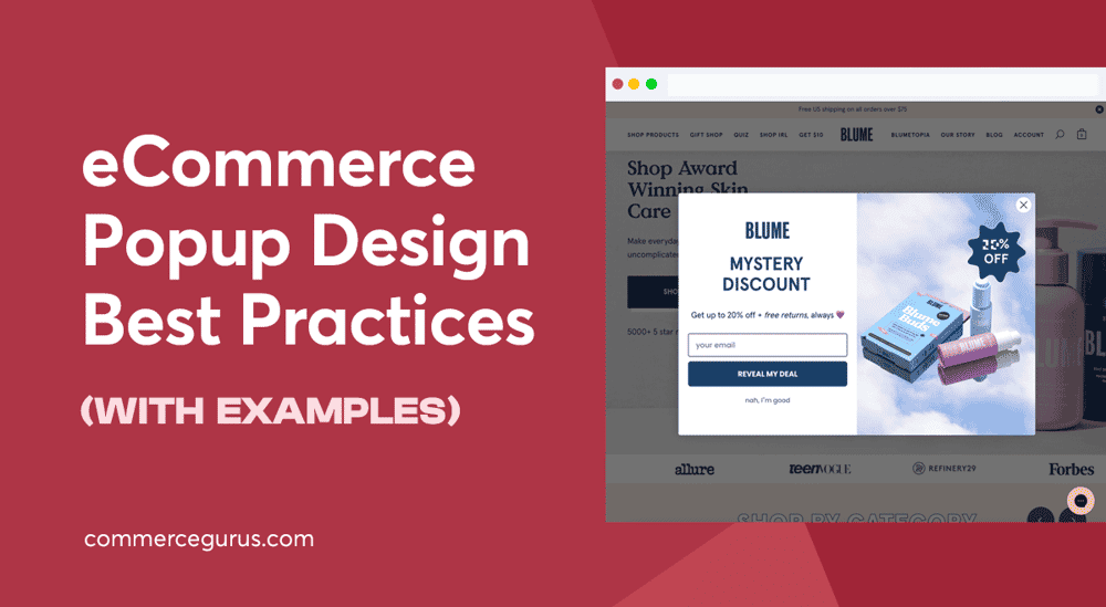
Just so we’re all on the same page, popups, in this case, refers to the pieces of content that “pop up” or are displayed on a web page, usually on top of the regular page content.
Website popups can come in many forms, but typically, they cover a portion of the page. However, you can also create full-screen popups that cover the entire browser window.
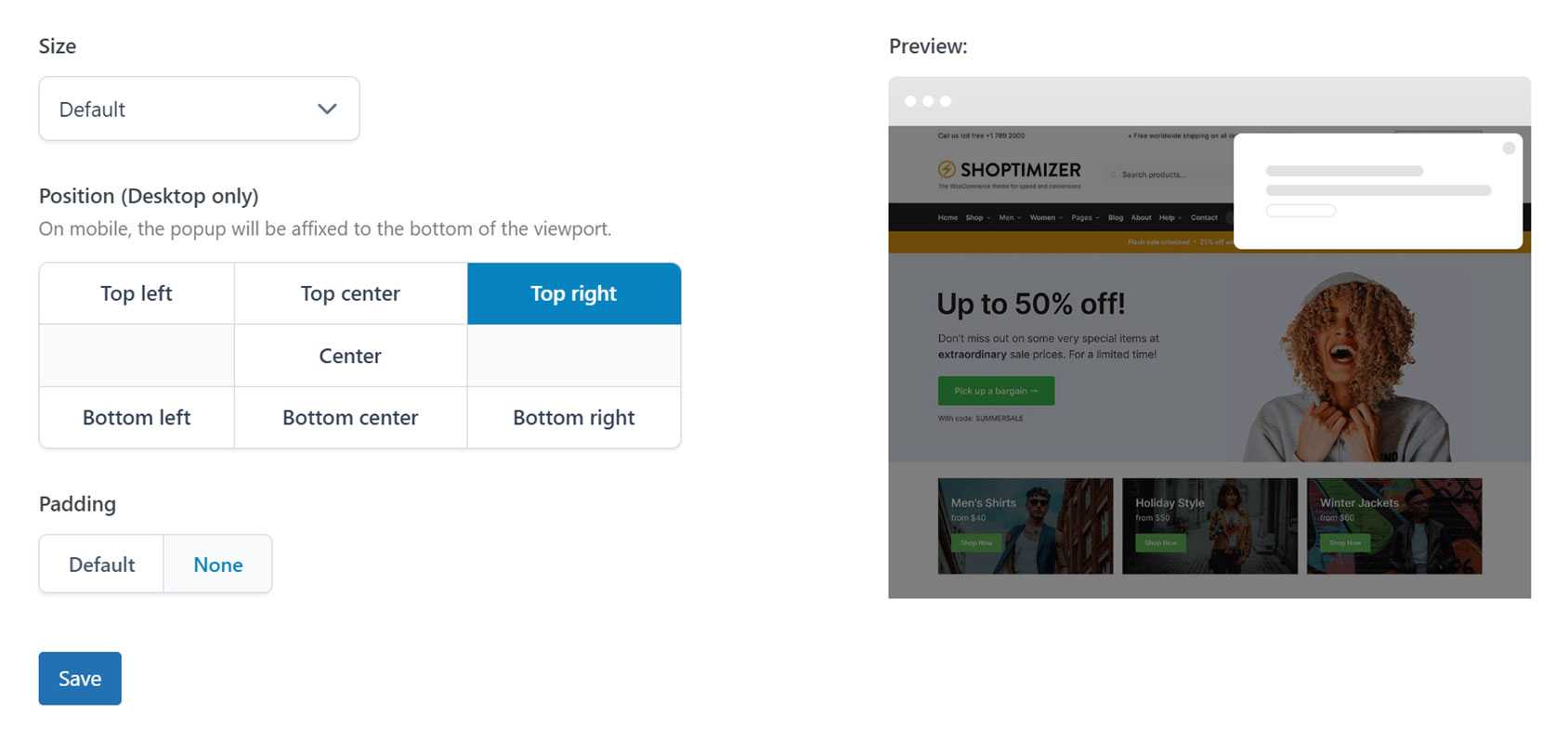
Popups are most commonly positioned in the center of the page or screen but can be displayed in any location.
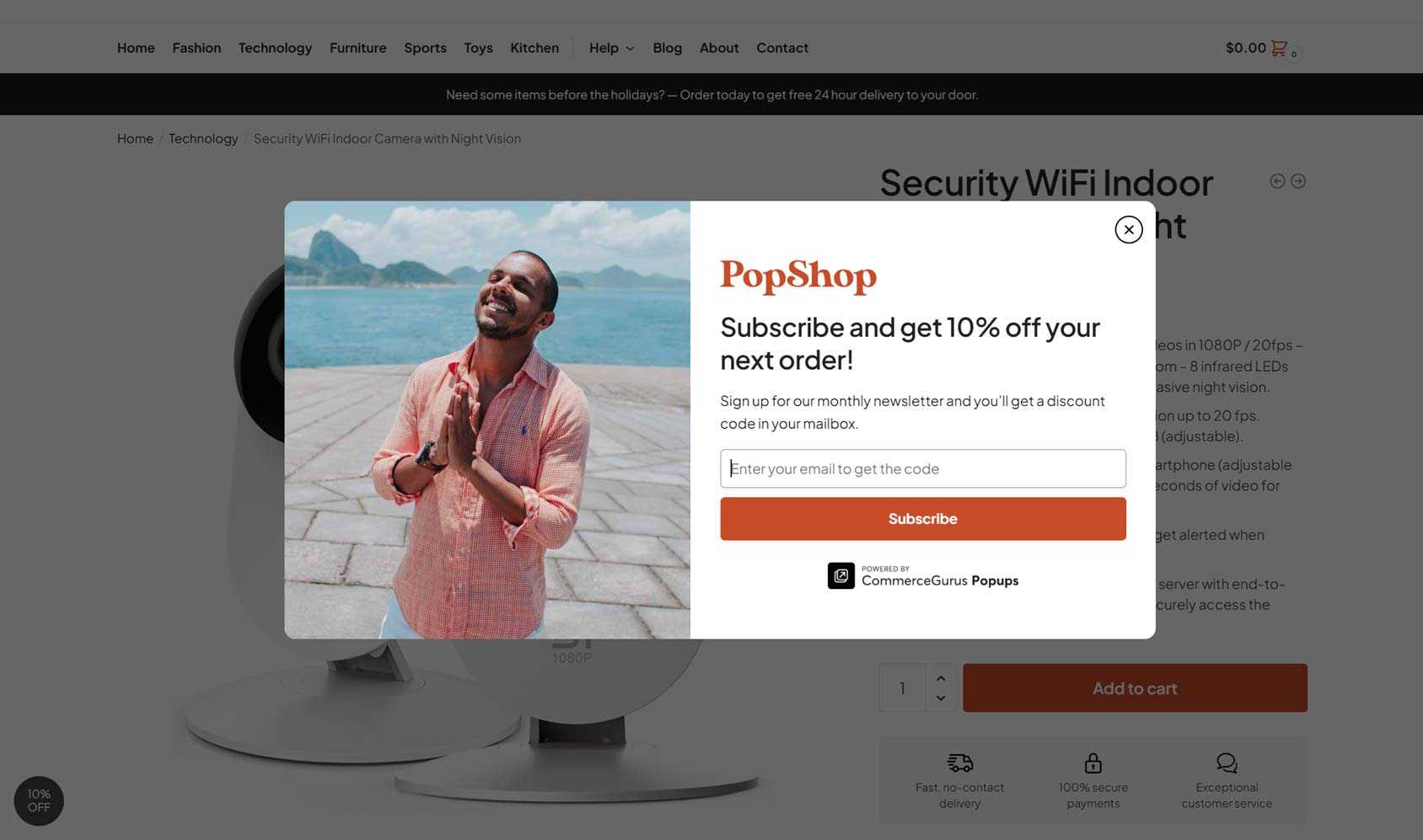
They can contain any type of content but typically display promotional content such as an optin form for an email newsletter, information about discounts on the site, or some other content designed to elicit a specific response from the visitor.
Popups can be launched or triggered in many ways, including:
- When a page first loads
- When a visitor has scrolled through a certain percentage of the page
- When a visitor is about to exit the site (also known as exit intent)
- After a set amount of time has passed
- After a period of inactivity (also known as dwell time)
- After the visitor has performed a specific action, such as clicking on a page element or adding an item to their cart
When it comes to using popups on your website, some sites come with built-in popup functionality, while others require this functionality to be added.
If you’re using WordPress for your site, you can quickly install a popup plugin to start using this powerful promotional tool today.
Choosing a good tool will increase your chances of getting the best results from your popups while also reducing the risk of annoying your visitors.
eCommerce Popup Design Best Practices
If you’re ready to start using popups to benefit your eCommerce business, or you’ve already started using them but aren’t getting the results you wanted, the rest of this guide will help you get the most from your popups.
Stay True to Your Brand
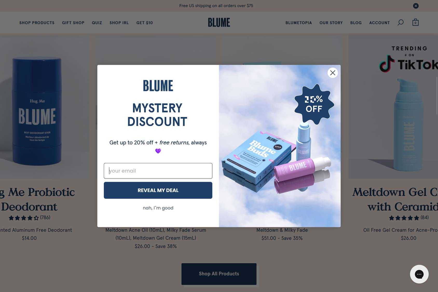
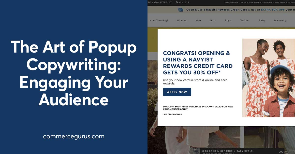
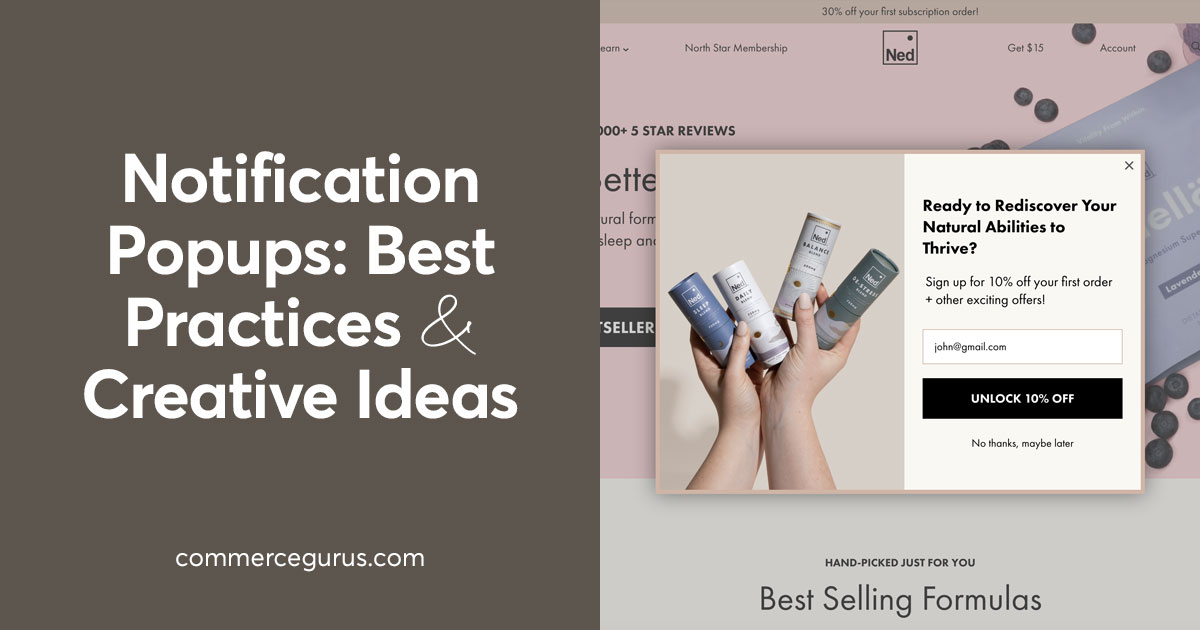
The branding you’ve created for your business and website should extend to your popups. This includes the fonts, colors, voice, tone, and overall style and personality of your brand.
Failure to do this could mean your message won’t resonate with your audience. Even worse, your popup might be mistaken for a third-party advertisement. If that happens, visitors will be happy to close the popup without hesitation rather than checking out your offer.
However, as we’ll see in the following tips, you should also try to prevent your popups from blending into your site to the point where they’re ineffective.
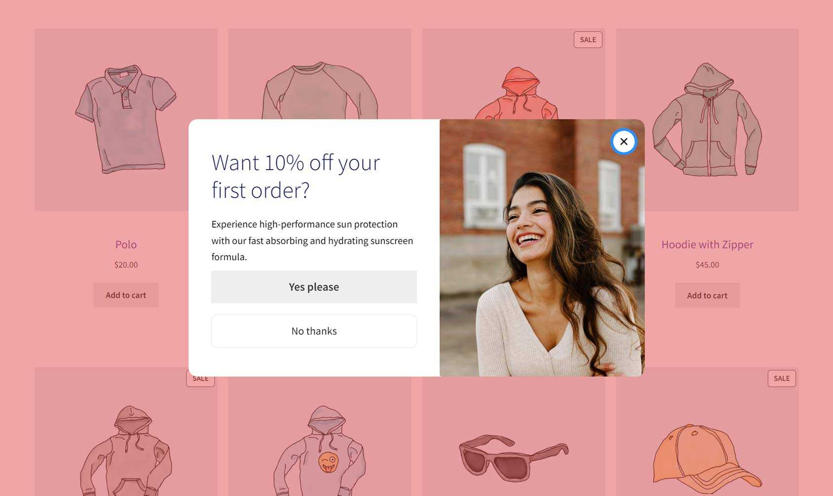
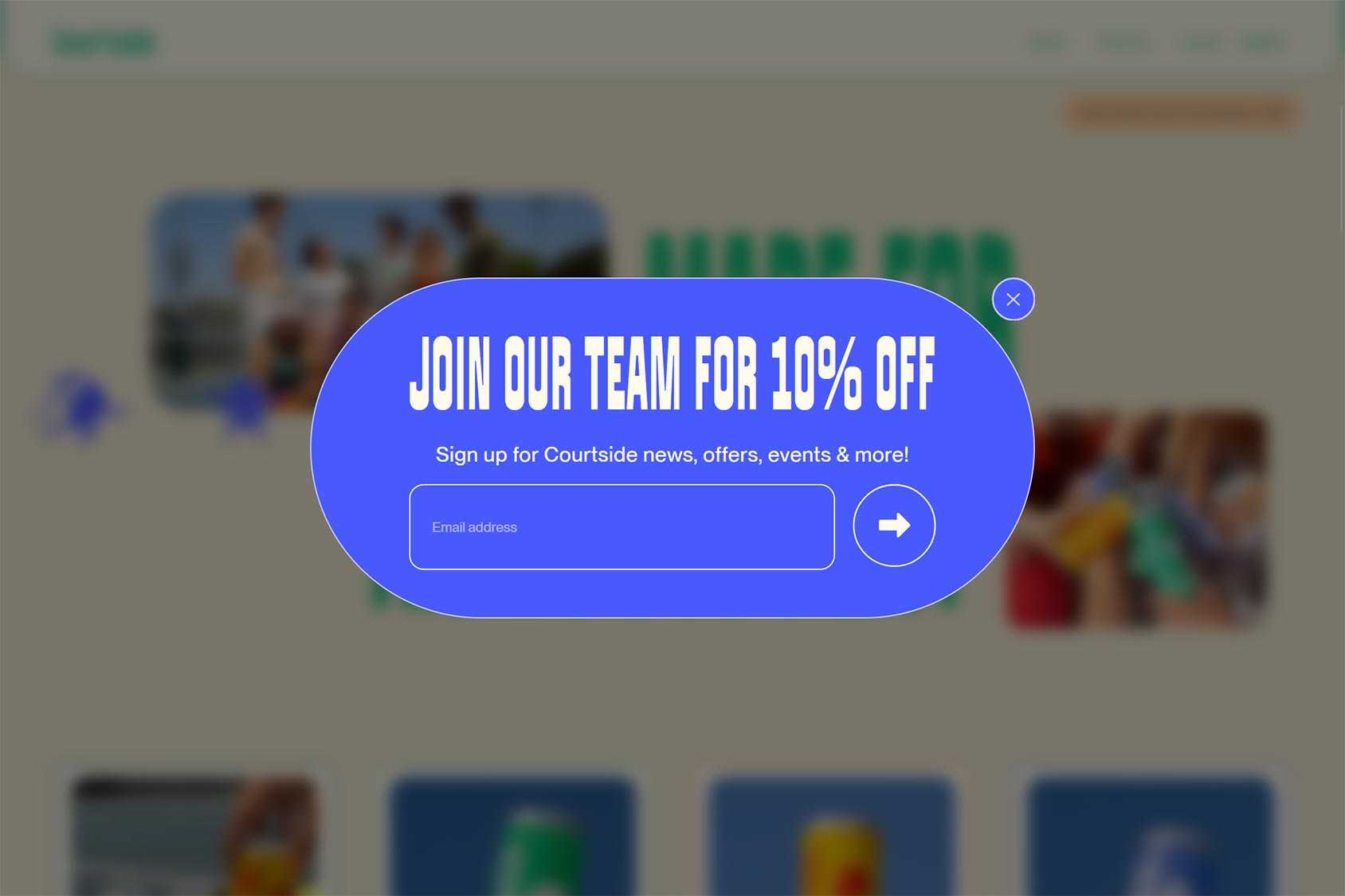
Create Contrast To Stand Out
Making your popups stand out on the screen is key to ensuring your visitors don’t instantly dismiss them.
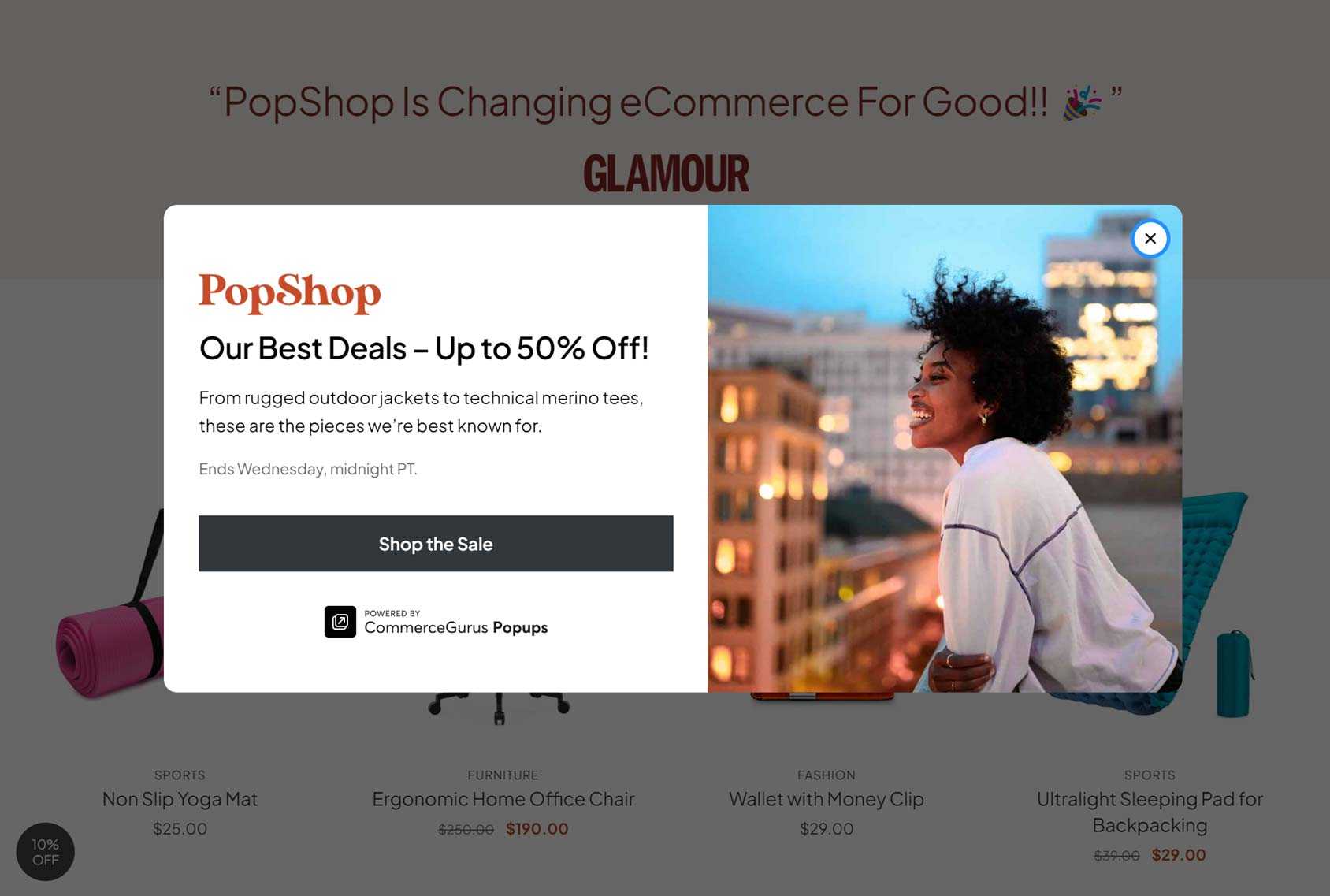
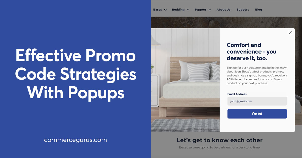
One effective way to catch the attention of your visitors is to use the lightbox effect by configuring the backdrop background appearance.
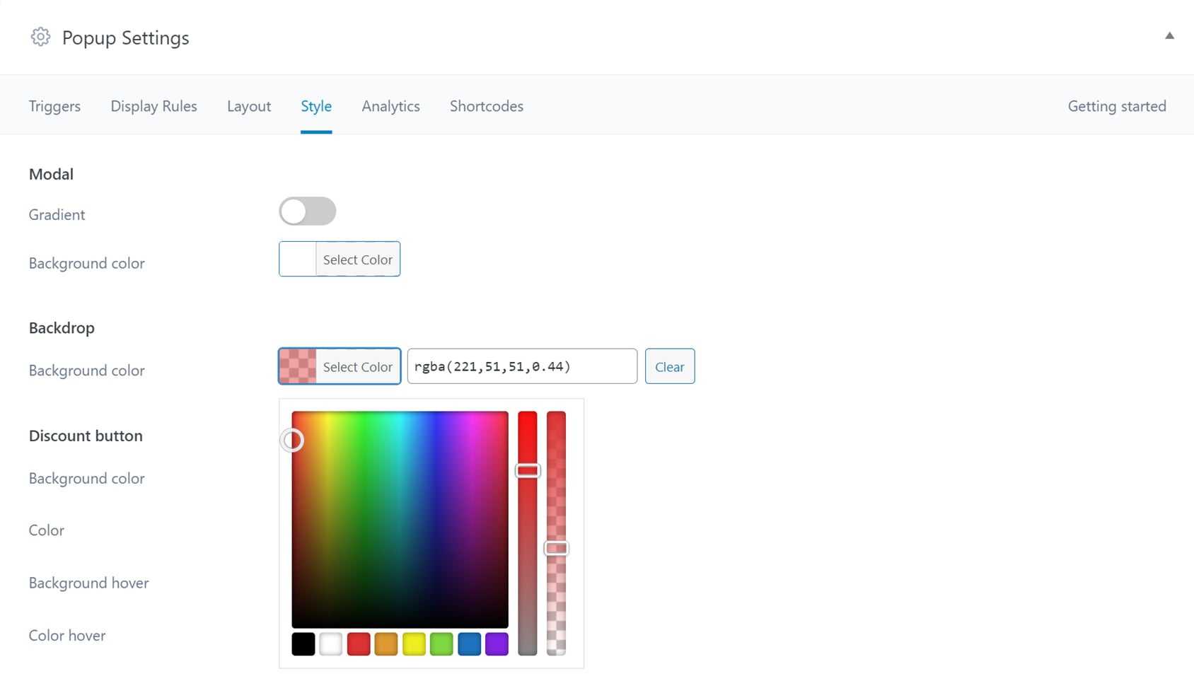
A good popup tool will let you change the opacity of the background display to obscure the rest of the page. This makes it impossible for visitors to miss the popup and its content.
Adding a border to your popups helps them stand out, too. This is especially relevant if you’re using colors in your popups that are similar to those of your page.
Color Choices
As mentioned, it’s a good idea to ensure the design of your popups matches your branding.
However, you can still use colors to make your popups stand out from the rest of your content while following your branding guidelines and style guide.
For example, you could invert your brand’s color scheme, using the colors featured sparingly on your site as the main colors of your popup.
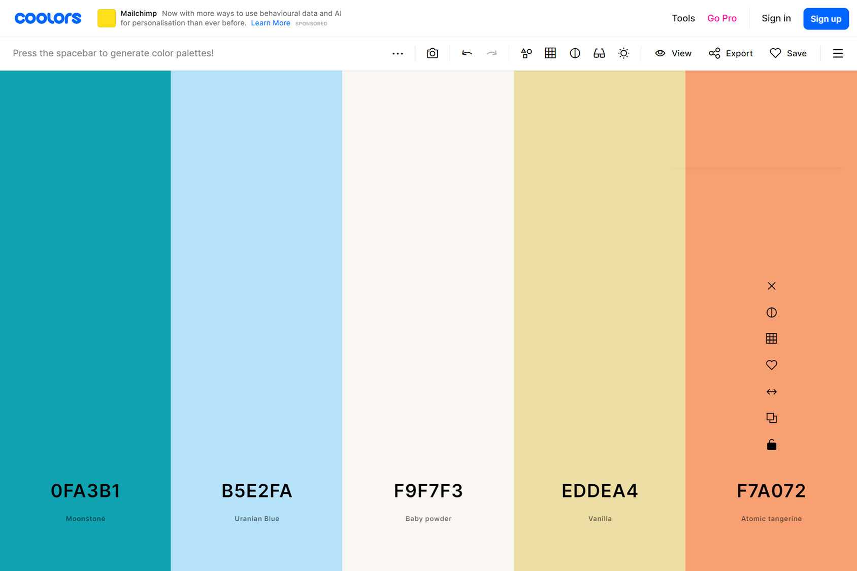
If your color scheme or palette includes a bold purple that you only use for headings, maybe use that color more prominently in your popup design. This will ensure your popup stands out from the rest of your site while still adhering to your branding.
If you’ve yet to define a color scheme or palette for your site and brand, Coolors has useful free tools to help you find the right selection.
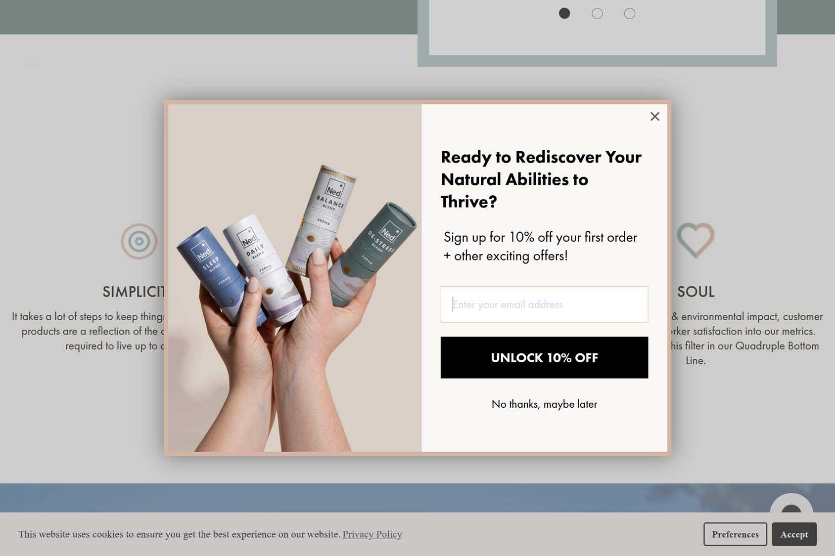
Include Appropriate Images (and Consider Video)
You should definitely be using images in your popups. Not only will this make them more eye-catching, but if chosen correctly, the images can boost conversions further.
One way to use images effectively in your popups is to promote a new product or showcase the personality of your brand.
When it comes to selecting images for your popups, you have a few options.
One option is to use product images. This can be an excellent way to promote your key products or show products in use.
Another option is to opt for more aspirational images. This type of image can help promote the feelings you want to be associated with your brand and forge an emotional connection with your audience.
For example, if your business is related to health and fitness, then displaying an image of someone looking radiant and happy could be a good option.
The quality of your images can have a significant impact on conversions. This is true whether you’re trying to encourage visitors to join your mailing list, take advantage of a promotion, or sign up for your service.
Due to this, you must use high-quality images.
If you’re unable to produce high-quality original items of your products or images related to your brand, then using stock images is a good solution. Just be aware that your competitors might be using the same photos. To counter this, try using premium image libraries over free ones or seeking out lesser-known, more boutique catalogs to find images with less exposure.
As the best popup tools let you create multiple popups for your site, you can use this functionality to ensure that you’re always displaying images that are relevant to the page a popup is displayed on rather than a general image that’s used throughout your site.
You might also consider adding videos to your popups. Doing so gives you even more options for the type of content you can include, such as personalized messages to your visitors, product demonstrations, and aspirational content shot in the style of a video ad or commercial.
In fact, research has shown that customers are 73% more likely to purchase a product if they’ve seen it demonstrated in a video. So whether you use them in your popups or not, adding product videos to your eCommerce store is a good idea.
Keep it Simple
Each popup you create should have a main goal, whether that’s gaining email subscribers or generating more sales.
If you try to achieve multiple goals with a single popup, there’s a good chance the message will get diluted, and you’ll miss out on conversions.
However, you can still use popups to achieve multiple goals on your site.
Choosing a tool that lets you create multiple popups enables you to target different goals with each one.
You can then deploy those popups to the parts of your site where they’ll have the greatest impact. Examples include displaying the email subscription popup when a visitor is about to exit your site or triggering one that’s built to generate sales with a money-off coupon when a customer has dwelled on the checkout page.
As well as having a single goal for each popup, keep the design simple, too. Avoid including lots of content or multiple types of media, such as text, images, and video.
If you’re asking for visitor information, such as contact details, limit form fields to keep the sign-up process as swift as possible.
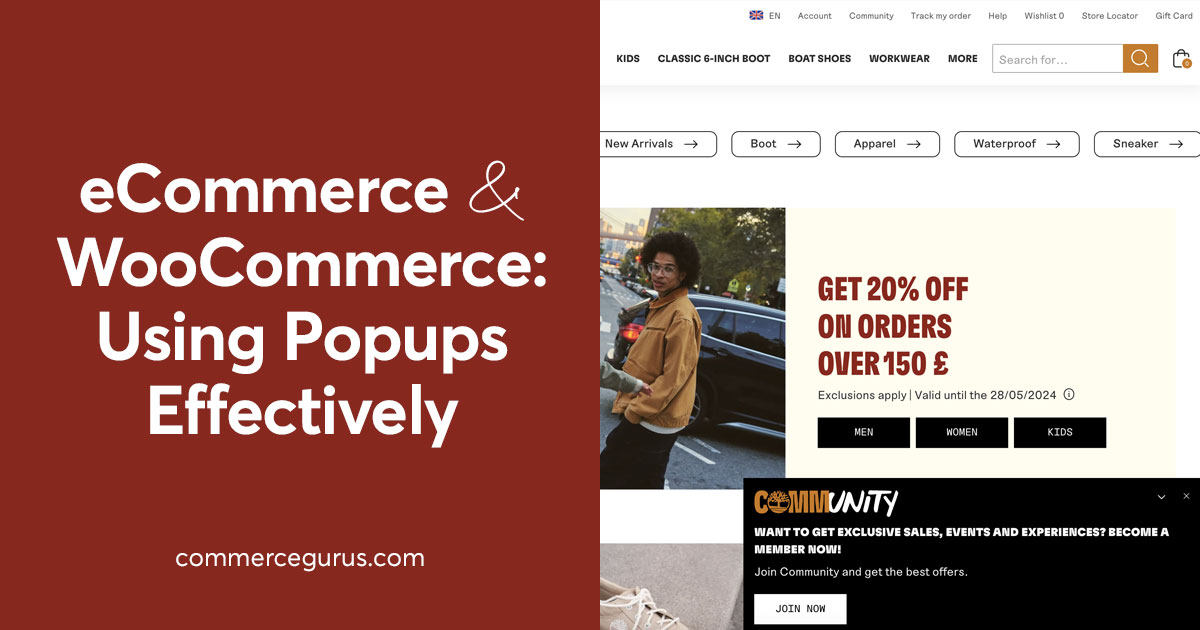
Clear Call-to-Actions
Along with simple objectives and designs for your popups, you should also make sure what you want visitors to do is obvious.
If you want the visitor to click on a button, make that button big and obvious. Avoid styling form fields so that they blend in too seamlessly with the rest of the popup.
Again, don’t dilute your message by asking visitors to take multiple actions, such as signing up and accessing a coupon code.
Targeted Offers
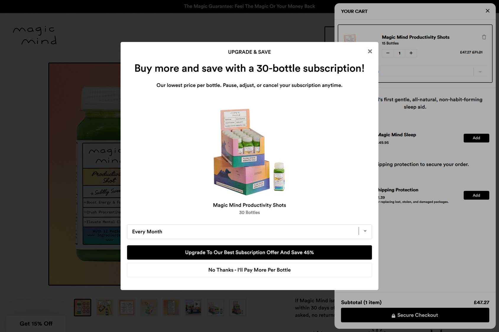
As mentioned, good popup builders let you create multiple popups and then define precisely when and where they’re displayed on your site.
One way you can use this functionality is to create a popup that displays recommended or related products to the item the visitor is currently viewing to generate cross-sells and up-sells.
Another option is displaying money-off coupon codes on the product pages of high-ticket items.
Adding a free shipping coupon code popup to the checkout page that’s triggered when the visitor has dwelled for a set amount of time can be an effective way to encourage them to complete the transaction.
On the homepage of your eCommerce store, you might want to display a popup that contains more general content, such as a welcome video or a showcase of your latest or most popular product.
If you tailor your popup content, where they’re displayed, and how they’re triggered to where the customer is in their journey, you’re more likely to yield positive results from your popups.
Make it Easy to Say No
While we want the visitor to take positive action after seeing a popup, that’s not going to happen every time.
So, with that in mind, it’s vital that you give shoppers an easy way to reject your offer, dismiss the popup, and carry on browsing your store.
Adding a prominent close button to your popups is essential if you don’t want to frustrate your visitors and lose their trust.
Summary
As you can see, popups can come in my styles and varieties.
This flexibility is a good thing as it gives you lots of freedom. However, it also has a downside, as there’s more scope for getting your popup design and implementation wrong.
However, by following our eCommerce popup design best practices, you’ll be able to start using this powerful marketing technique at your store to help rather than harm your business.
If you’re looking for a powerful popup tool built specifically for WooCommerce stores, check out CommerceGurus Popups, our WordPress popup plugin.

 eCommerce Listings Pages – 10 Top Examples
 Increase your store traffic with Yoast WooCommerce SEO
 12 Must-Have Features of Top Performing Product Pages
 Help Shape What We Build Next: The CommerceGurus Community Survey 2026