CommerceGurus Popups includes a number of design and appearance options to allow you to change how your popup looks. Note that the content within the popup is designed within the editor itself.
You can use the native WordPress editor, or a page builder such as Elementor to create beautiful looking designs.
Layout
Within the Layout tab you can change the size, position, and padding of the modal.
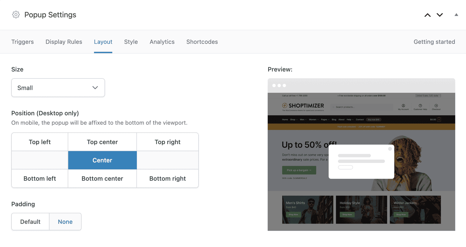
You can see a preview on the right-hand-side of what the modal will look like depending on the size and position settings you have picked.
Note that if you have set your popup to appear on small screens these will always appear at the bottom of the viewport, irregardless of the position selected. This is a UX consideration as it’s easier to engage with an action button at the bottom of small or mobile screens.
Setting the Padding to Default is best employed only if you use the native WordPress editor. If you use Elementor, or any other page builder, these will have their own padding options which offer more control.
Style
The style tab allows you to control the colors of various elements of the popup.
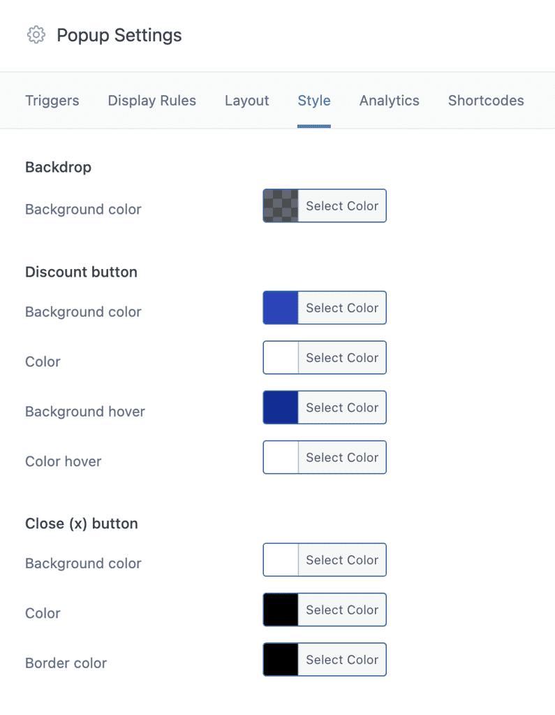
The backdrop background color refers to the overlay which appears behind the modal. This is normally dark, but you can change it to any color you like, and adjust the opacity which controls how much of the content behind it is visible.
The discount button color settings change the appearance of the discount shortcode button.
Finally, the Close (x) button colors change the appearance of the icon which is displayed on the top right of each modal.