- Notification popups can help eCommerce store owners achieve their business goals.
- The design of your popup notifications should match the design of your site.
- Creating multiple unique notification popups increases effectiveness.
- Advanced display rules and triggers enable you to tailor your popups.
- Choosing the right popup tool will increase your chances of success.
Adding notification popups to your site is an effective way to reach your goals.
Whether you want to increase newsletter subscribers, promote specific products, increase average order value, or sell more products, notification popups can help.
However, there are many ways to use notification popups on a website. If you get it right, your business will grow, but if you don’t, these popups could have a negative impact.
In this popup notification guide, we cover the best practices for adding them to your site and share some creative ideas so that you can get the best results without annoying your visitors.
We’ll also take a quick look at how to choose the right tool to add notification popups to your site.
What Are Notification Popups?
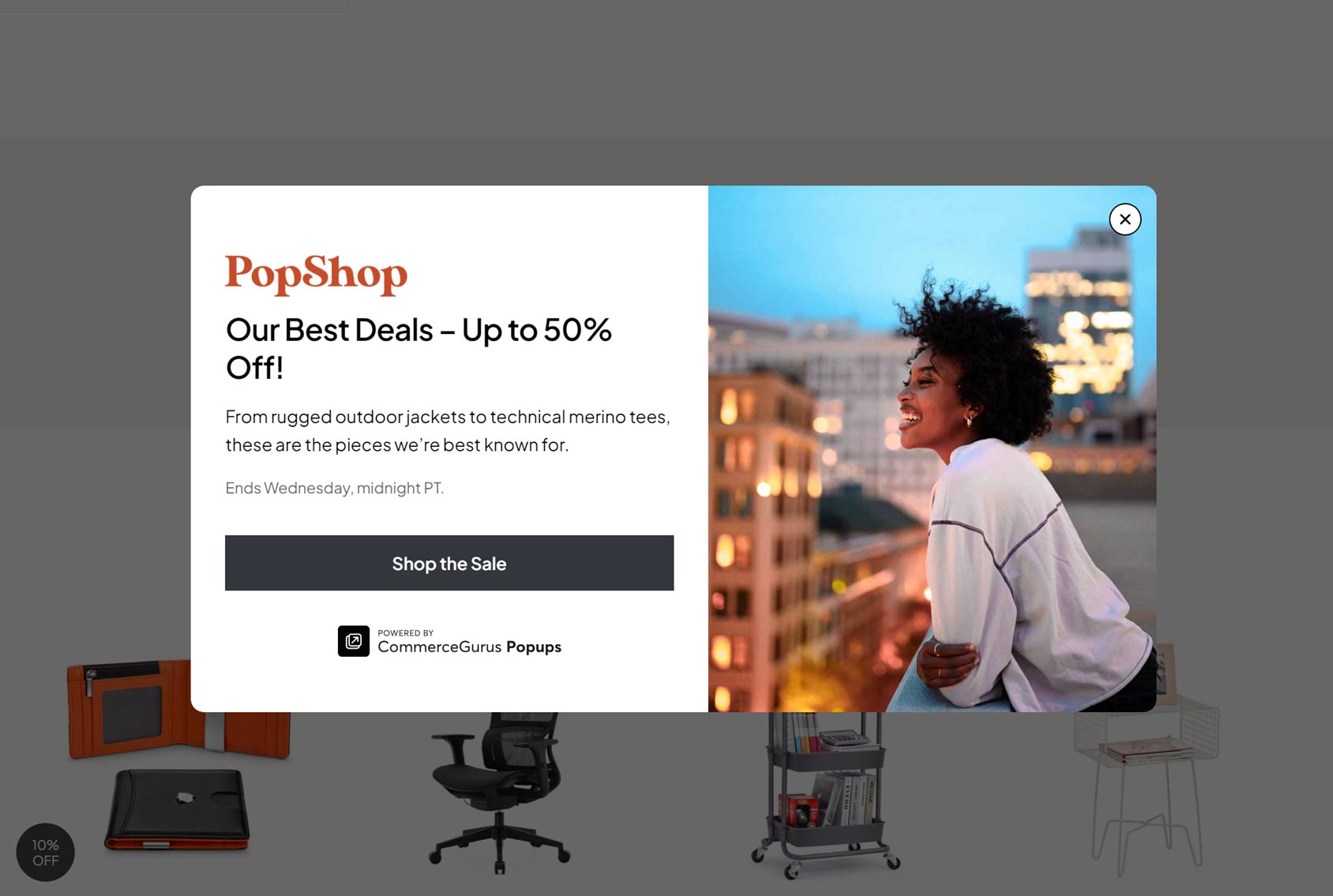
Notification popups are displayed while you’re browsing a website. They notify you of something, usually with the aim of encouraging you to take a specific action.
They can be used on all types of websites, but they’re widely used on eCommerce stores. This is because they’re very effective at helping store owners achieve their business goals.
Examples of common popup notification uses include displaying a welcome message when a visitor arrives at the site or store.
This welcome message will usually be accompanied by some kind of offer for the visitor, such as a money-off promo code. However, the visitor will usually have to take some sort of action, such as signing up for a marketing newsletter, to access the promo code and unlock the discount.
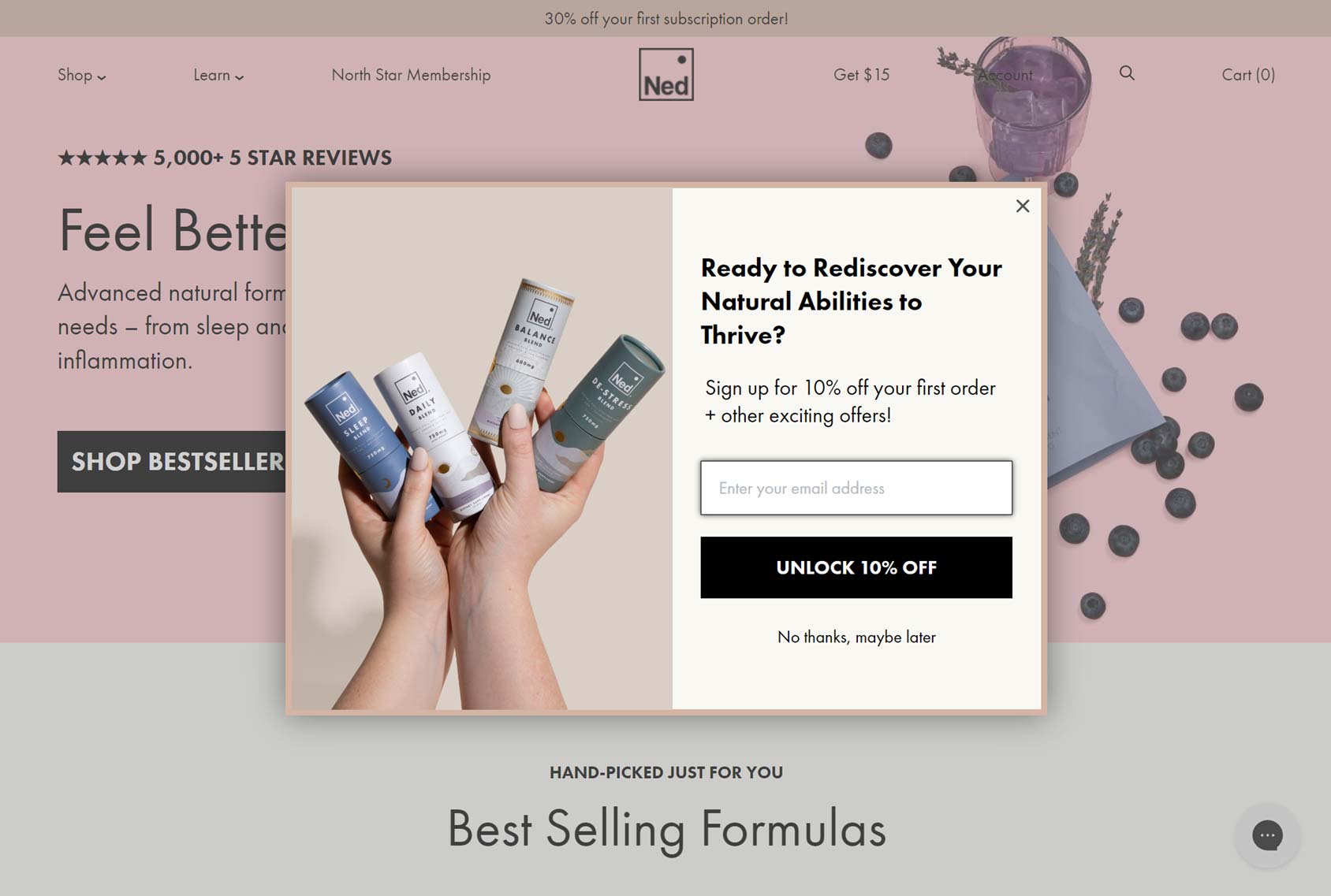
While that’s a good example of a generic notification popup — one that’s shown to everybody who arrives at the site with an offer that should appeal to everyone — they can get much more sophisticated, especially if you’re using a feature-rich popup maker.
You can learn more about these notification popups and other types in our complete guide to eCommerce popups. However, an example of a more sophisticated and personalized notification popup would be one that’s triggered when a visitor is about to leave the site and includes content, such as a promo code, related to the items in their shopping cart.
Types of Notification Popups
Notification popups can take many forms, and it’s best to use a range of popups when adding this type of element to your site. Thankfully, the best popup makers allow you to create multiple types.
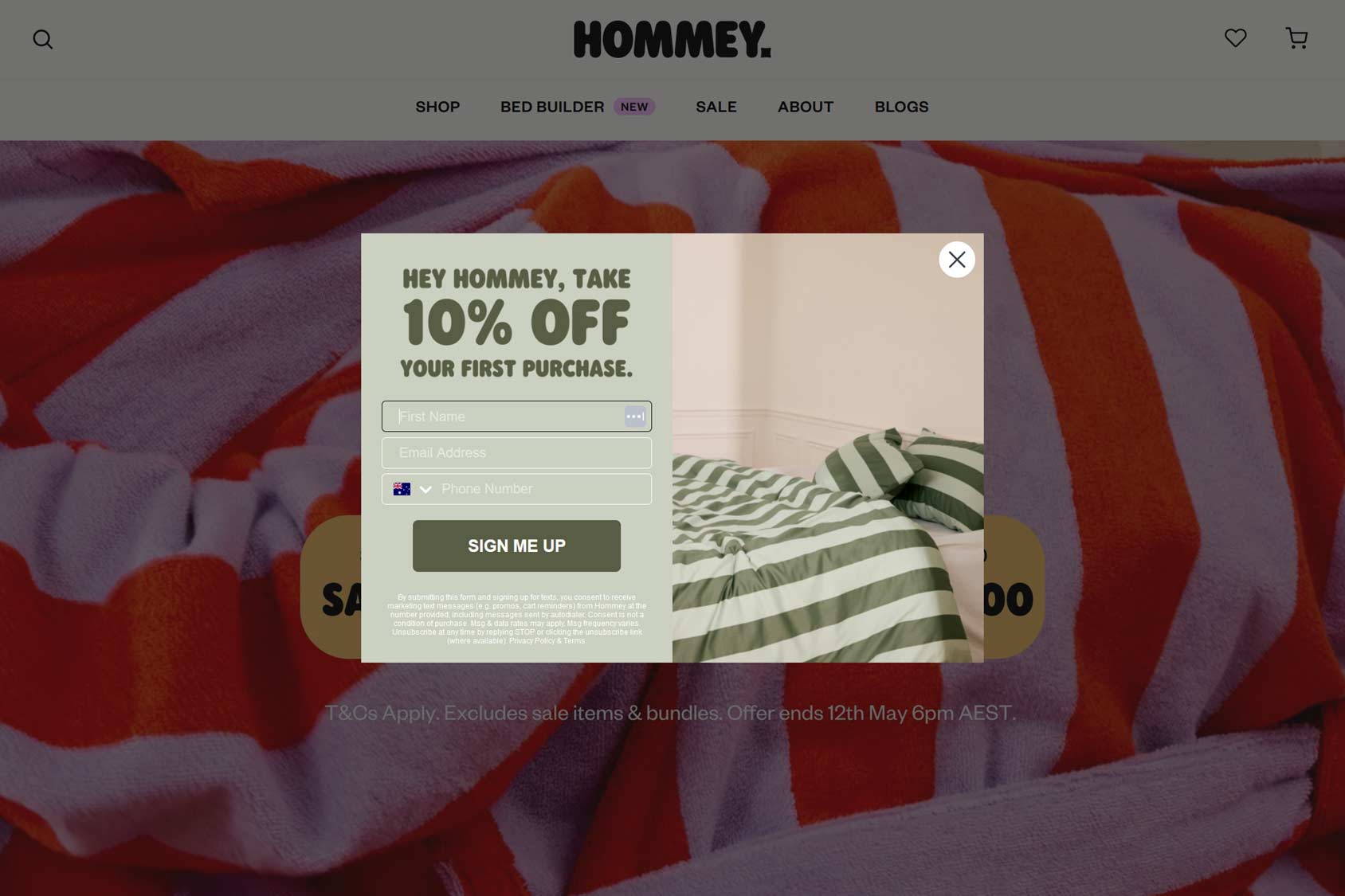
The lightbox popup is probably the most common option. This type of popup displays a notification in the center of the browser window, with a semi-transparent overlay obscuring the rest of the page.
The lightbox popup is a great option for catching visitors’ attention. It’s also a versatile type of popup, suitable for a range of goals.
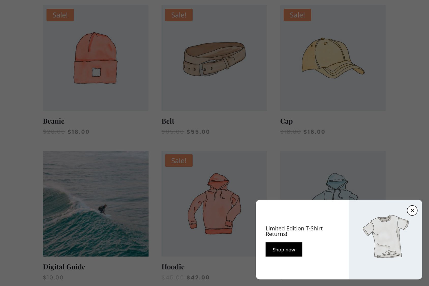
Another popular type is the popup notification displayed in one of the corners of the browser window. Typically, this type of popup slides into view. As it only covers a small part of the page, it’s good for displaying notifications that aren’t urgent but still might benefit the visitor. This could include information about the product being viewed or a reminder to sign up for the email list.
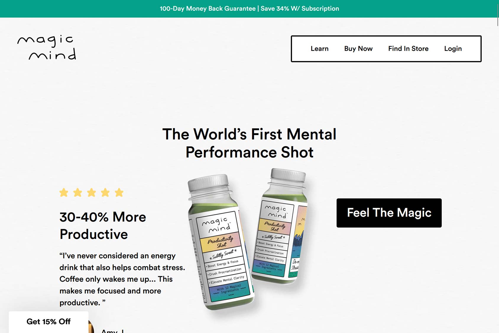
Another less disruptive notification popup is the header or footer bar popup. These banners usually either cover the top or bottom part of the page or “push” the page content down to deliver their message. Again, these header and footer popup notifications are good for useful but not vital information you’d like to share with your audience.
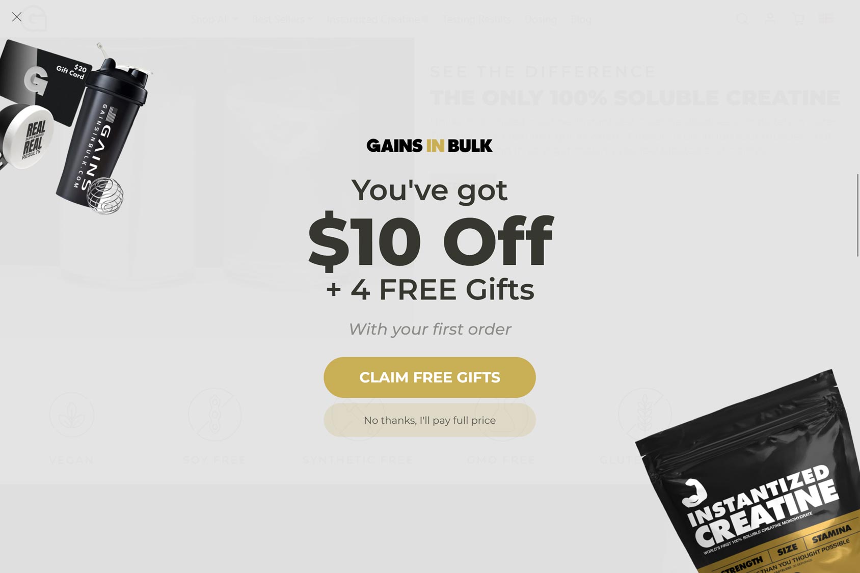
For maximum impact, you can deploy the full-screen or welcome mat notification popup. This option covers the entire browser window, making it impossible to ignore. These popups can annoy visitors as they disrupt the browsing experience, so be sure to use them sparingly and only when you have an offer or message you really need to share.
Popup Notification Best Practices
Successfully adding notification popups to a site involves some experimentation to find what works with your particular goal and audience. However, there are best practices you can follow to increase your chances of reaching your goals.
Popup Notification Design
The first place to start when creating a notification popup is the design. If the popup design isn’t appealing or it looks out of place, it will be easy for visitors to ignore or close without any engagement.
However, they not only have to look right, but they also have to be easy to understand.
When designing a popup, a good tool will provide you with a selection of templates to help you get started. You can then customize the popup to match your goals. The best popup makers also work with third-party design tools to simplify customization.
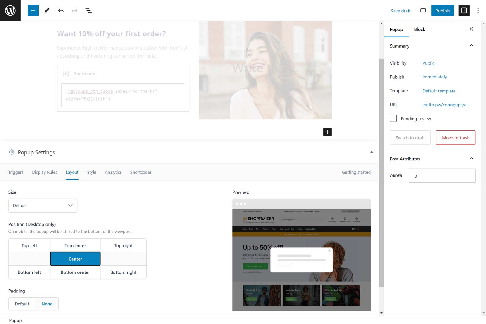
When creating a popup, it should match the design of your site. Although we want the popup to stand out on the page and catch your audience’s attention, its appearance shouldn’t be too different from the rest of your site.
Applying the overall style of your site, such as the branding, colors, and typeface choices to your popups, will help them feel like a part of your site rather than a third-party piece of content, such as a display ad.
Including images or videos in your popup designs is a good idea, too. However, they should be relevant to the message of the popup, such as images of the product or offer you’re promoting.
Popups should always have a purpose. Usually, that’s to persuade the visitor to take a specific action. Therefore, you must make sure that the call to action is clear so that the visitor knows what to do next.
Visitors should also have an easy way to dismiss the popup, such as a clear close icon or button if they’re not interested in the offer being presented.
This guide has examples of engaging popup design and tips on creating high-quality notification popups.
Create Multiple Notification Popups
To get the most out of notification popups, you should create more than one for your site.
Each popup should be tailored to where the visitor is in their journey. As part of the tailoring process, the popup should have its own design, content, call to action, and goal.
One popup could be created for your site’s homepage. It could display a welcome message to new visitors alongside a sign-up form for your email marketing list.
Another popup would be created for your store’s checkout page. This popup would be triggered when the shopper hesitates to place an order. This popup could contain a money-off promo code to encourage the hesitant shopper to complete the checkout process.
The user journey includes many more steps between arriving at your site and placing an order. This means there are plenty of opportunities for creating tailored popups for your audience.
Use a Range of Display Rules and Triggers
When you first start creating notification popups, you might want to design a general-purpose popup that you display all over your site. It could use a simple trigger, such as waiting five seconds before popping up.
However, to get the best results, you should start exploring your chosen popup tool’s display rules and triggers.
Doing so will allow you to assign popups to specific parts of your site.
Through the display rules, you can choose which parts of your site the popup is available on. This could include specific pages, content from specific categories, or the eCommerce parts of your store.
Advanced eCommerce popup tools give you access to more powerful display rules. These could include letting you use the value of the products in the customer’s shopping cart or whether the customer’s email address is already in your database to determine whether or not to display a popup.
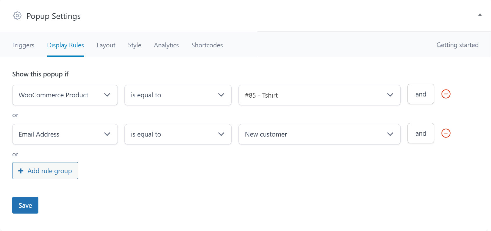
Our guide to maximizing your popup maker covers display rules and triggers in more detail.
Experiment With Notification Popup Content and Offers
Combining triggers and display rules lets you get more creative with notification popup content and offers.
For example, you could use a display rule to determine whether a potential customer has yet to place an order at your store. If they haven’t, you could display a popup with a new customer promo code to encourage them to do so.
Another option would be to use the display rules to assign a popup to the checkout page and use the exit intent trigger to only show that popup when the visitor is about to leave your store empty-handed.
Displaying a promo code in that popup could be enough to persuade them to stay and finish their journey by purchasing the items in their cart.
These are just some of the promo code popup strategies that are available to you with the right tools.
Choose a Tool That Matches Your Goals and Platform
If your site doesn’t already have the ability to create popup notifications, you’ll need to add it yourself. One way to do so is to use a tool and install it as a plugin or app.
As mentioned, the tool you choose will dictate what type of popup notifications you can create and how you can trigger and display them on your site. This will affect how successful your notification popups are at helping you achieve your goals.
When it comes to choosing a popup builder, some points to consider include:
- Compatibility — Is it compatible with your site infrastructure, such as WordPress, WooCommerce, or Shopify?
- Relevant Features — As well as being compatible with your platform, it should also have features for that platform, such as WooCommerce display rules if you’re using WooCommerce.
- Essential Functionality — Do the display rules and triggers provide enough functionality for creating tailored notification popups?
- Popup Templates — Does it have ready-made popup notification templates, and do they match your goals?
- Customization Options — Is the popup design interface familiar or user-friendly? Can you use third-party tools to create the designs?
- Analytics Data — Can you easily monitor the performance of your popups to evaluate their effectiveness?
For more information on choosing a tool, our guide to the best popup makers for WordPress will help you find the right solution for your project.
Summary
As you can see, notification popups can be a useful addition to any site.
Most tools will let you quickly add a site-wide popup notification to your site with the aim of welcoming new visitors and inviting them to join your email marketing list.
However, if you choose a powerful popup maker that aligns with your goals, you can get much more value from notification popups. By creating multiple popups, each with its own content, triggers, and display rules, you’ll be able to optimize your popups to match where the visitor is in their journey to get the best results.
Over time, your popup strategy will develop, and you’ll get closer to reaching your goals.

