- Choosing a tool that’s compatible with your site and aligns with your goals is key for designing effective and engaging popups.
- Being aware of popup design best practices and the types of elements you can add to popups will help you when designing engaging popups.
- You can learn from examples of effective popup design to help you build the right popups for your site and its audience.
If you want to grow your audience, generate more leads, and increase sales, adding popups to your site or store is definitely a suitable option.
However, in order for your popups to benefit your blog or business, they need to be effective.
It’s not enough to simply enable a popup, leave the settings in their default state, and sit back and wait for the rewards to start rolling in.
To get the best results from popups, you need to choose the right tool. Then, you must design and configure them to suit your site and your audience. Furthermore, you’ll need to monitor and improve your popups to get the most from them.
While that might sound like a lot of effort, following the advice in this guide to creating engaging popups can eliminate much of the guesswork and reduce the time you spend researching, experimenting, and troubleshooting your popups.
How to Design Engaging Popups
Popups can be used for a range of purposes, from collecting leads and growing your email list via optin forms to promoting products at your store and offering visitors incentives to complete a profitable action at your site.
Whatever the purpose of your site, there’s a high chance popups will help you achieve your goals.
So, to ensure you get the most out of this effective website feature, we’re going to quickly cover some of the points to consider when choosing a popup tool and look at the key points that will help you create effective popup designs.
After that, you’ll find some real-life popup examples that work well and might serve as good templates for your own popups.
Choose a Suitable Popup Tool
When it comes to designing engaging popups, choosing the right tool is critical.
This is because the best tools include user-friendly interfaces, high-quality popup templates, varied display rules, and useful triggers. Without these features, creating effective popups is much more difficult.
This means that if you choose correctly, you’ll be able to create popups with the right look for your audience and can be deployed to specific parts of your site.
As they can also be set only to load when certain conditions have been met, offers promoted in the popups can be targeted to exactly where the shopper is in their journey.
All of this combines to increase your chances of creating effective popups.
Some things to look for when choosing a popup tool include:
- Maximum Compatibility — Look for a tool built for your set up and with relevant features. For example, if you’re using WordPress and WooCommerce, choose a popup plugin that has been built specifically for that platform and has WooCommerce-specific features.
- Appropriate Templates — A selection of high-quality popup templates that match your site/store and goals will make publishing effective popups easier.
- Advanced Display Rules — Having extensive control over when and where popups are displayed on your site will make them more effective.
- Various Triggers — Being able to launch popups when certain conditions have been met, such as cart value or whether the customer is new or returning, lets you optimize your popups and their content.
- Selection of Popup Types — A range of popup types, including lightbox, horizontal bar, and slide-in popups, will help keep your popups fresh and aligned with your goals, compared to relying on just one type.
For more information on choosing a tool, check out our detailed guide to WordPress popups.
Popup Design Elements to Consider
Once you’ve chosen a tool, you can start creating engaging popups designs for your site.
Here are some tips to help you master effective popup design:
- Colors — Stick to the color palette of your site so your popups match your branding, but don’t be afraid to mix things up to make your popups stand out, such as inverting color palettes and using site foreground colors as popup background colors.
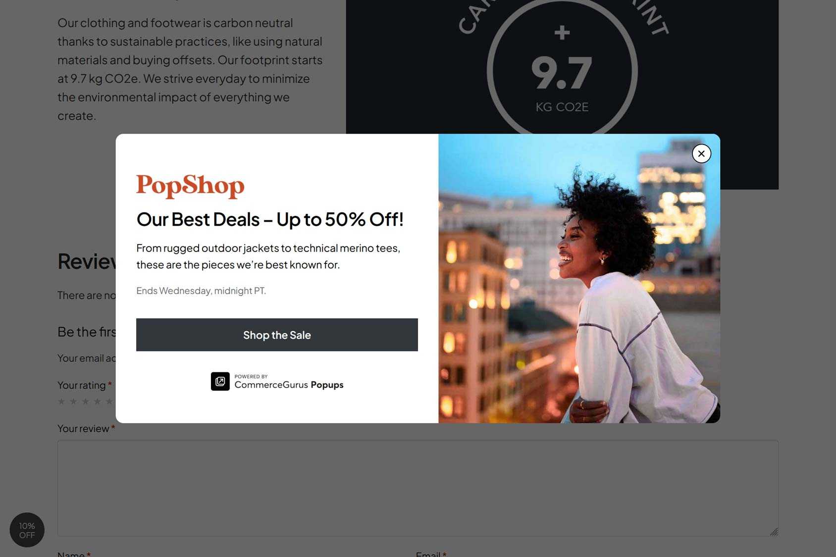
- Images and Video — Adding relevant images and images to your popups, such as those showing your products in use or displayed in interesting ways, can help make your popups more engaging and effective at promoting your goods.
- Form Fields — If you’re asking visitors to sign up for something in your popups, then keep form fields to a minimum so it takes them as little effort as possible to complete the form. If you need to capture a lot of information, add a single button that takes
- visitors to the sign-up page.
- Buttons — If you want visitors to click on a button in a popup, such as one that takes them to a specific part of your store or applies a coupon code, then make sure the buttons are highly visible and clearly labeled.
- Targeted Offers — Use advanced display rules and triggers to show popups that contain offers tailored to where the visitor is at your store and in their buying journey, such as on single product pages, in the cart, or at the checkout.
- Unmissable but not Obnoxious — Aim to make your popups unmissable with offers that are hard to ignore, but don’t bombard your visitors with popups on every page or create popups that are hard to close.
For detailed advice, check out our guide to eCommerce popup design best practices.
Examples of Engaging Popup Designs
Now that you know the theory behind designing engaging popups, here are some popup examples that illustrate some of these points. These popup examples can provide inspiration for your own designs and templates.
Culture Espresso
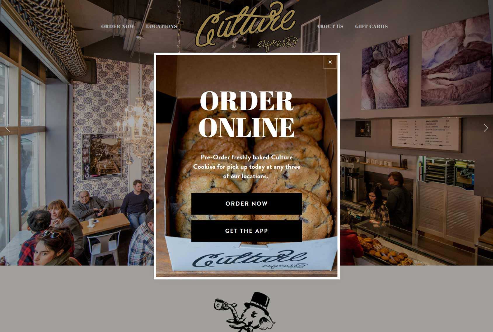
This lightbox popup on the Culture Espresso site uses a tempting product image to encourage visitors to place an order.
The white border helps the popup to stand out from the rest of the page, making it impossible to miss.
Clear button text lets visitors easily see where each option will take them, increasing the chances that they will either get the app or place an order.
Pointly
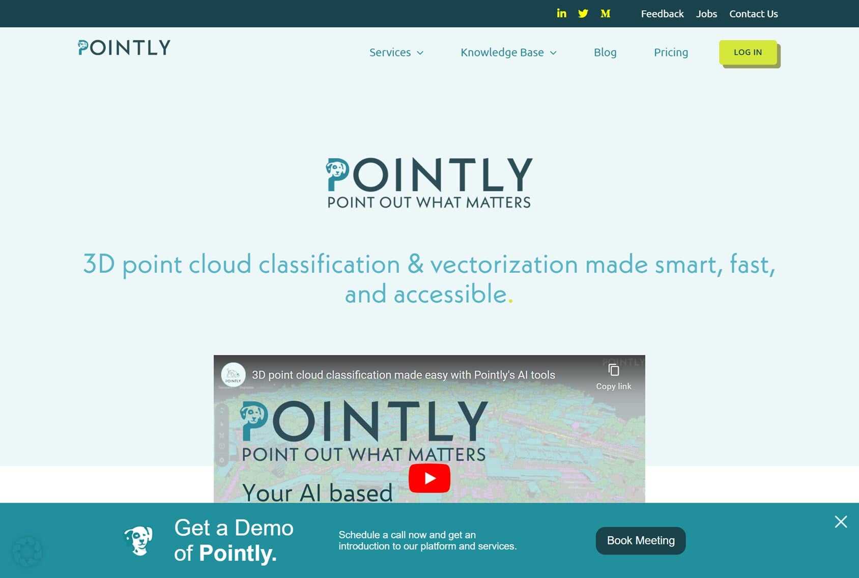
Pointly uses a horizontal popup bar at the bottom of the screen to encourage visitors to book a meeting to demo their product.
The popup design uses the site’s color palette but inverts it so that it uses a darker color for its background. This makes the popup stand out on the page while still following the company branding for a consistent user experience.
The clear copy of the popup and its button makes it obvious what the offer is and why visitors should engage with it.
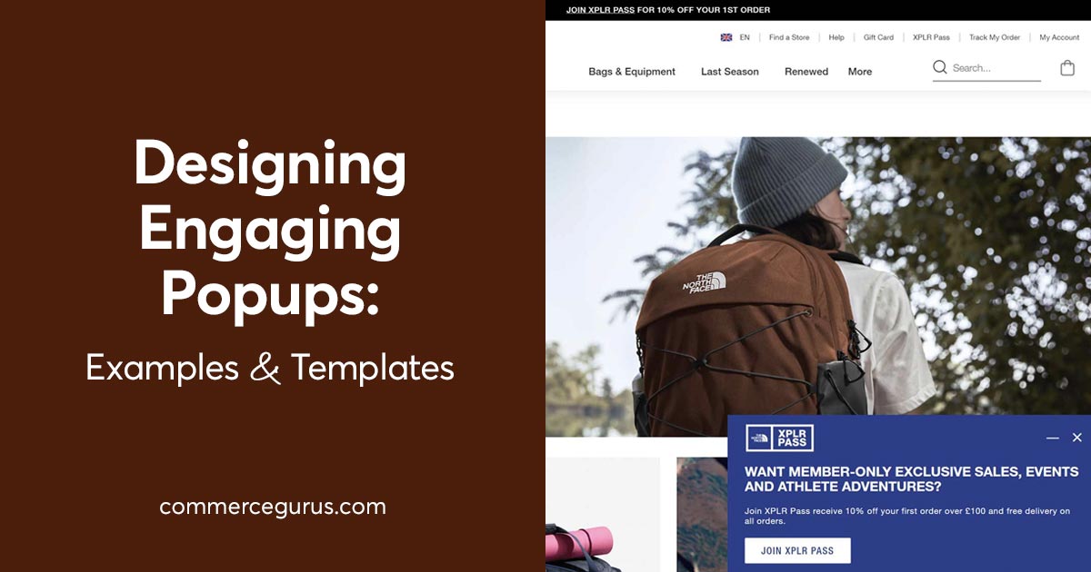
The North Face
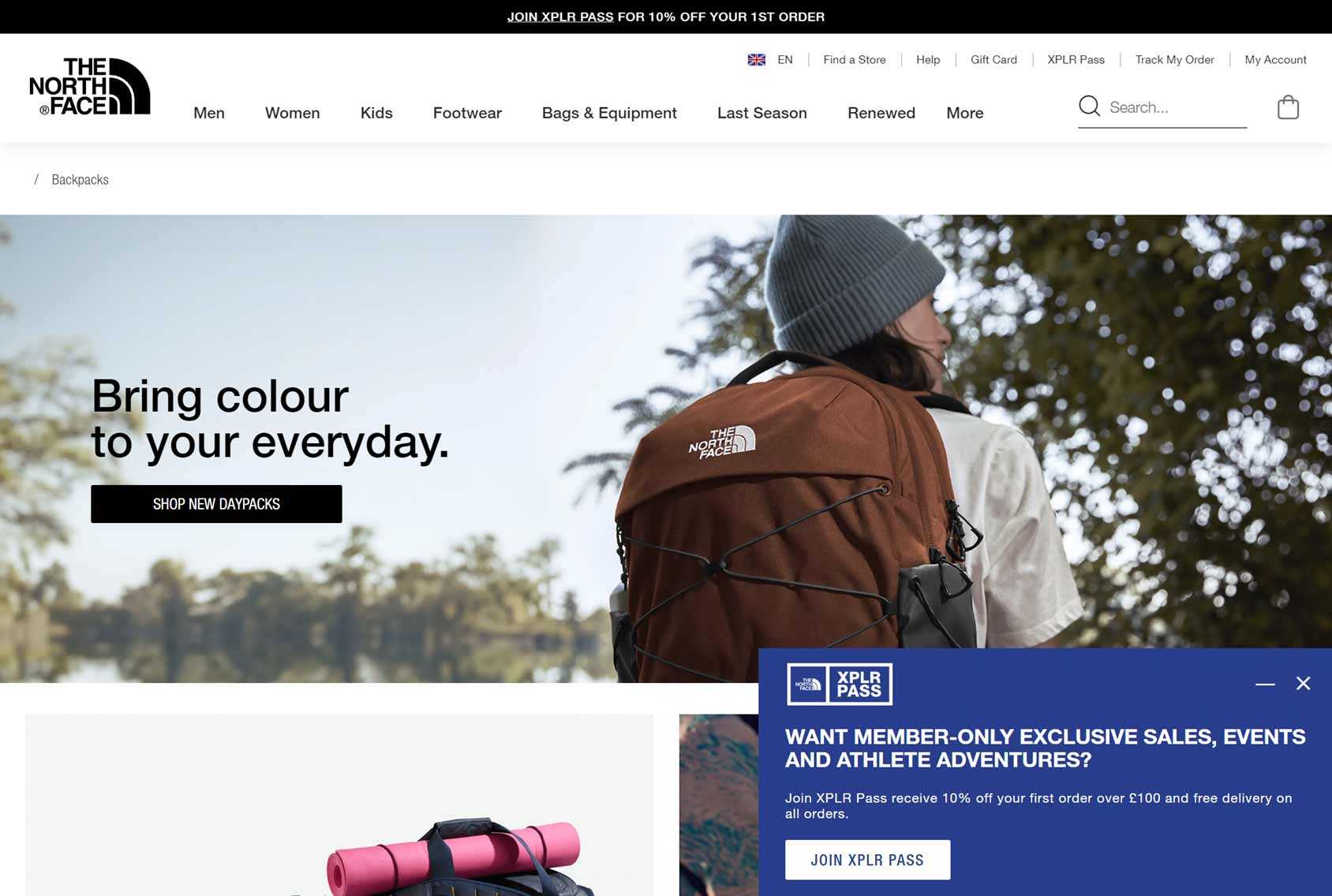
The North Face opts to promote its members’ program using a popup that slides in from a corner.
While the contrasting color of the popup makes it hard to miss, the corner placement makes it less obtrusive than a lightbox popup displayed in the center of the screen.
As the popup is displayed on the home and category pages, it has a generic offer that applies to all products rather than a more focused one that would work better on individual product pages.
Human Made
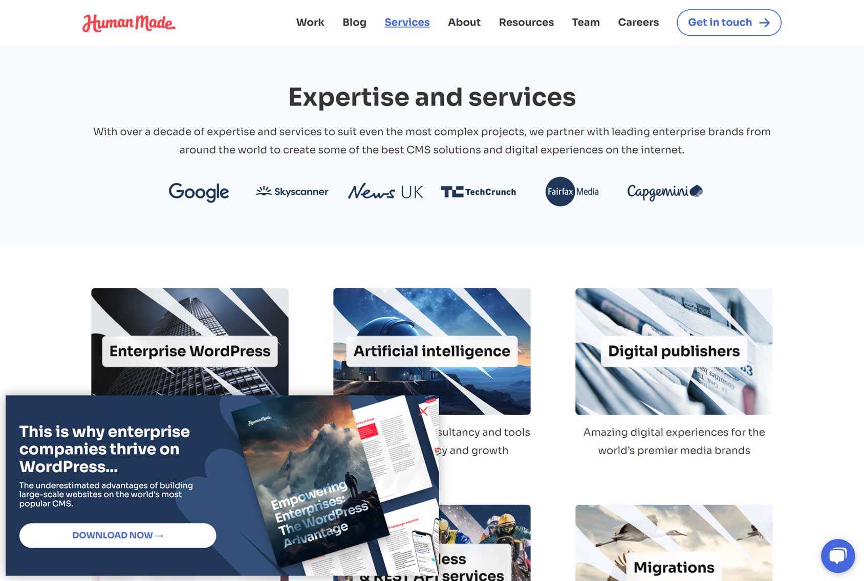
Human Made is another company that’s chosen the less obtrusive corner popup design.
However, to ensure it catches the visitor’s attention, it uses a slide-in and bounce animation effect. The popup design also contrasts with the rest of the page, making it stand out.
The offer presented in the popup — a free guide — is well-positioned to move visitors closer to becoming clients.
Villeroy Boch
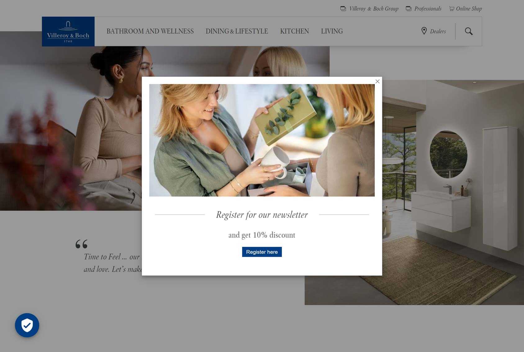
Villeroy Boch wants visitors to provide more than just an email address when signing up for their newsletter.
However, instead of asking for all of the required information in the popup — something that might put people off — they’ve placed the sign-up form on a separate registration page that visitors reach by clicking the button in the popup.
Taking this approach is a good way to increase sign-ups. Firstly, the visitor doesn’t see all the steps required to unlock the offer right away.
Secondly, once they reach the offer page, they’re presented with more content focused on encouraging them to sign up.
Finally, as the visitor has already positively engaged with the button in the popup, they’re more likely to engage positively with further requests, in accordance with the foot-in-the-door technique or sunk cost fallacy.
Frank Green
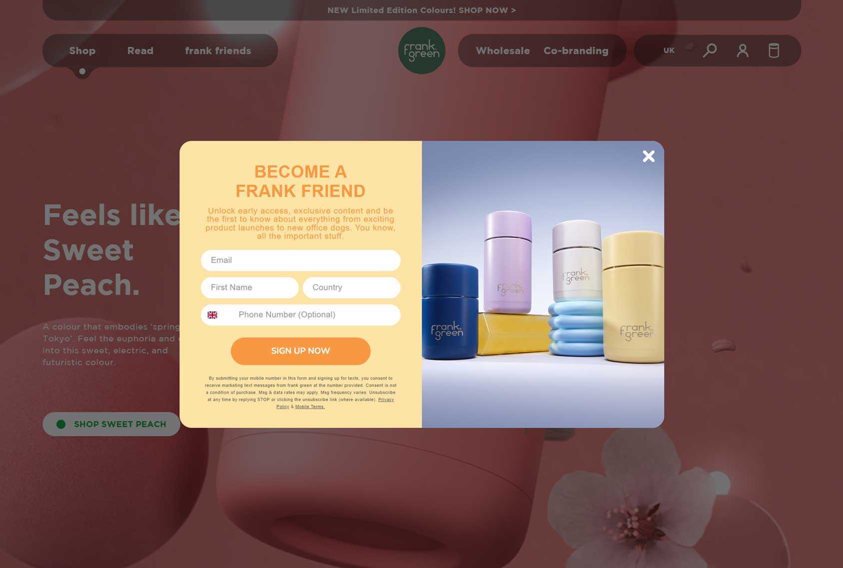
The Frank Green popup design contrasts nicely with the page design, ensuring visitors can’t miss it.
Including terms and conditions on the popup is a controversial decision. On one hand, it adds a lot of copy to the popup that might be distracting or off-putting. However, on the other hand, it should reassure visitors that their information won’t be misused.
Like Frank Green, you can add stylish product photos to your popups to remind visitors why they came to your site and hopefully encourage them to take the desired action.
Casetify
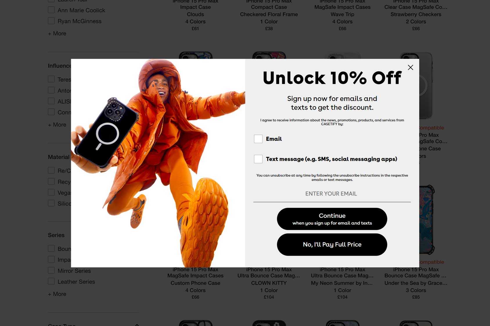
Giving your visitors multiple ways to sign up, such as via email or mobile, allows you to cater to a wider audience.
Like Casetify, you can also experiment with using button text that makes visitors think twice about saying no. Rather than simply giving them a button to reject the offer, try spelling out the consequences of saying no, such as having to pay full price.
Muji
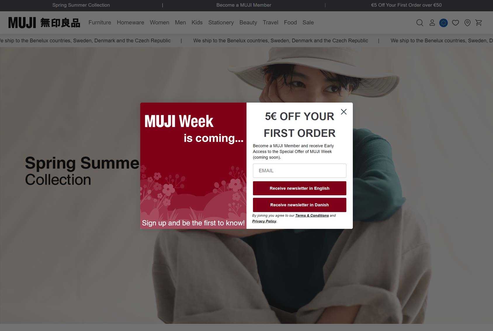
Muji keeps things simple by offering a fixed amount off of new customers’ first orders and only asking for an email address in return.
An offer like this is very hard to refuse as most shoppers will appreciate money off their order. Only having to enter an email address and hit the button keeps friction to a minimum.
To further increase the chances of generating sign-ups, subscribers also get early access to the special offer of the week, giving them another way to save money when shopping at Muji.
Menkind
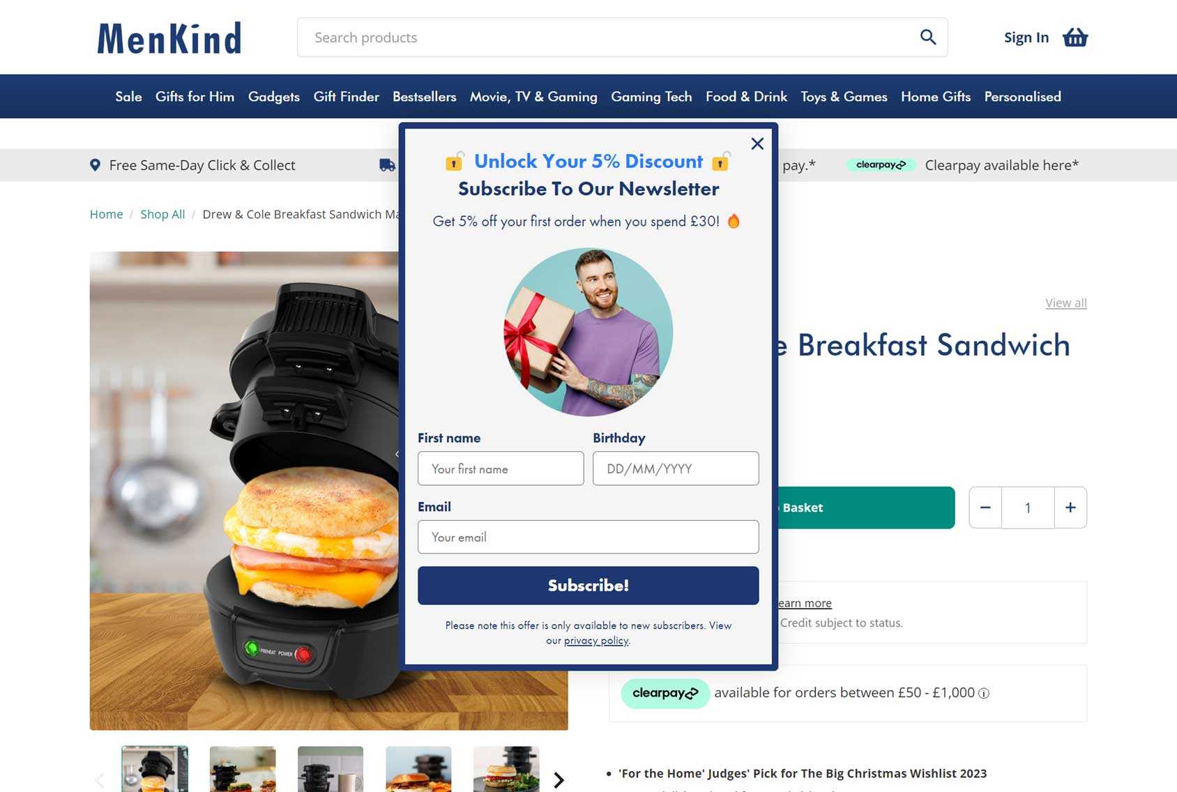
Asking for customers’ date of birth when they sign up lets you send them birthday offers that can generate sales. Wishing them a happy birth also gives you an excuse to contact them.
Including extra fields on a sign-up form, such as the date of birth field, is risky as longer forms tend to convert worse than short ones. However, if your offer is generous enough or it’s not time-consuming to provide the additional information, and getting that information is valuable to you, it could still be worthwhile.
Like Menkind, you can also make all fields, apart from the essential email address field optional so that visitors can still quickly sign up with the least amount of effort.
Summary
These popup examples should have given you some good ideas for your own sites and stores.
If you choose the right tool, you should get access to a library of well-designed popup templates that make adding these elements to your site very straightforward.
As mentioned, to get the most out of popups, look for a tool with features built for your platform rather than a generic option or one built for a different type of site.
If you’re using WordPress and WooCommerce, our CommerceGurus Popups plugin has some powerful WooCommerce-focused features that let you optimize your popups for a range of scenarios, using cart values, customer status, and activity levels as triggers and display rules.
For more information on creating successful popups, check out our complete guide to eCommerce popups.


