A badly designed eCommerce checkout page could be costing your online store valuable sales and profits.
One sign that you might have a badly designed checkout page is your metrics reporting that shoppers are reaching the checkout only to leave without making a purchase.
While there are many reasons why someone might abandon their cart at the checkout page, poor design is definitely one of them.
As design covers much more than just aesthetics, including user experience, trustworthiness and credibility, ease of use, load times, and accessibility, there’s a lot that can go wrong with the design of your checkout page.
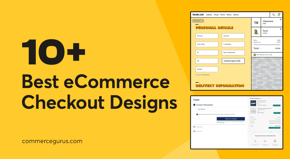
If you’re worried that this part of your store is letting down your business, this guide covering the 10 best eCommerce checkout page designs to learn from will help you determine if your checkout page could be improved, and if so, in what ways.
Lessons From the Best Checkout Page Designs
While the examples of good eCommerce checkout page designs in this article are all different, they do share some common traits.
Thanks to this, you can quickly see how they compare to the checkout page design at your store, and what you can do to make improvements.
Some of the common traits of good eCommerce checkout page designs include:
- Quick and Painless Experience: Keep form fields to a minimum by not asking for unnecessary information. The best eCommerce checkouts tend to use a single-page design. Although Shopify shows that the multi-page approach can still work if pages are kept to a minimum.
- Enable Guest Checkouts: Making shoppers create an account before proceeding is sure to deter some customers (24% according to one study). Instead, allow guest checkouts and then give customers the chance to register after they’ve completed their purchase.
- Keep Shoppers Updated: Use progress bars and other visual indicators to let users know how far they’ve come and how long there’s left to go.
- Minimize Distractions: Good checkout page designs are often very minimal compared to the rest of the store. Hiding links to other parts of your store can prevent shoppers from clicking away from the checkout and abandoning their cart.
- Provide Support: Displaying your contact details, such as a phone number or live chat link on the checkout page gives shoppers an easy way to get help if they get stuck.
- Add Trust Seals and Badges: Displaying logos related to payment processors, guarantees, and other provisions you have in place can reassure shoppers.
- Display Product Images: Including images of the products in the cart on the checkout page can remind shoppers why they’re about to pay you and overcome any second thoughts they might have about making the purchase.
- Make Cart Editing Easy: It might be tempting to not include a link back to the cart on the checkout page as shoppers could use it to remove some items when they see the total price. However, if a customer has to find their own way back to the cart, there’s a chance they won’t check out and the sale will be lost. Letting customers quickly reach the cart directly from the checkout page might mean they remove a few items, but you’re more likely to get the sale.
You’ll see examples of the above characteristics in the collection of eCommerce checkout page designs featured below.
10 Best eCommerce Checkout Page Designs
Here are 10 of the best eCommerce checkout page designs to help you improve this part of your store:
Amazon
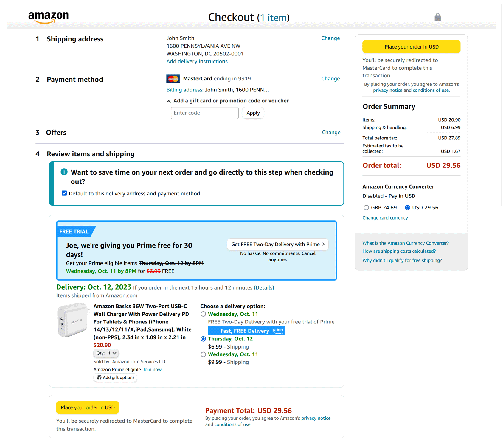
Who better to learn from than the most successful eCommerce retailer of all time, Amazon.com?
To help deliver an efficient checkout experience, Amazon uses a one-page layout — an approach that’s popular among the best eCommerce checkout page designs.
Removing unnecessary form fields and keeping the checkout process to just four steps is sure to increase conversions by reducing the chances of shoppers getting bored and exiting before placing their orders.
Giving shoppers the ability to skip some of the steps on their next order is sure to help increase conversions for return visitors.
As Amazon lets you save multiple shipping addresses and payment methods, the checkout page is a little more cluttered than some of the other examples here.
The Prime upsell and the ability to choose from a selection of delivery dates add a few more things for shoppers to think about, too.
However, it’s safe to say that Amazon tests its page for maximum conversions and won’t include anything that hurts its bottom line.
Interestingly, there are two buttons for completing the order on the page. One is positioned in the top right corner above the fold and is provided for those who are ready to buy using their default shipping address and payment method.
For those who want to view all of their options and maybe change some of those variables, there’s another “buy now” button at the end of the page.
Thanks to this, wherever the shopper is on the page, there’s a way to complete their order.
Away
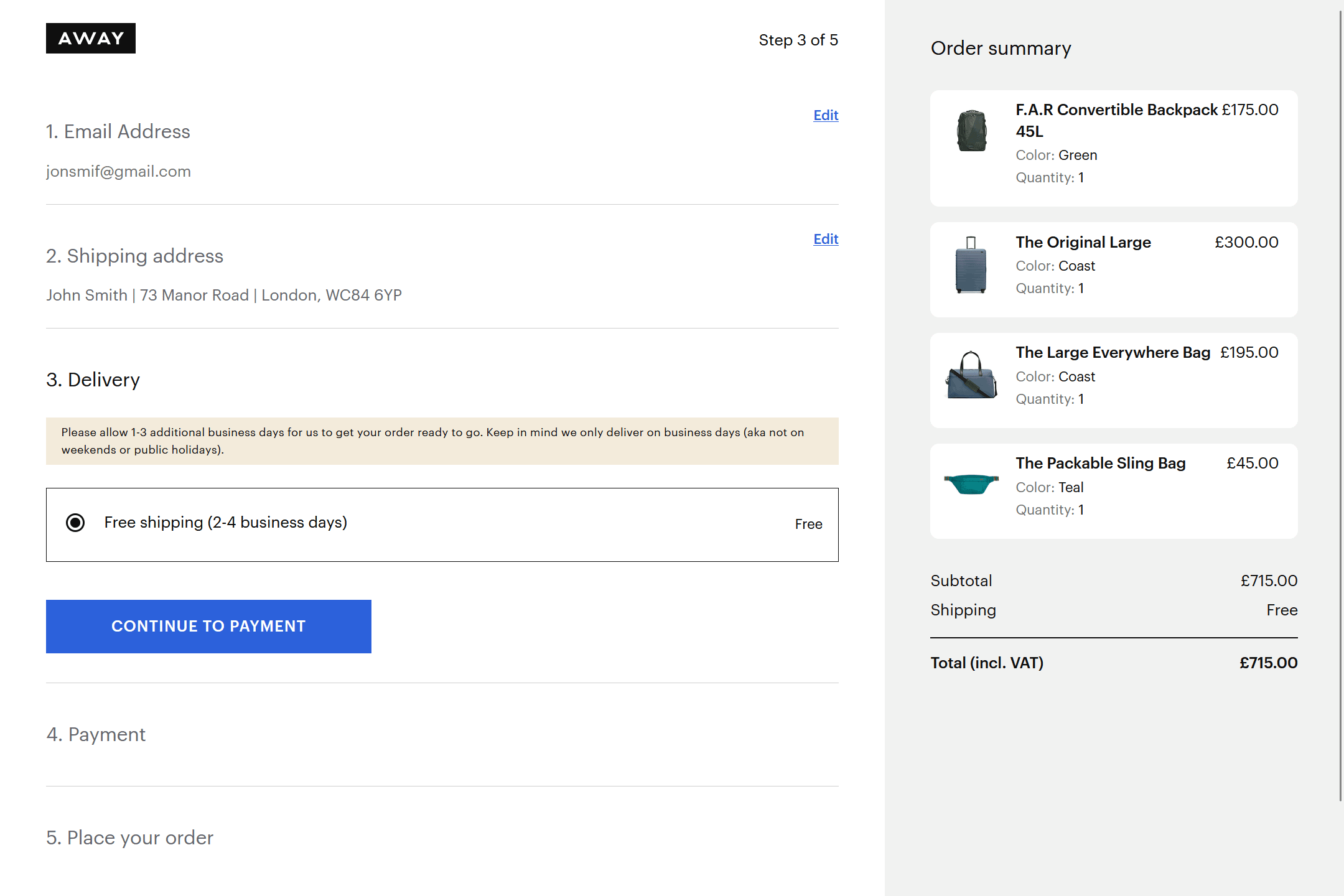
With a small logo being the only way to navigate out of the checkout experience, Away has done a good job of removing as many exits or leaks as possible.
The only potential downside of this checkout page is that there’s no link to go back to the cart or edit the cart contents. Due to this, if a shopper wants to change what’s in their cart, they’ll have to go back to the store homepage and then navigate to the cart. As they’re not taken directly to their cart, there’s a chance they might get distracted along the way and fail to return and complete their order.
Once on the checkout page, there are a few more steps than most other stores — five rather than three or four. However, Away still manages to deliver what is effectively a one-page checkout experience by using an accordion-style layout to fit everything on a single page.
Displaying images of all the products in the cart is a nice way to remind shoppers of what they’re purchasing. This can be especially effective with higher-priced items where a high total might cause shoppers to have second thoughts. Being able to see the products will remind shoppers why they added the item in the first place.
The minimal design ensures everything loads as quickly as possible, reducing the risk of a slow-loading checkout leading to abandonments.
Brooks
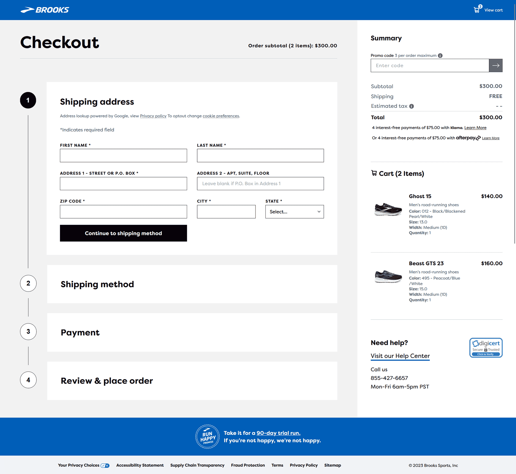
Brooks is an excellent example of a store that delivers a one-page checkout experience.
The four steps of the checkout process are included on the same page. But to prevent overwhelm, only the form fields for the current step are displayed. However, the headers for each section are always on display, providing a progress update.
Thanks to this, shoppers can easily see how far they’ve come in the checkout process without getting overwhelmed by everything that they have to do.
Shoppers in a hurry can checkout as a guest. However, they still get the option of creating an account during the checkout process. By providing this option, shoppers are more likely to sign up and become members, even if they initially opt for a guest checkout. This then gives Brooks a way to contact them in the future with marketing content while also facilitating faster checkouts as the customer details are already saved.
Casper
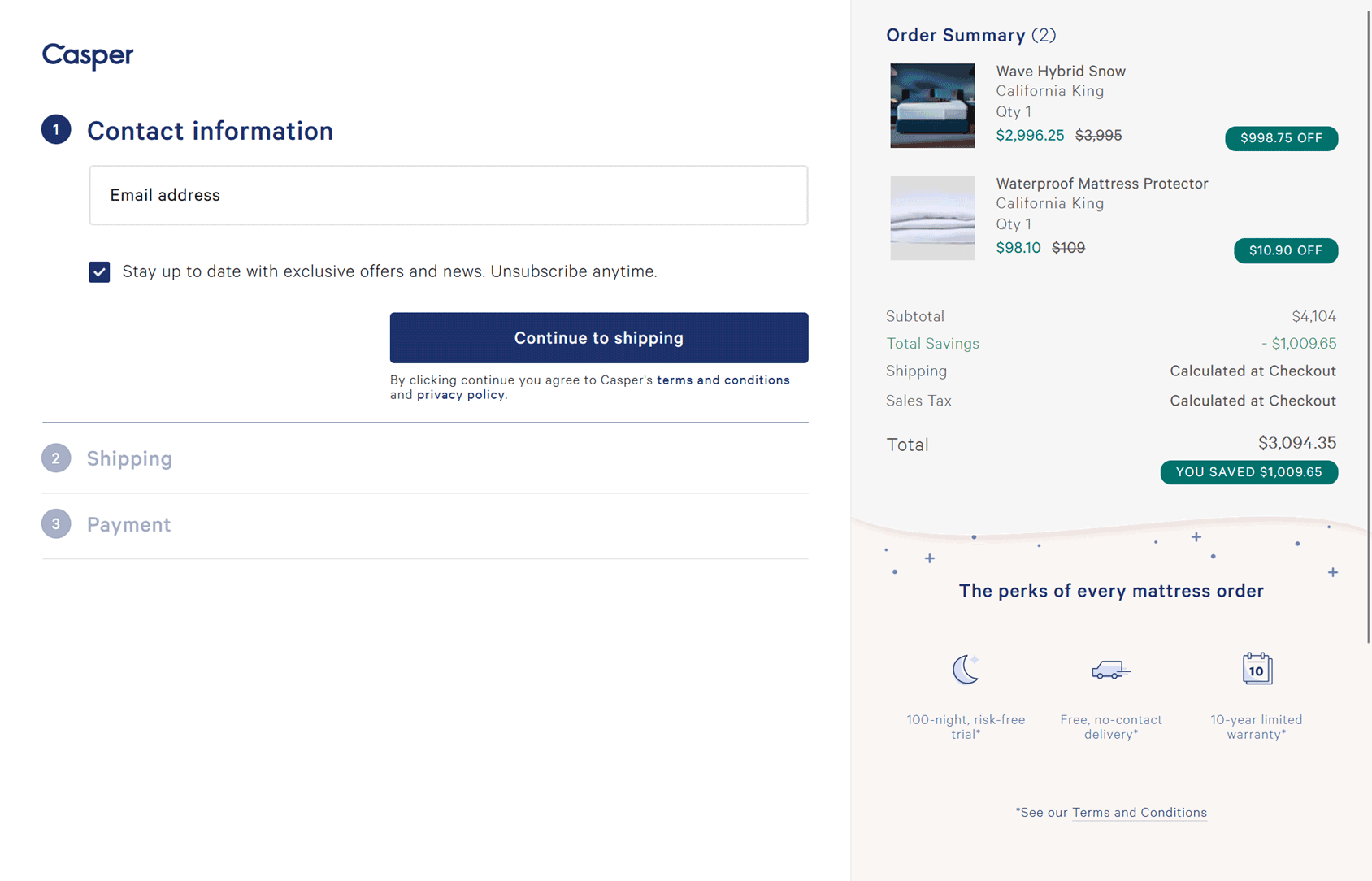
Casper manages to keep everything on one page to deliver a streamlined checkout experience.
Highlighting the benefits of buying a mattress from Casper just underneath the order total does an excellent job of reassuring shoppers that they’re making the right decision.
While there’s no link to quickly return to the cart, the support phone number is displayed in the footer for any shoppers who need help completing their order.
If there are benefits to shopping from your store, such as free delivery or a money-back guarantee, then displaying that on the checkout page is an effective way of reassuring hesitant shoppers.
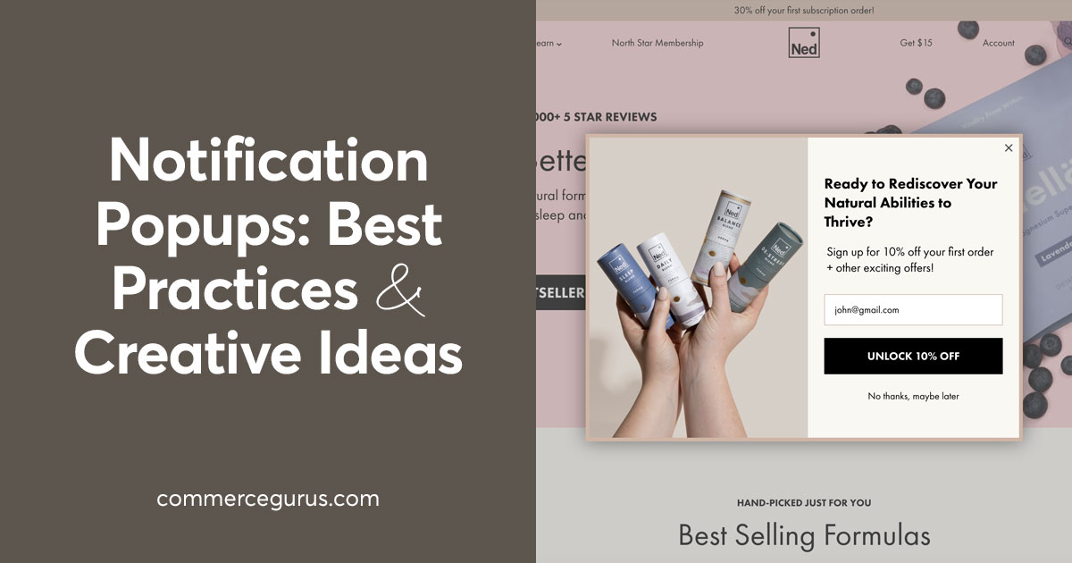
Ned
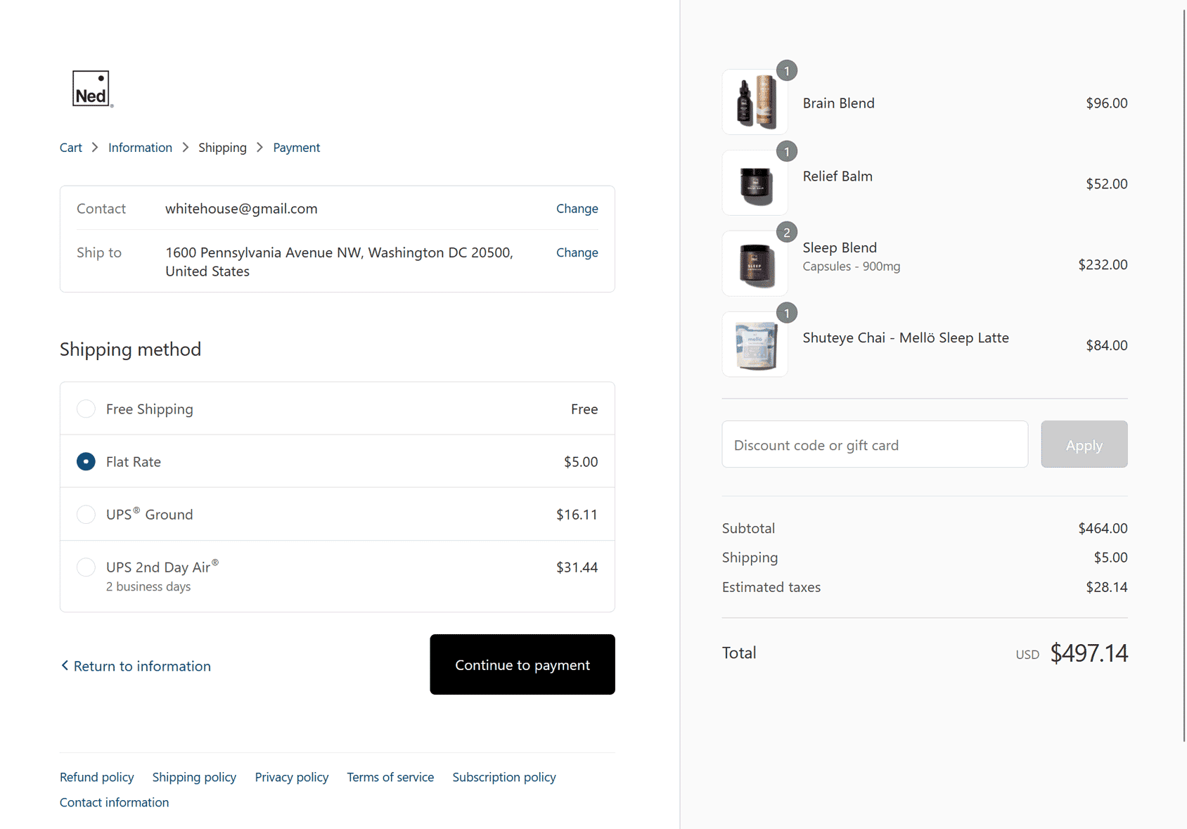
Unlike most of the examples here, the Ned checkout experience spans three pages rather than being a single-page design.
However, as three pages are typical for stores powered by Shopify, it’s probably not something to be too worried about — it’s unlikely Shopify would allow this approach if it had too much of a detrimental effect on conversions.
Although there’s only a small discrete link, in the form of the Ned logo, that takes users back to the store, shoppers can easily navigate between the three pages of the checkout via the breadcrumb links.
One of the main criticisms of multi-page checkouts is that they slow down the user journey. To combat this, Ned has given their pages a very minimal design to ensure they load quickly.
Nike
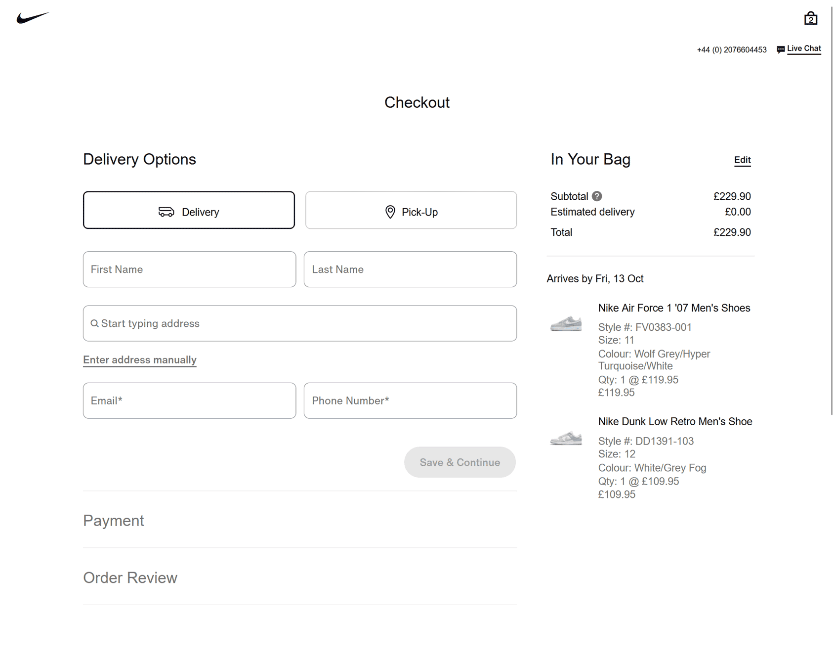
The entire Nike store has a minimal design but the checkout page takes that a step further by removing as many distractions as possible.
To speed things up, there are only three steps to the checkout — all of which are displayed on the same page. Once the shopper has entered their delivery or pickup location and payment method, they can review and place their order in the final step.
Although the main store navigation menu is removed from the checkout page, there is a discrete Nike logo that takes shoppers back to the store home page. Another equally discrete link takes shoppers back to their cart.
If shoppers run into problems or have a query, instead of abandoning the checkout, they can easily get help by using the phone number and live chat link.
The Nike checkout is an excellent example of streamlining the checkout experience so that shoppers can place an order in very few clicks.
Shoptimizer
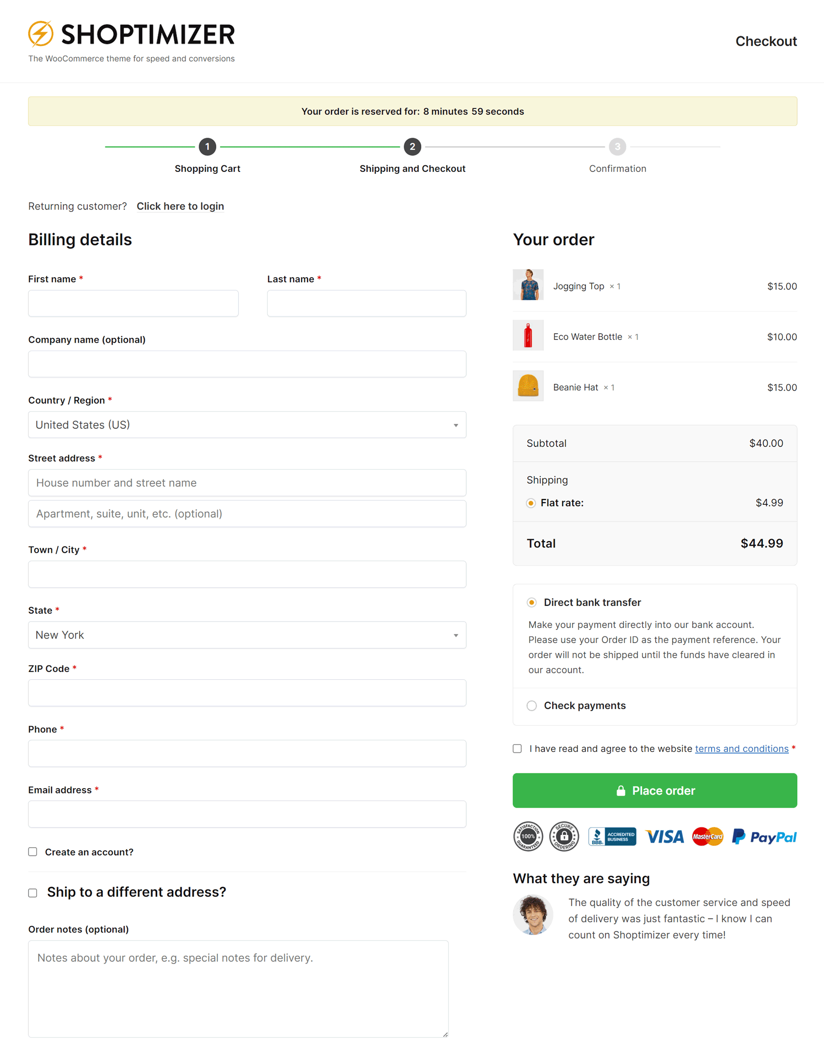
The Shoptimizer theme demo delivers an express checkout experience by displaying everything on a single page.
The progress bar at the top of the page instantly lets shoppers know where they are in the checkout process, while required form fields are kept to a minimum to reduce the likelihood of abandoned carts. To create a sense of urgency, a countdown timer shows how long the order is reserved for.
Trust seals and payment icons, including Visa, MasterCard, and PayPal are displayed to build credibility and boost conversions. Including customer testimonials on the checkout page is another great idea that can reassure shoppers who might be having second thoughts.
Guests can check out very quickly, with the option of checking a box to create an account as they check out.
You can discover more about the Shoptimizer WooCommerce theme here.
Studio Job
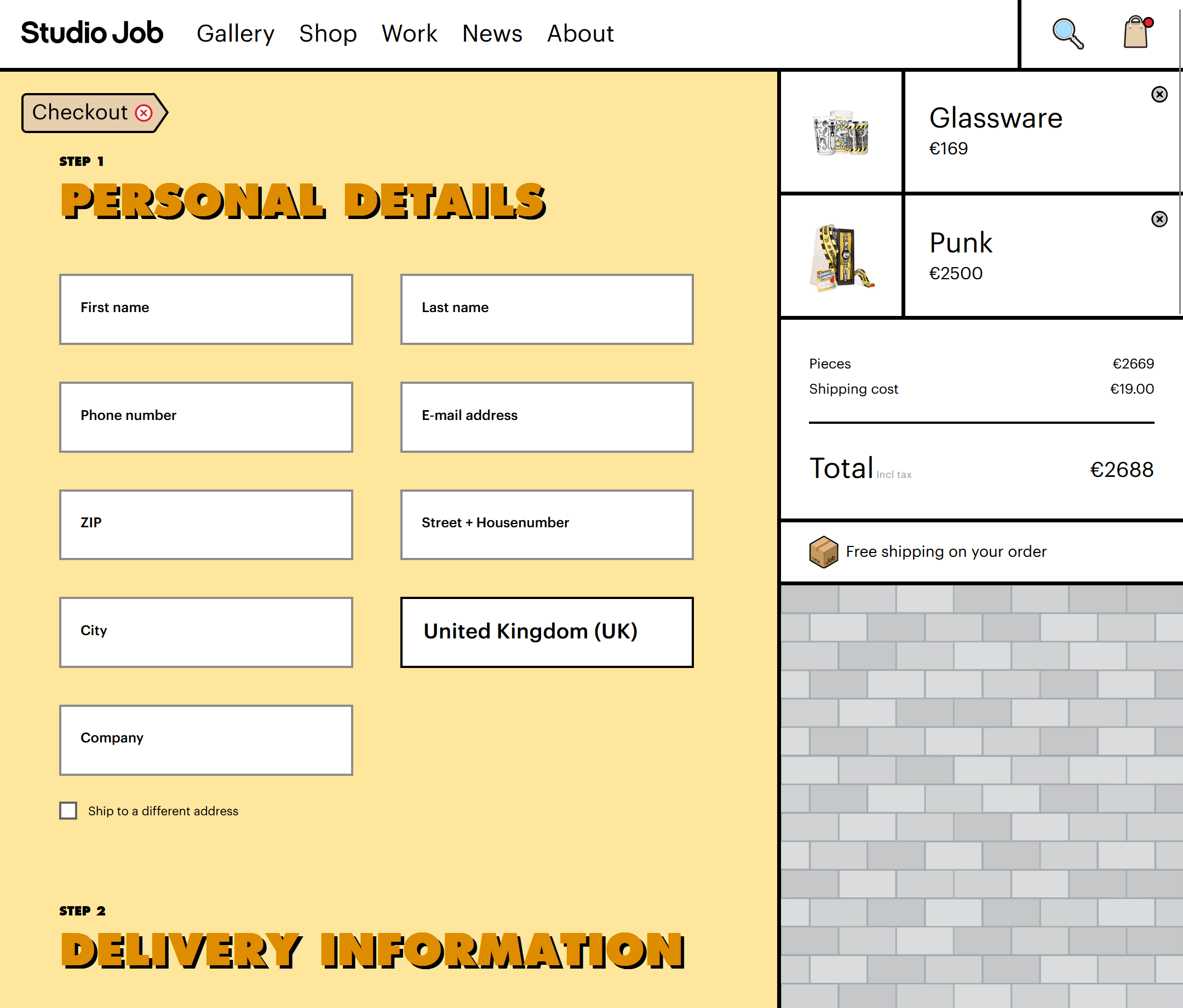
The unique and eye-catching design of the Studio Job store extends all the way through to the checkout page to deliver a consistent user experience.
Despite the quirky design of the store, the two-step checkout page is very easy to navigate. Once you’ve entered your name and address on the first page of the checkout, you can then enter your payment details on the next.
The only slightly controversial design choice of the Studio Job checkout experience is the fact that the main store navigation menu is displayed on the first page. This could potentially see shoppers leaving before they’ve placed their order. However, the second page, where payment details are entered, removes distractions by not including any navigation elements.
Trainline
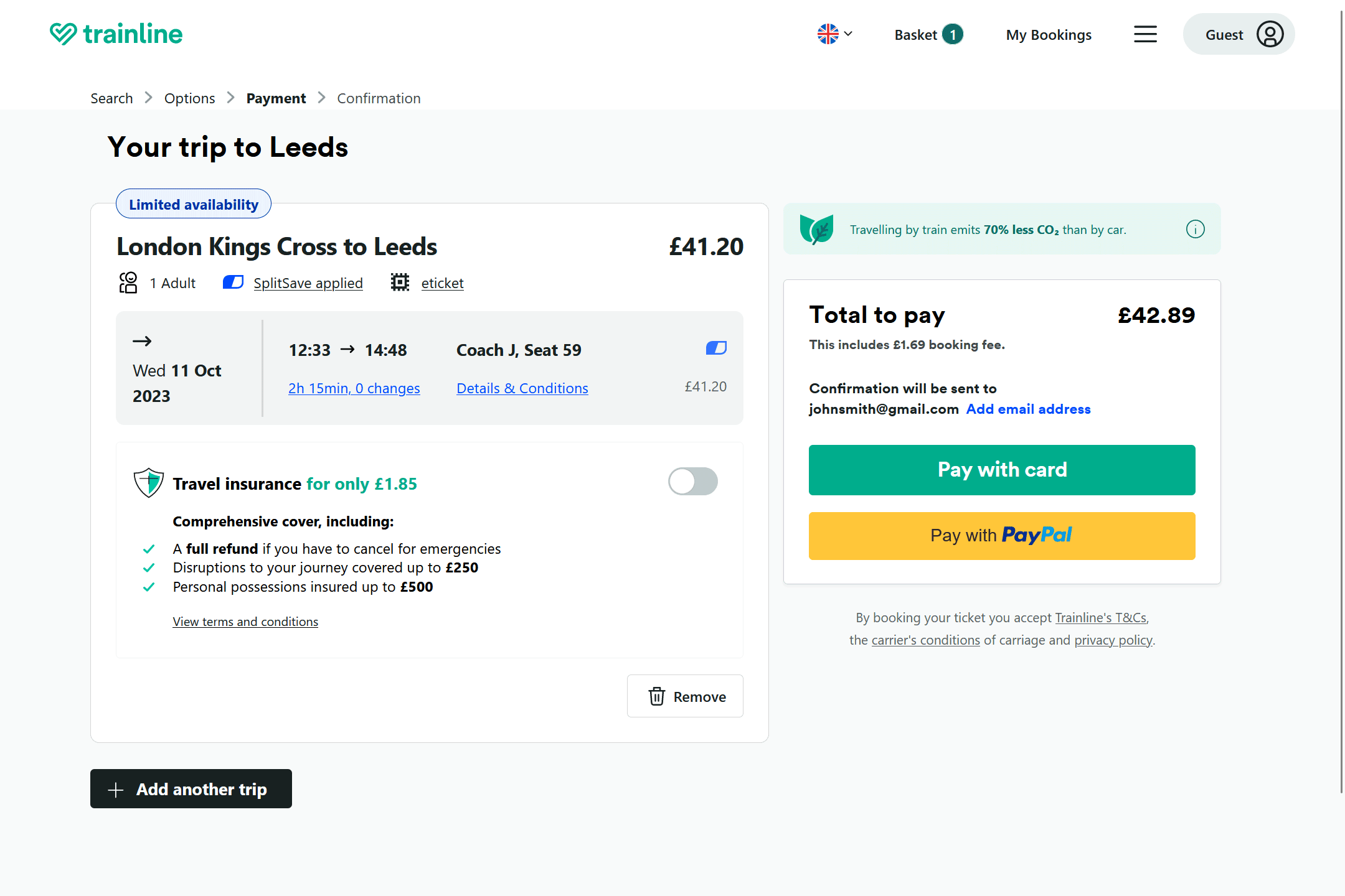
Once you’ve added a train ticket to your cart, this checkout page couldn’t be easier to navigate.
Simply click the Pay with Card or Pay with PayPal button and then enter your payment details in the panel that’s revealed on the same page, and you’ve made your purchase.
To make you feel better about your purchase, Trainline displays why traveling by train is better for the environment than driving or flying. Using a similar tactic for your products could help increase checkout page conversions at your store.
There are a few more buttons and links than you usually see on the best eCommerce checkout designs. However, the minimal style and layout ensure that the page never looks overcrowded or confusing.
Tyler’s
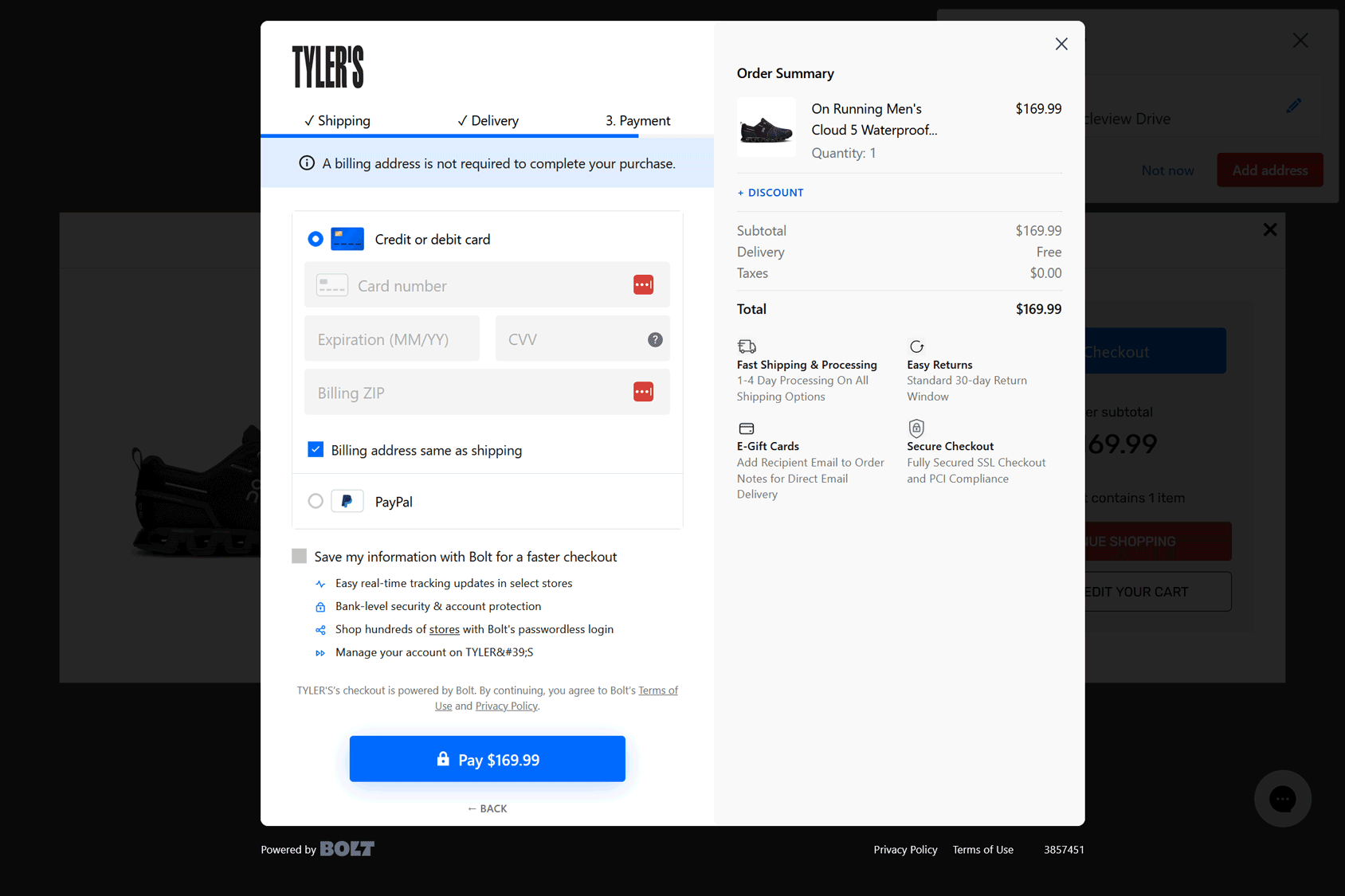
Tlyer’s opts for a three-step checkout delivered via a popup window. The limited number of steps enables a quick and painless checkout experience that’s sure to have a positive effect on conversions.
As the popup window obscures the store’s navigation system, Tyler’s is unlikely to lose shoppers who are prone to abandoning their cart due to visiting other parts of the store mid-checkout.
The progress bar that’s displayed underneath the steps, combined with the check mark icons next to each completed step does a good job of letting shoppers know how close they are to finishing their order.
Summary
As we’ve just seen, the best eCommerce checkout page designs come in all shapes and sizes. However, they do all share some common characteristics.
To summarize, you could be able to improve your eCommerce checkout page by doing the following:
- Remove distractions, such as links and unnecessary design elements.
- Include a link back to the shopping cart.
- Display ways shoppers can make contact and get help.
- Keep form fields to a minimum and reduce the number of checkout pages.
- Display trust badges, security seals, and credit card logos.
- Include a progress bar, even if it’s a one-page checkout
- Display images of products being purchased to keep shoppers excited about their orders.
- Hide the coupons field if you don’t offer coupons.
- Enable guest checkout and give shoppers the chance to create an account during or after checkout
- Publish testimonials on the checkout page.
If the checkout page of your store is in need of a major revamp, consider installing our Shoptimizer theme.


 WooCommerce Memberships review – reward frequent buyers
 The Ultimate Guide to eCommerce Accessibility
 Rescue orders from oblivion with Abandoned Cart Pro
 Best WooCommerce Warehouse Management Systems