If you’re not using popups on your eCommerce store or you’re not getting the results from your existing popups, this article is for you.
After checking out these examples of high-converting eCommerce popups, you’ll either have plenty of inspiration for implementing this powerful marketing tactic at your store or you’ll gain a better understanding of how your popups could be improved.
Popups are definitely an essential tool for eCommerce store owners, but it’s not as simple as enabling a generic popup and then sitting back and reaping the rewards.
As we’re about to see, there are many ways to implement popups to get the results you want, and choosing the right type can make or break your campaign.
So if your popups aren’t as effective as you’d like, or you’re yet to start using this powerful marketing technique, this collection of high-converting examples of eCommerce popups will get you up and running.
Why Use eCommerce Popups?
Before we get to the examples of effective eCommerce popups, you might be wondering why you’d want to add this type of feature to your store.
Well, the main reason is to display content to your visitors that you don’t want them to miss.
The type of content you add to your popups can come in many forms. This includes new product announcements, promotion details, recommended and related products, or a request for the visitor to join your marketing list.
While the content of the popup can vary, the goal is usually the same: to persuade the visitor to give you permission to market to them directly, usually via email, or to encourage them to make a purchase during their visit.
The most popular way to persuade a visitor to join your marketing list is to offer them a reward in exchange for their email address. Options for rewards range from getting advanced notifications of new products to discounts on purchases. However, if your brand is strong enough, you might not even have to offer an incentive as visitors will be happy to sign up when asked. For most stores, though, some kind of incentive will be needed.
It’s true that popups can be a little annoying. But the best popup tools give you lots of control over how your popups are displayed and what content they contain. Due to this, you can configure them to strike the right balance between effectiveness and obtrusiveness to get great results without frustrating your visitors.
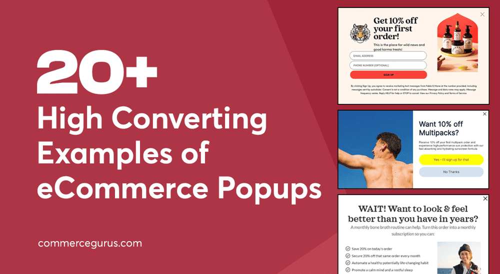
High-Converting Examples of eCommerce Popups
Here are 24 examples of high-converting eCommerce popups to provide you with inspiration for adding this effective marketing technique to your store.
Anthropologie
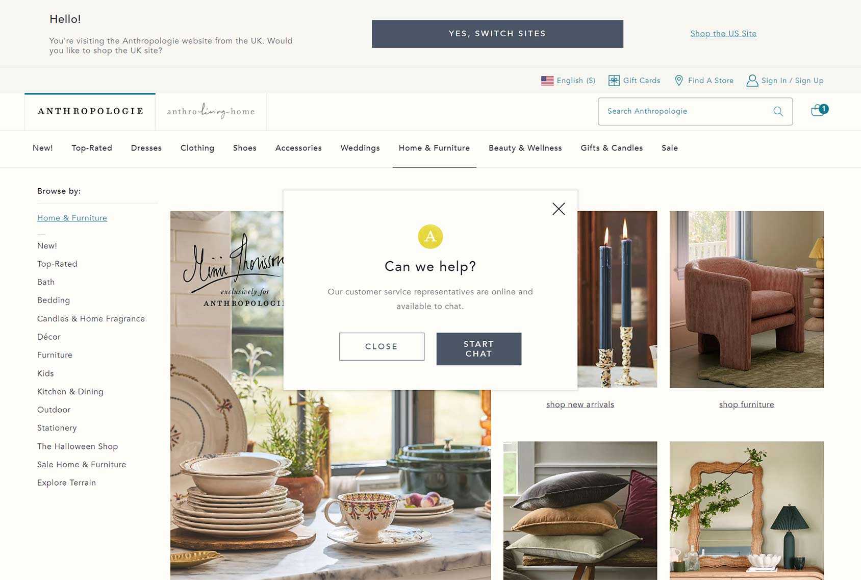
As the best popup tools give you lots of control over when your popups are triggered, you could follow the approach of Anthropologie and launch a popup that displays an offer of help if a visitor has been at your store for a while and hasn’t performed certain actions, such as adding an item to their cart.
If they accept your offer, you can then help them find the type of products they’re looking for and hopefully turn a confused visitor into a happy customer.
CariFree
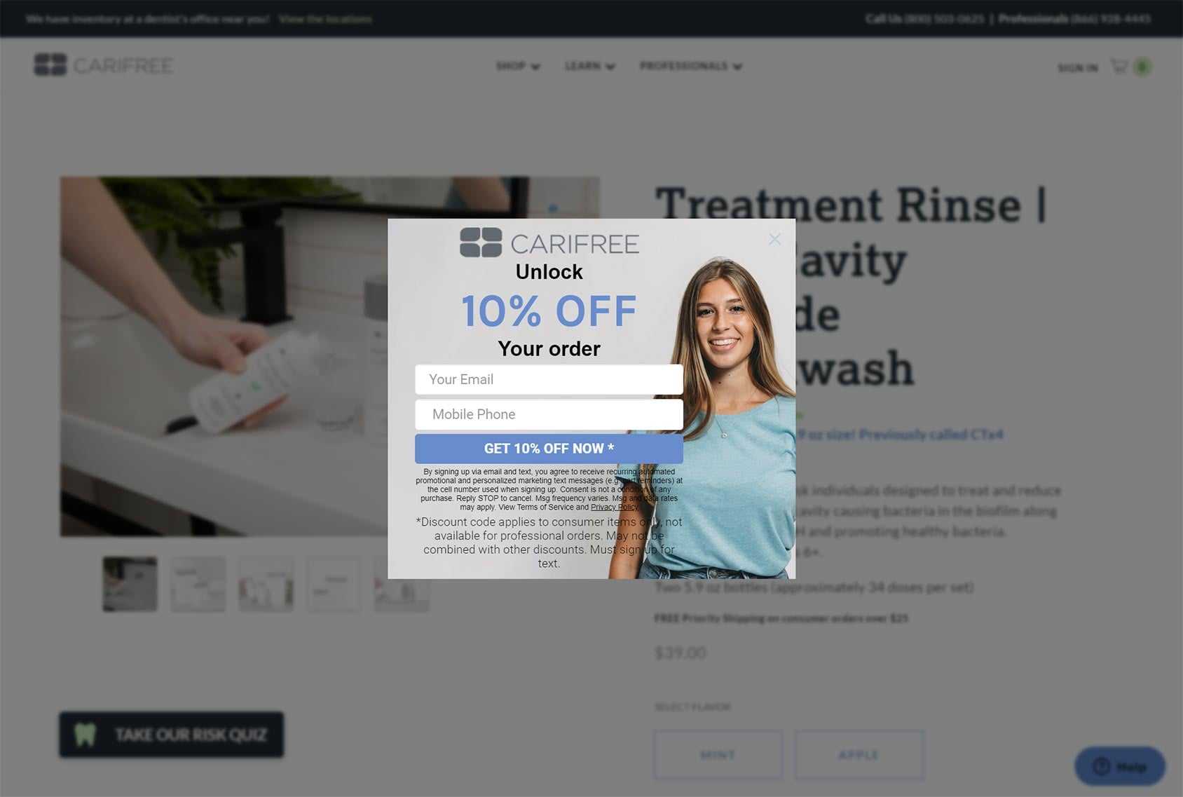
Blurring everything in the browser window apart from the popup makes it impossible to miss the invitation to join the CariFree marketing list.
The popup design is an excellent example of how to use the right image to make the offer more appealing, which in this case is a photo of a healthy-looking person with good teeth on a site selling dental products.
Giving visitors the option of signing up for either email or SMS marketing combined with a 10% discount should increase optin rates.
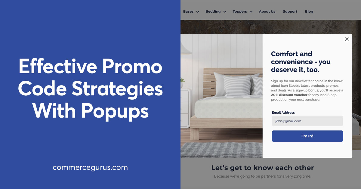
Eight Sleep
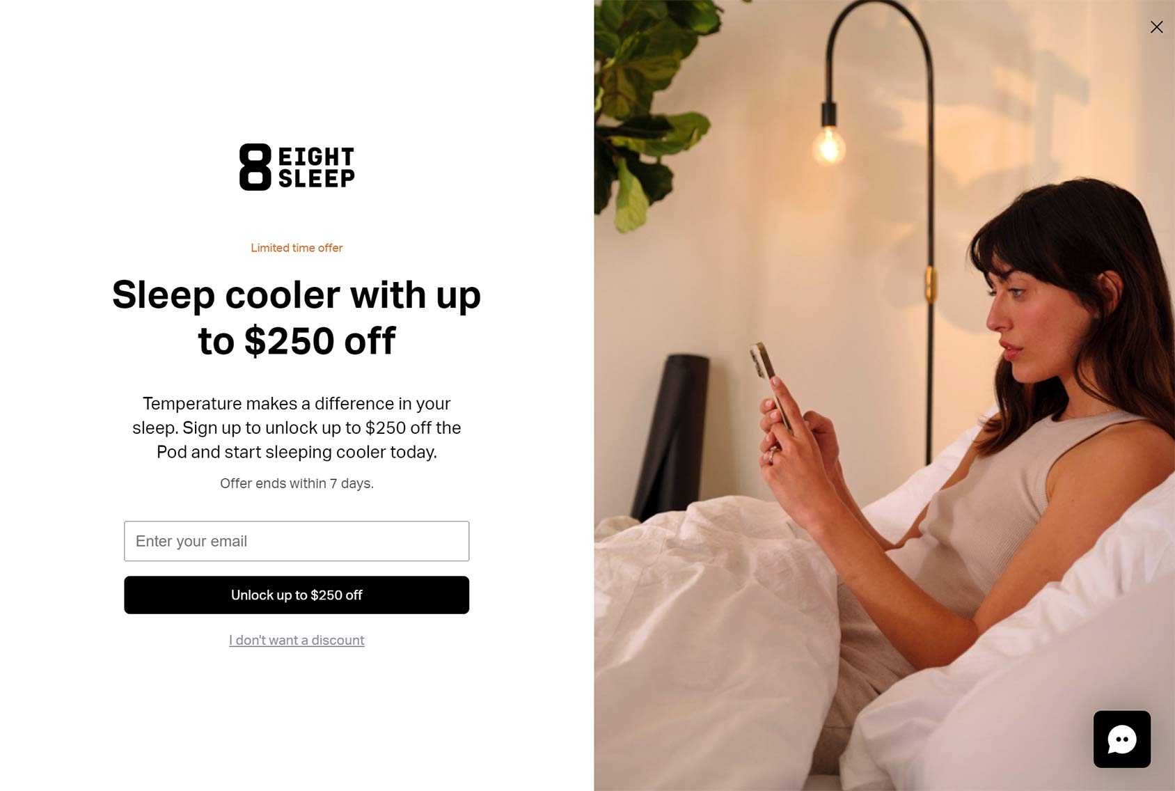
If you’re selling higher-priced items, the relatively aggressive approach to collecting emails from Eight Sleep might be something you want to emulate.
Not only does Eight Sleep offer a generous discount to anyone who joins their email list, but they’ve gone for a full-screen popup — sometimes referred to as a welcome mat — rather than a small popup window. Also, the popup is displayed as soon as visitors arrive at the site, rather than waiting for them first to have a look around.
As high-priced products — such as those sold by Eight Sleep — tend to require longer sales cycles than lower-priced items that are often bought impulsively, it makes sense that they’ve made such an effort to connect with potential customers. Doing so gives them the ability to educate leads about the benefits of their products and explain why they should make the investment.
So if you’re selling higher-priced items, it might be worth emulating the Eight Sleep approach and focussing on collecting emails rather than hoping visitors to your store that haven’t been through your sales funnel will spontaneously make a purchase.
Fable & Mane
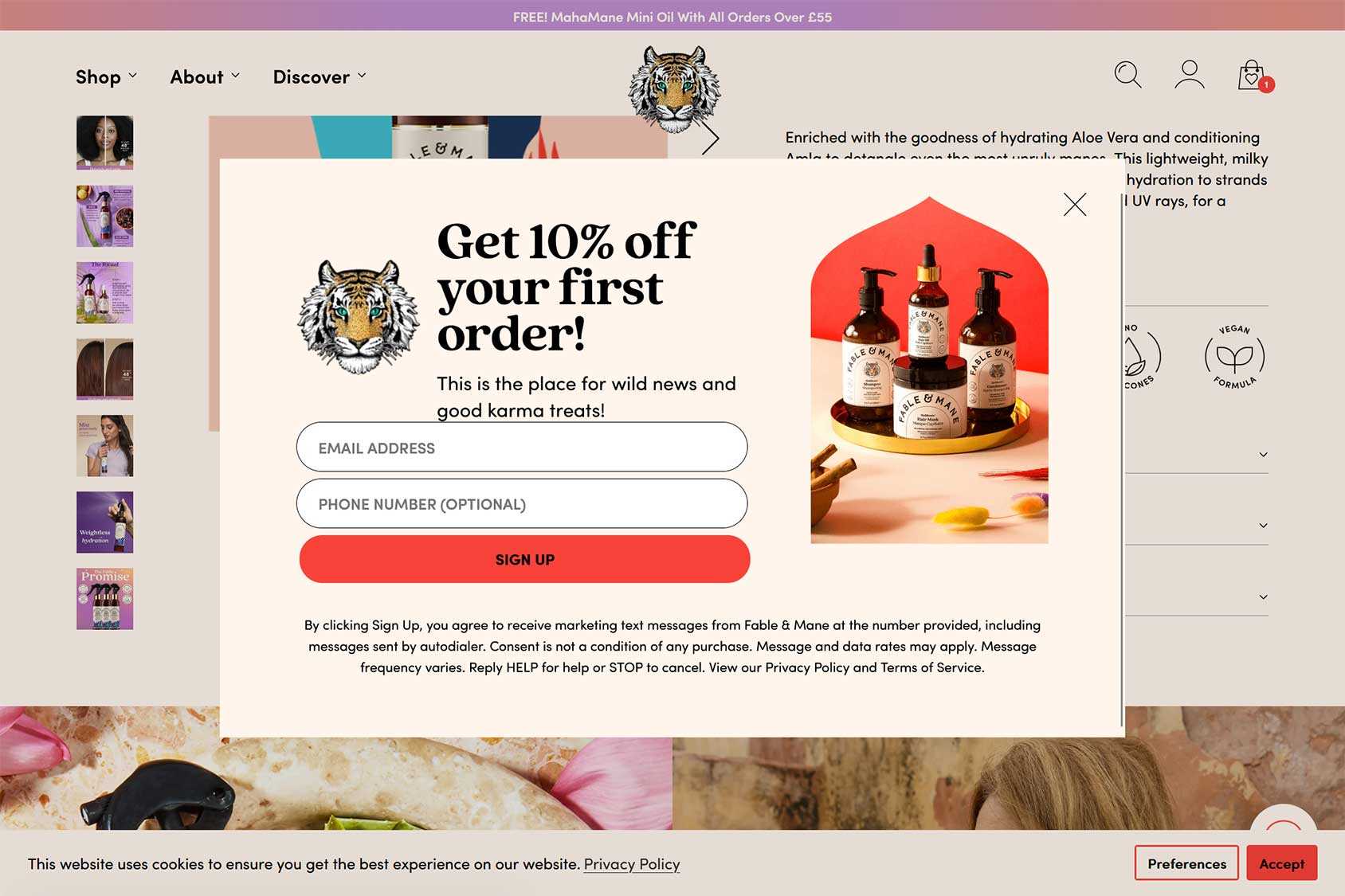
As shorter forms often have higher conversion rates than longer ones, it’s good to see that Fable & Mane only have one required field.
Visitors do have the option of also entering their phone number to access the 10% discount, but for those in a hurry, simply entering their email address will suffice.
If you want to make it as easy as possible for visitors to subscribe via your popups, try the one-required field approach of Fable & Mane.
Furniture Maxi
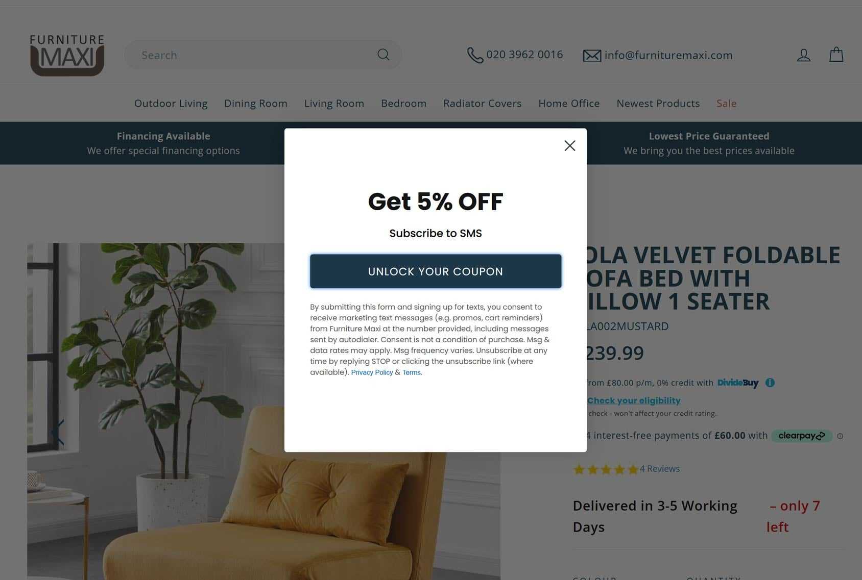
Furniture Maxi uses a two-step optin form in their popup to collect leads.
This approach is popular as, according to the theory behind it, asking the visitor to perform an action they’re unlikely to refuse, such as unlocking a coupon, makes them more likely to respond positively when later asked to enter their contact details.
Hardgraft
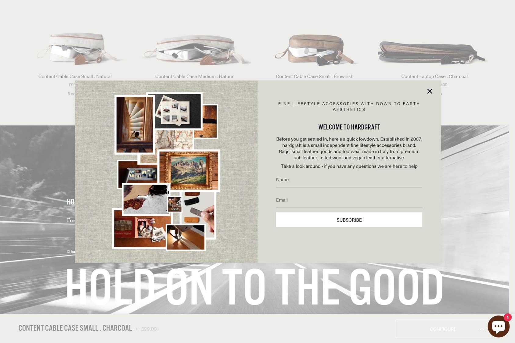
The email popup on the Hardgraft site isn’t triggered until you’ve scrolled to the bottom of a page. Unlike many popups, the design of this one blends in with the rest of the site.
When the popup is displayed, visitors are prompted to enter their name and email address in order to subscribe. There’s no incentive to sign up, such as a discount code. Instead, Hardgraft is relying on their visitors to subscribe out of a genuine desire to keep in touch — or because they didn’t notice the close icon in the top right corner.
If you have a brand that’s strong enough to generate subscribers without a reward, or you’re not that invested in growing your list, this approach could work for you. For everyone else, some kind of incentive is probably a good idea.
High Sierra
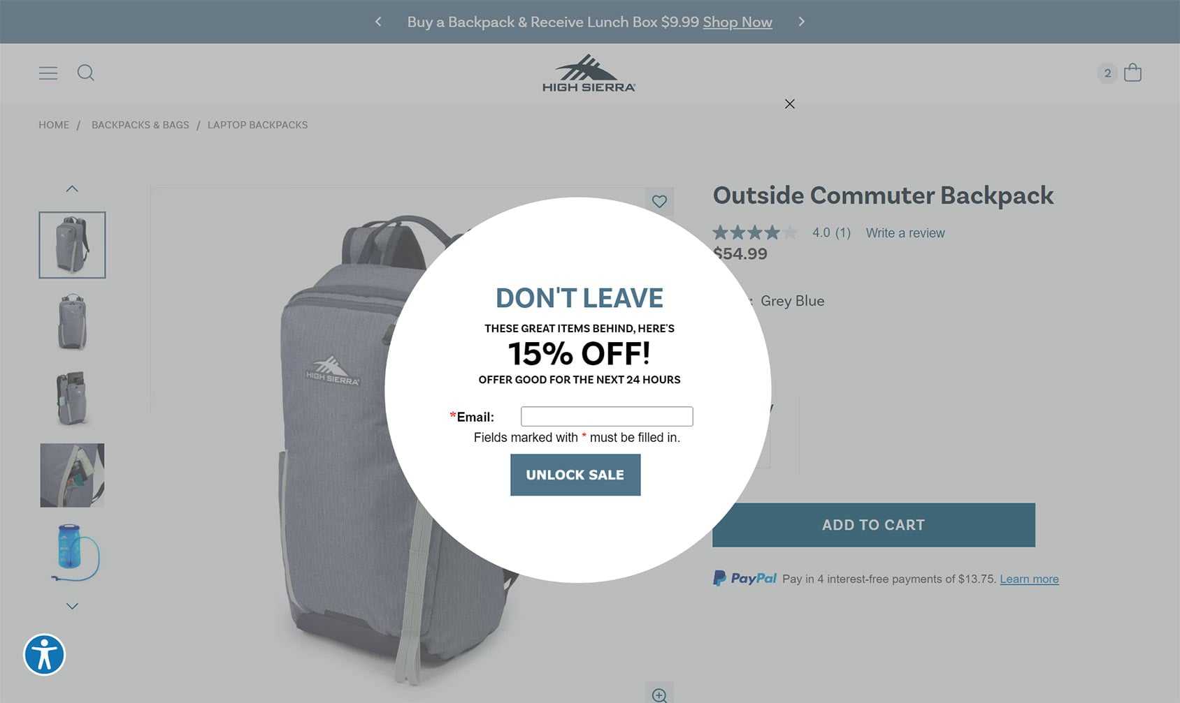
As an eCommerce store owner, you’re probably very familiar with abandoned carts. While there are many services you can use to recover abandoned carts, displaying a popup when a customer has added something to their cart and looks like they’re about to leave your store is a good way to attempt a recovery, especially if you don’t have their contact details so can’t follow up with them later.
If, like High Sierra, you combine the recovery attempt with an invitation to join your email list, you could gain a subscriber and save a lost sale.
Human Food Bar
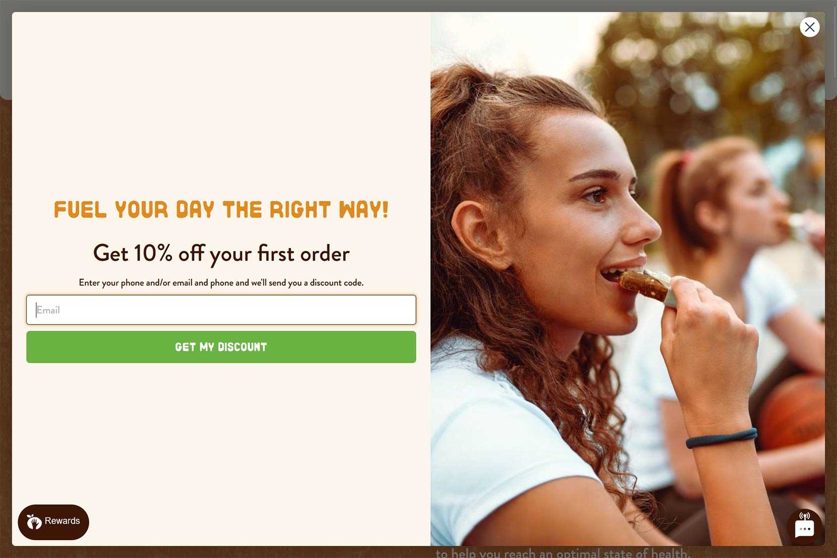
Human Food Bar attempts to land new customers by displaying a full-screen popup and offering them 10% off their first order.
Like Human Food Bar, you might want to consider giving visitors the option of entering their email address or phone number so they can subscribe via their preferred method of communication. Doing so is likely to increase sign-up rates.
Kettle and Fire
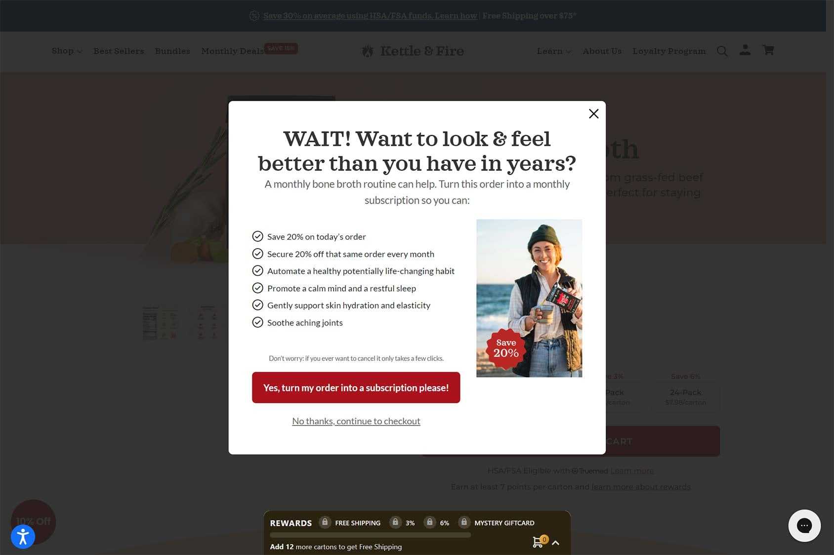
Another way to use popups is to encourage visitors to spend more or sign up for a longer-term commitment.
Here, Kettle and Fire uses a popup to promote their subscription option. The goal is to encourage visitors who’ve added an item to their cart to switch to a recurring purchase, rather than opting for a one-time transaction.
Magic Spoon
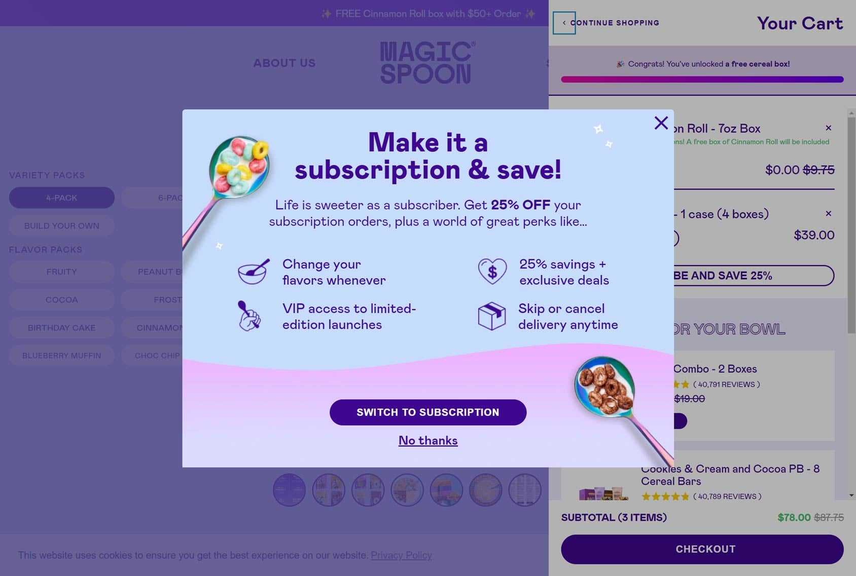
Magic Spoon is another company that uses popups to encourage shoppers to sign up for a subscription rather than making a one-time purchase.
In this example, Magic Spoon quickly outlines the main benefits of their subscription service in a well-designed popup. As the popup is only displayed once a visitor has added something to their cart, they don’t waste any effort trying to upsell visitors who aren’t already showing an intention to buy.
Mila
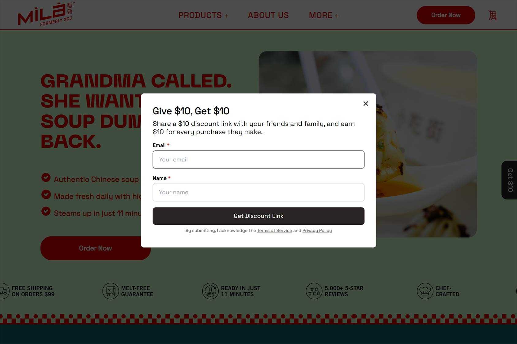
If the idea of using popups to give a discount to people who are already at your store doesn’t appeal, you might like the approach of Mila.
While Mila will give their visitors a discount, they have to earn it by recommending the store to their contacts. Those contacts then have to make a purchase before the discount is unlocked.
With this approach, new people are introduced to your brand and those doing the introducing get rewarded for their efforts, but only once an order has been placed.
MVMT Watches
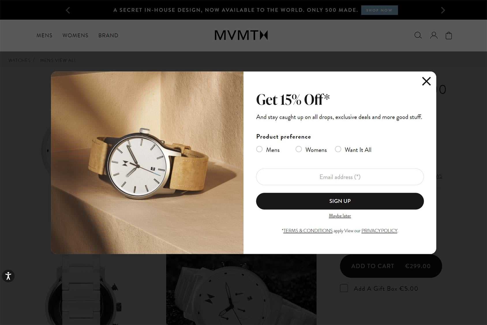
Like MVMT Watches, you can try segmenting your subscribers when they sign up by asking them what type of products they’re interested in.
The main benefit of this is that your marketing efforts will be more targeted and therefore more likely to yield positive results.
My Protein
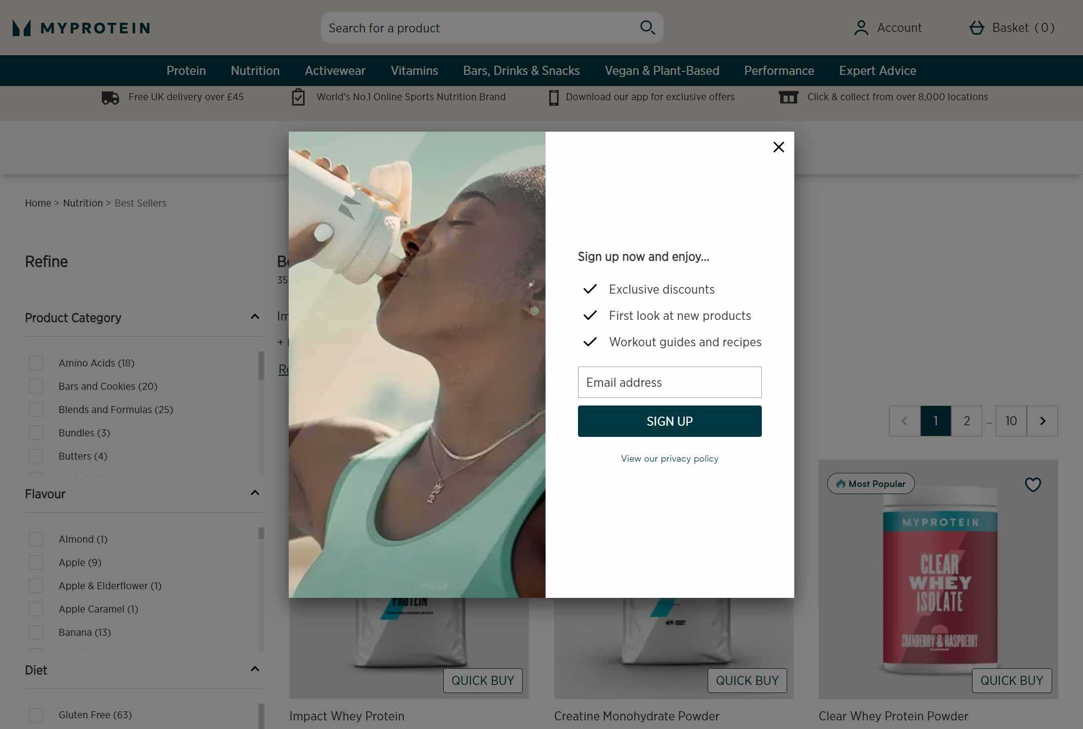
Rather than simply handing out a fixed discount to subscribers, you can follow My Protein and offer a range of rewards, including non-specified discounts via your popups.
If you don’t want your subscription incentive to result in a reduction in profits, offering new product previews and digital assets as rewards is a good alternative.
Native
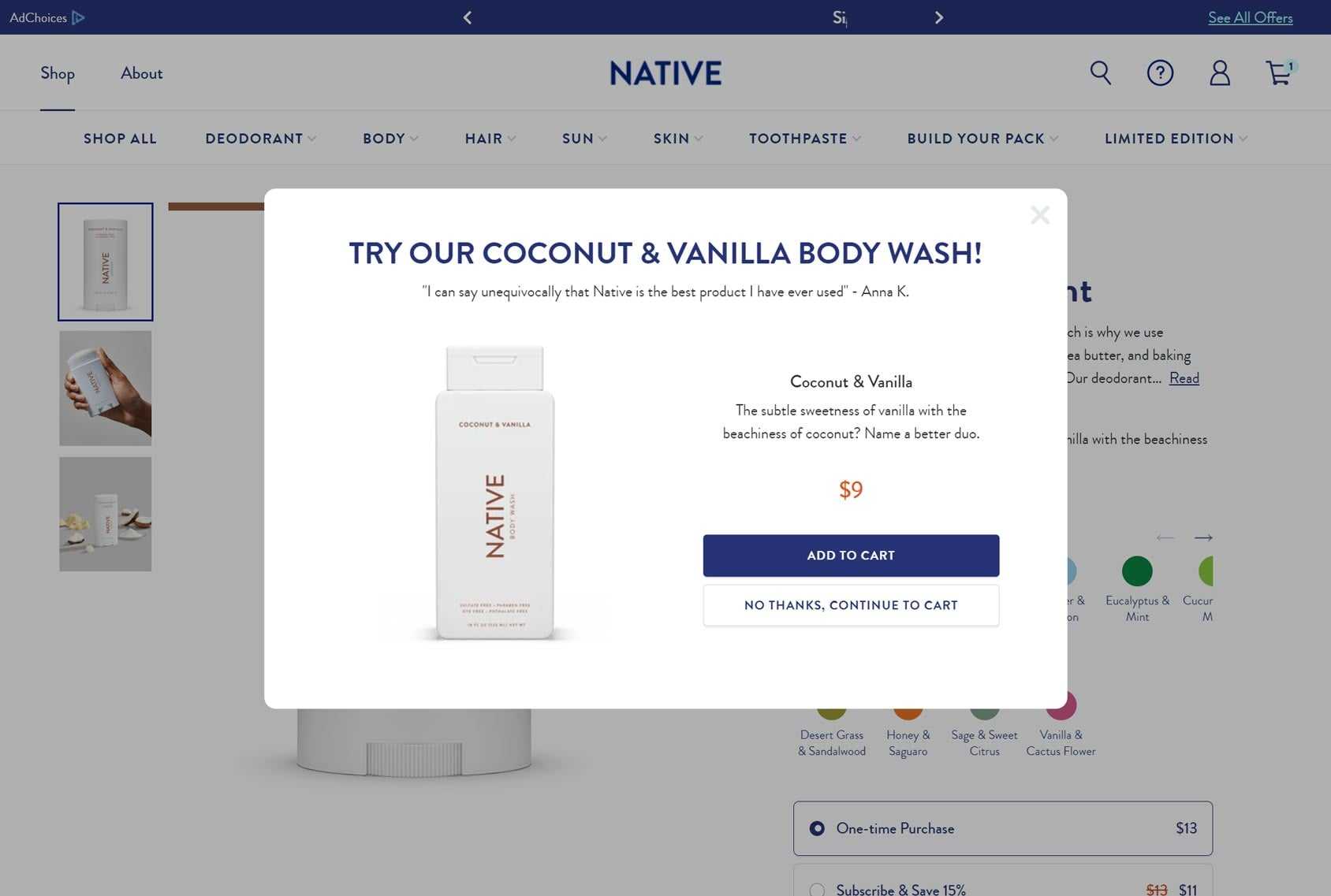
Up-sells and cross-sells are proven ways to boost eCommerce conversions and drive sales at your store.
But what’s the best way to get those recommended and related products in front of your customers? One effective way is to use popups to display up-sells and cross-sells.
With the right tools, you too can display an up-sell or cross-sell in a popup that’s related to what the customer has already added to their cart.
Omsom
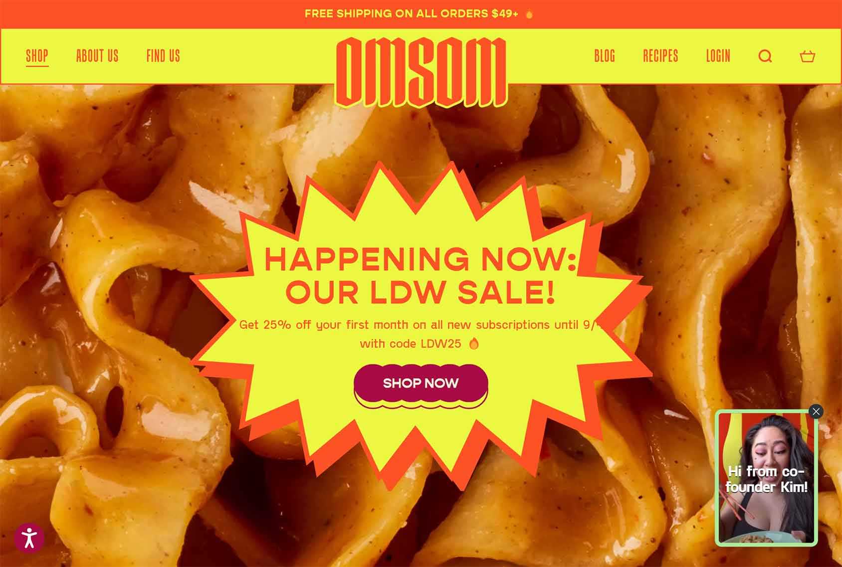
Popups don’t have to be used to promote an offer or capture leads. They can also be used to display helpful content to your audience, with no strings attached.
Like Omsom, you could try using a popup to display a welcome message that educates visitors about your products. If there’s a chance your visitors won’t be familiar with your business or inventory, this type of popup can quickly rectify that.
On
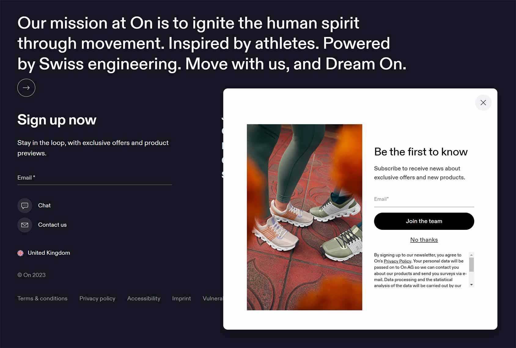
Taking a similar approach to My Protein, On gives subscribers access to unspecified exclusive offers and previews of new products instead of a discount on their first order.
This is another example of rewarding subscribers without cutting your profit margin.
Portrait Coffee
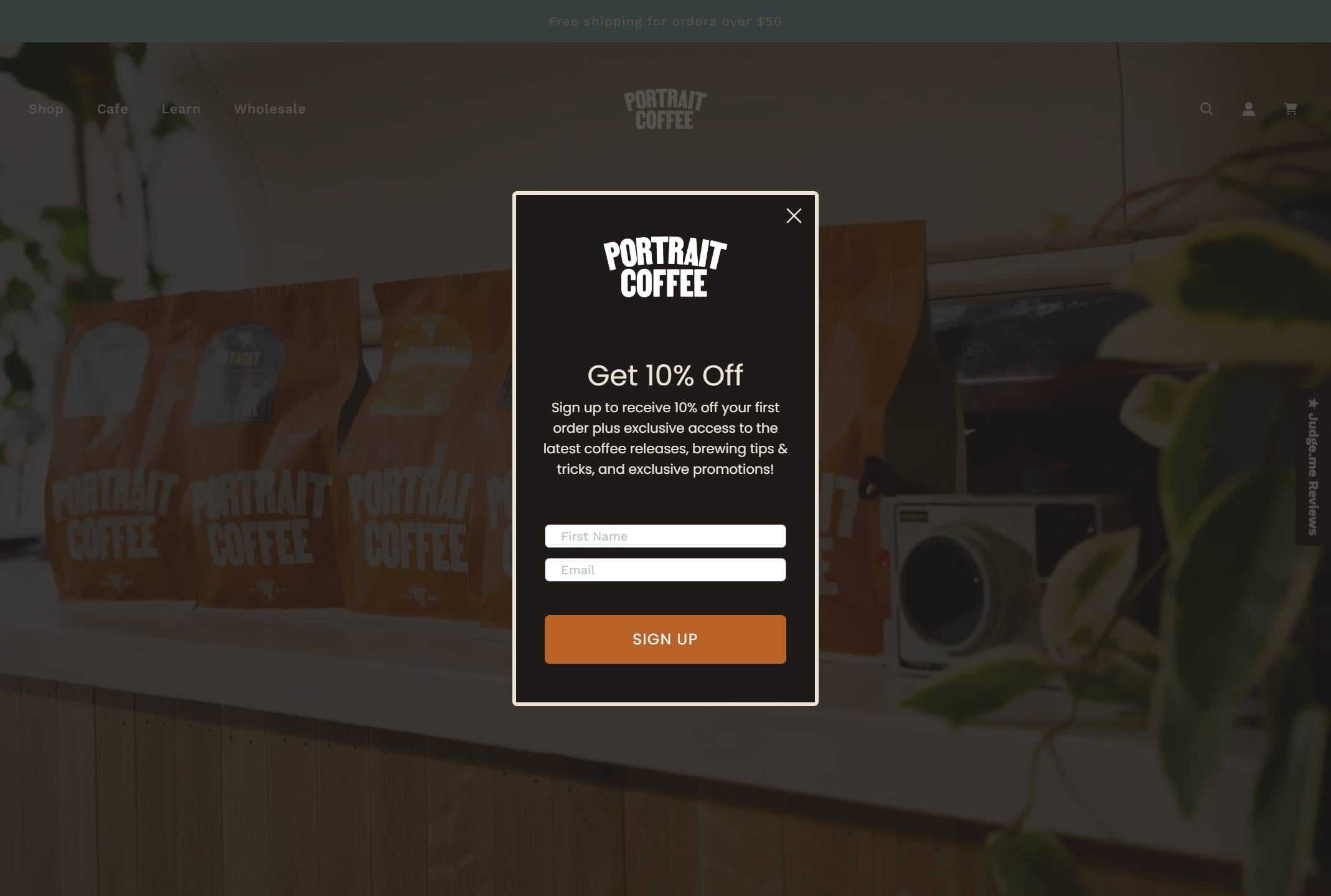
Not only do new Portrait Coffee subscribers get 10% off their first order but they also get access to useful content, new product news, and additional promotions.
If you really want to grow your subscriber list then offering a combination of rewards might be necessary.
Shein
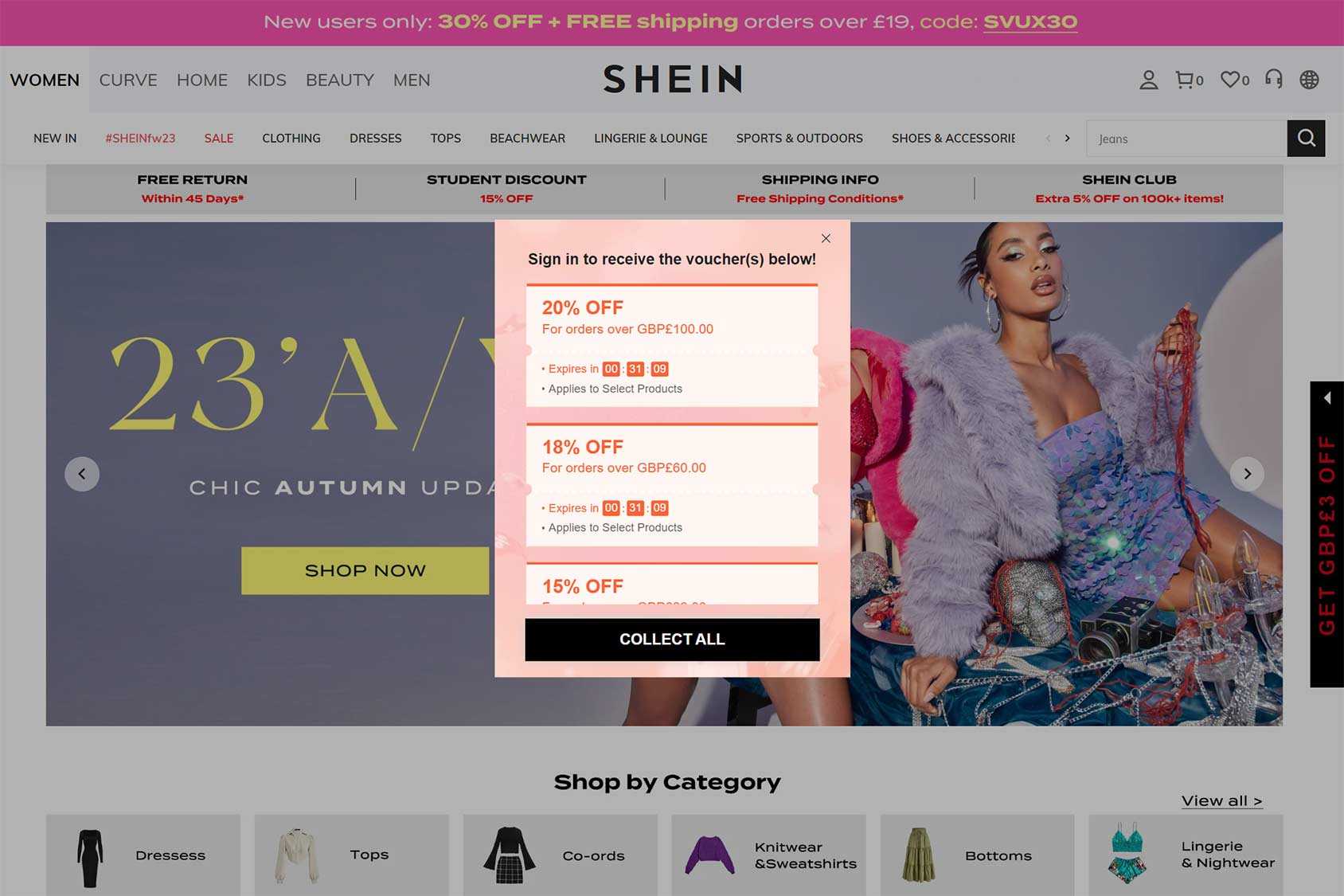
Rather than asking for your contact details right away, Shein first offers you a reward. It’s not until you’ve decided you want the reward and clicked on the Collect All button that you’re asked to sign up.
This two-step approach tends to work well. Because the visitor is already invested in the outcome they’re more likely to respond positively when asked to provide their details.
The Shein approach is interesting in other ways. One is that it uses timers to add an element of scarcity to the promotion. Another is that there are multiple offers available, with the most generous one reserved for higher spenders — something which should help increase average order value as people choose to spend more to save more.
Shonen
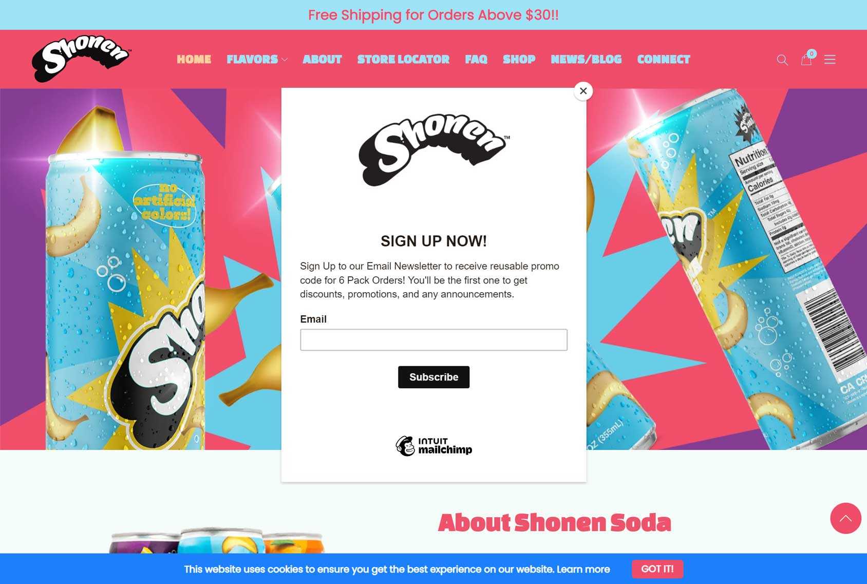
If you want your popup to really stand out but your site already features a bold color palette, taking a leaf out of the Shonen UI design book can help.
Opting for muted colors for your popup when the rest of the site is bright and colorful ensures your audience can’t miss your invitation for them to sign up.
Slate
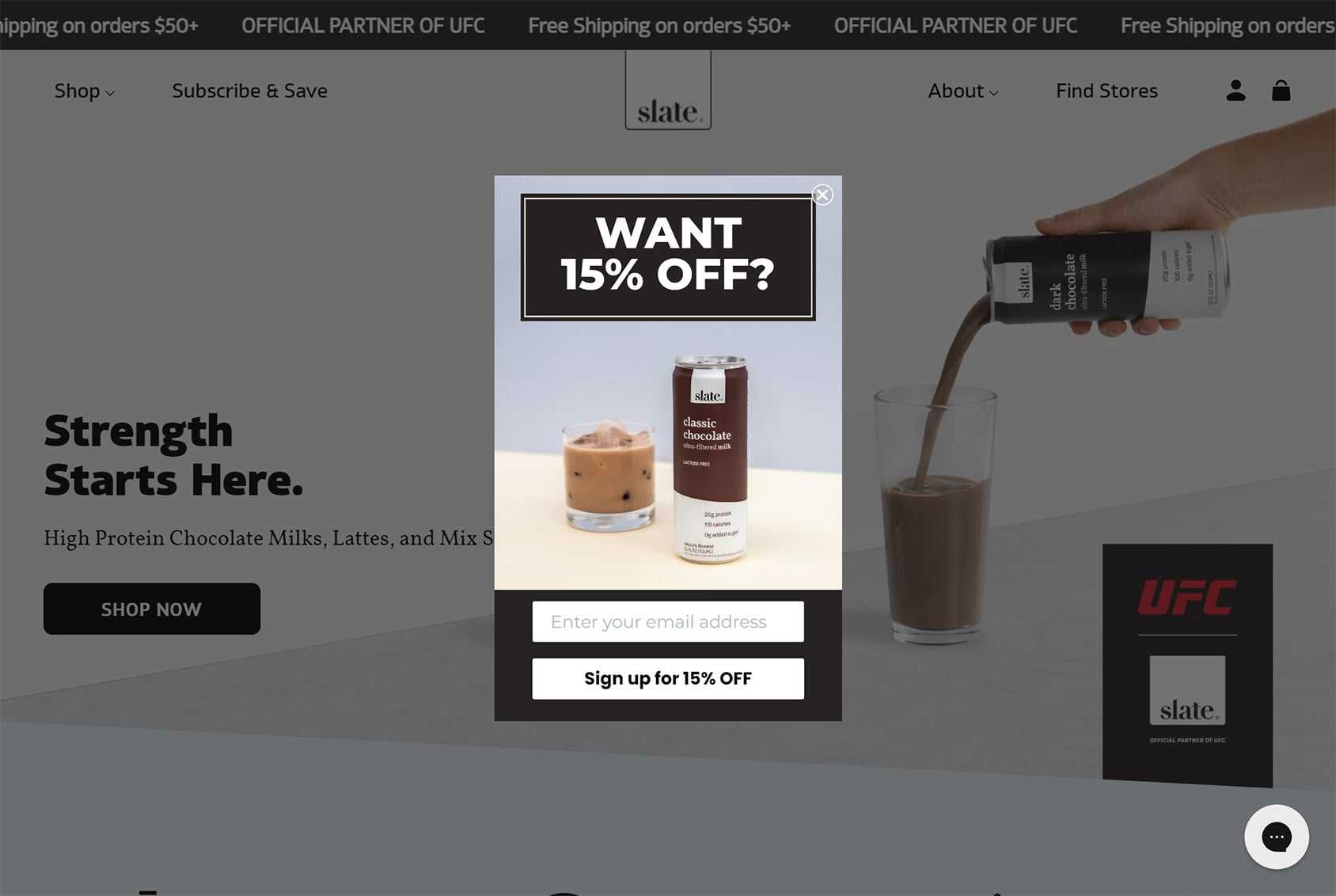
Slate cuts to the chase with a straightforward question: Do you want to save money?
If you’re not having much success with your optin rates, being direct and keeping things simple like this is worth trying.
Solarsport
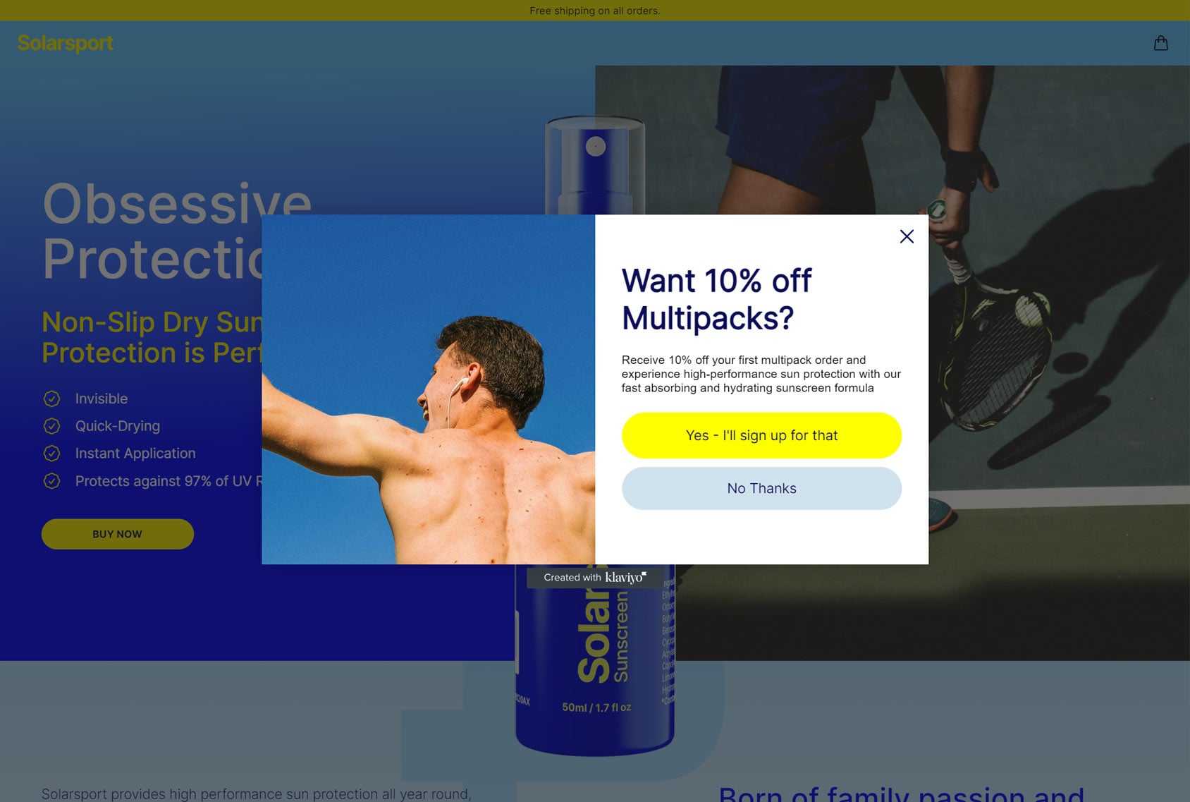
The Solarsport popup is another good example of keeping things simple and giving visitors what they want. As most people will want a discount, it will be hard for them to say no, even if they don’t want to sign up.
After responding positively to the first question, visitors are then shown the optin form. It’s only at this point that they find out they’ll be agreeing to receive email marketing if they request the discount. Hopefully, by that point, they’re already committed to getting the reward and are willing to sign up.
Uniqlo
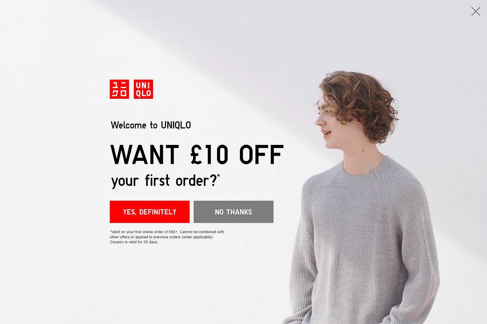
Full-screen popups are a surefire way to grab the attention of your audience. In this example, Uniqlo shows you how to grow your list by combining a stylish full-screen popup with an offer that’s hard to refuse.
As we’ve already seen elsewhere in this article, asking a question that’s highly likely to get a positive response before displaying the sign-up form is a good way to prime the audience to opt in.
Unrecorded
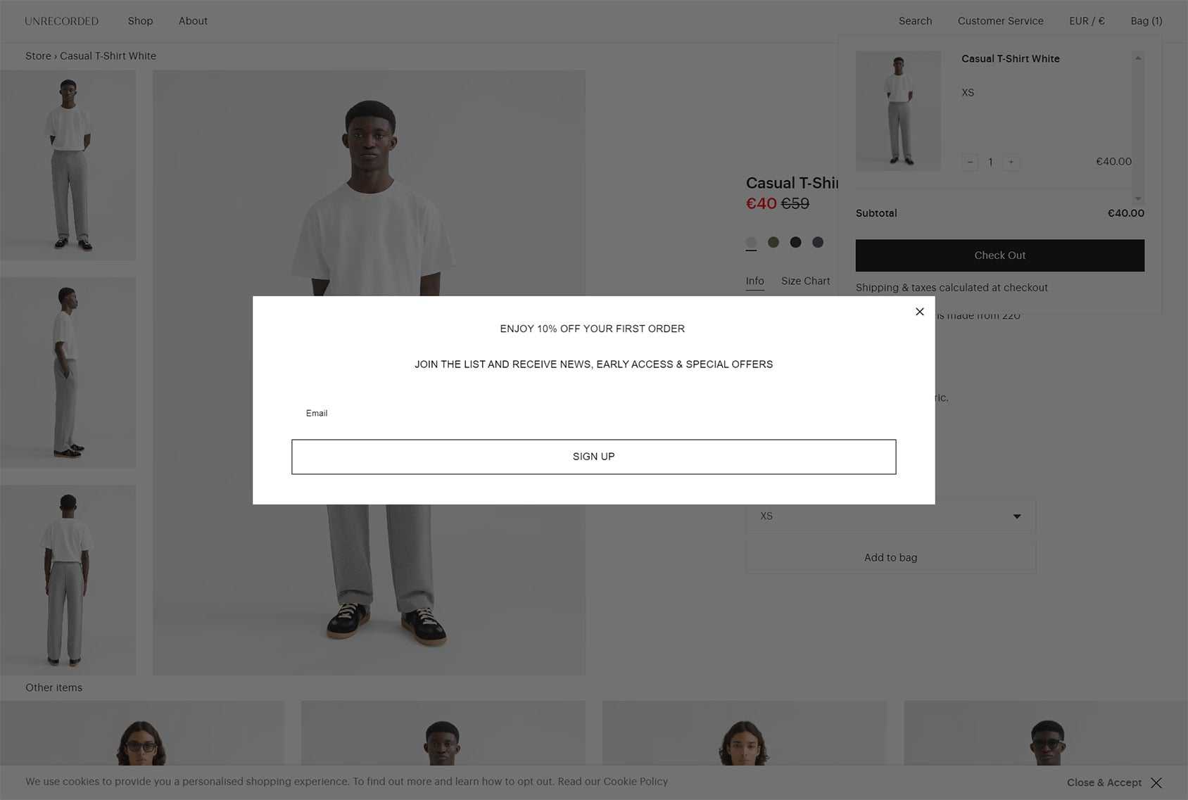
Unrecorded shows that minimal popup designs can still work.
If your overdesigned popups aren’t getting the desired results, going back to basics and simplifying your approach could help.
Urban Outfitters
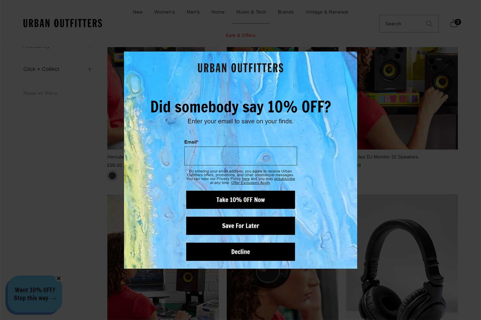
Using a lightbox overlay to dim the page and then displaying a popup with a bold background is one way to make your offer stand out.
Giving visitors the option of saving the offer for later is a good idea if you want to sign up those visitors who aren’t quite ready to buy but don’t want to miss out on the discount.
Summary
As you’ve just seen, the options for adding popups to your eCommerce store are almost endless.
Best of all, you can combine multiple types of popups and use each one on a different part of your store.
As the best eCommerce popup tools often include A/B testing functionality, you can run experiments to find out which type of popups work best with your store and audience.
If you want to grow your email marketing list, increase average order value, and generate more sales, adding popups to your eCommerce store is something to consider.

 Managing WooCommerce settings with Captiva Theme Options
 Setary Review: Bulk Edit Products in WooCommerce
 WooCommerce Quickbooks Online Integration – How to Guide
 Beyond Translation: Your Guide to eCommerce Localization