One of the keys to a successful eCommerce store is reducing user bounce rates (customers entering your website and rapidly returning to search engines).
Essentially, the longer you can keep site visitors on your listings/product pages, the more likely they are to convert from passive users to proactive customers. But how exactly can you refine your product listings pages to minimize bounce rates and maximize user interest and conversion rates?
10 Great eCommerce Listings Page Examples
Happily, we have created the following guide to 10 ways of making enticing eCommerce product listings pages, using examples from leading-edge eCommerce stores.
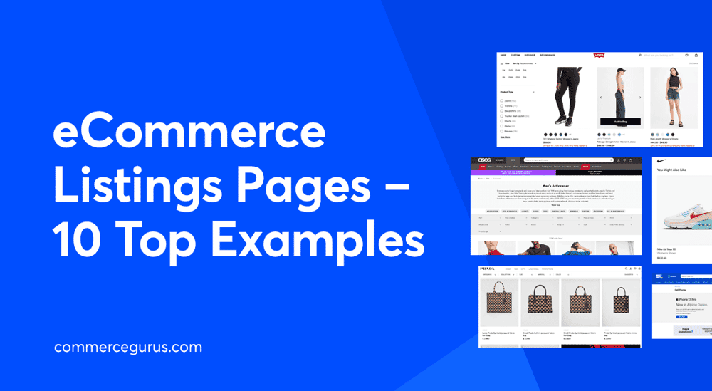
1. ASOS – Optimized page descriptions
In order to keep your users on your product pages, first, you need to get them there and the best way to do that is to write product listings page descriptions with search engine optimization (SEO) at their heart.
More specifically, by writing category descriptions that contain relevant keywords, you can simultaneously inform both Google and your users as to what your product pages are about. In turn, this enables the search engines to evaluate and rank your website more accurately, thus increasing organic traffic onto the page.
Now, this is all very well, but how exactly do you do that?
Well, in short, to optimize your category descriptions, you need to write informative, concise, and engaging copy that contains relevant keywords. The above example, taken from the ASOS website, demonstrates this nicely, though it isn’t without its faults.
However, while the product category description is littered with keywords and, arguably, is slightly too long, it immediately engages the reader with an emotive call to action that contains the right target keywords that will chime with both Google and potential customers.
“Browse our men’s sportswear and score your latest workout win.”
Call to action – focus keyword – emotive connection.
It’s the perfect opening gambit for a sportswear page. It says, “This is our men’s sportswear page and it contains exactly what you’re looking for.” Replicate this for your product pages and you won’t go too far wrong.
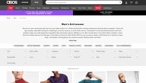
2. Walmart – Bestsellers to the top
Next up, it’s also important that you display your best-selling items at the top of your product listings pages, as demonstrated expertly by Walmart’s ‘Fresh Vegetables’ page (above).
Why? Because if, when a user arrives on the page, they’re met with popular items that many others have purchased, it immediately establishes product and brand trust and legitimacy. Needless to say, this helps customers decide and, thus, increases the likelihood of sales.
Additionally, it also improves the overall customer experience of your online store. After all, statistically, your best-selling items are the products most likely to match a user’s intent. Thus, by displaying them front and center, the consumer journey is streamlined.
3. Levi’s – Hover for more info
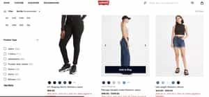
eCommerce customers like to gather as much product information as possible before committing to a purchase.
As such, it literally pays to meet that demand, and an intuitive way of doing so is to utilize a hover function (whereby a user hovers their cursor over a product in order to reveal more information). This allows a quick, yet more in-depth assessment of the product, its attributes, and its variations, as demonstrated by the Levis product page above.
Here, the ‘Shaping Skinny Woman’s Jeans’ have clearly been magnified by a curious user, while the central, ‘Ribcage Straight Ankle Women’s Jeans’ displays the option of an image carousel.
Ultimately, by providing such an intuitive means of accessing more options (product videos, information, in-depth analysis), you quickly endow the user with greater knowledge of your product.
Generally, this concludes in one of two ways – a sale or, safe in the knowledge they can quickly inefficiently assess more options, the user moving on to review another of your items. Ultimately, a simplified user journey increases the chance of sales.
4. Nike – Tailored recommendations
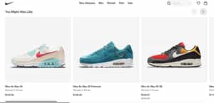
Tailored product recommendations are a tactic utilized with great success by a multitude of top brands. Demonstrated, in this instance, by Nike’s simple but effective “You Might Also Like” section, the technique enables you to display more products to a user that they have a pre-established interest in.
However, be warned, suggesting the right products is a must as users who visit a website that bombards them with irrelevant items will, invariably, bounce straight back out of your site. In order to enact this strategy correctly, then, the best strategy is to use their browsing history (on your site) as a guide.
Returning to our example of Nike, clearly, the user has shown a past interest in Nike Air Max trainers. While seeing alternative variations of their coveted shoe might not result in an immediate purchase, it will often sew the seed for future investment.
5. Fabletics – Social proof
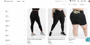
In this context, the power of social proof revolves around displaying reviews and customer testimonials. It works in a similar way to the concept of placing your best-selling items at the top of the product page. Why? Because, again, it instantly, visually establishes legitimacy and trust in the quality of the product and your brand.
Take the Fabletics shot above. The first two products both have almost 5-star product ratings and, consequently, they immediately dictate more trust than the ‘Boost Short 6″‘ which lacks a rating.
Essentially, social proof is a means of using human psychology to your advantage.
When partaking in online shopping, people don’t like to be the guinea pig and, in the context of eCommerce sites, they like to know they’re going to receive value for their money. If they can’t feel the fabric or try the product out for size, trusting the opinion/rating of unbiased user-generated content is the next best thing.
6. Best Buy – Effective page headers
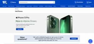
Your headers are the first impression of your product listings pages, so it’s critical to utilize them effectively. As such, just as your product page descriptions should be engaging, informative, and concise, so your landing page headers should be, too, with the additional quality of being eyecatching.
The Best Buy page (above) is a great example. Here, the eye is immediately drawn to the slick, emerald glow of the featured phone and, thus, guides the user to find out more by reading the information provided.
On that theme, when designing your own headers, try to make them visually stimulating in order to hook the user, and then back it up with concise, informative, and actionable copy. The key is to monopolize the brief window of user attention that you have caught.
Again, the Best Buy iPhone 13 header exemplifies this perfectly. The sharp product images catch your attention and the information immediately tells you what it is, what’s special about it, and provides a compelling call to action. “Save up to $1000…”, “Shop Now”.
7. Asics – Filtering to perfection
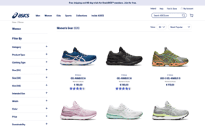
As we discussed above, when preparing your eCommerce site’s product descriptions and listings pages, the key is to optimize the content and then empower the consumer by simplifying their journey.
To that endeavor, filter pages are a fantastic way of streamlining your website and reducing the time spent searching for a particular item. This Asics ‘Women’s Shoes’ page (above) is a fine example of this.
By providing a comprehensive product filter (left of screen), the user can search, with precision, for the shoe that they are hoping to find. This is important because the longer a user stays on a web page without reward, the more likely they are to bounce back into the SERPs.
Providing shortcuts, such as filters, not only encourages a sale but it increases the chance of customer return. It is worth noting, however, that your filters needn’t be as extensive as the Asics example; ultimately it depends on the focus of your eCommerce product and site. If you sell wine, for instance, a filter for the region of origin may suffice.
For more on this topic, see our article on Adding Product Filters to WooCommerce.
8. Amazon – Key filters highlighted
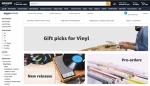
On the topic of filters, highlighting your key filters is a means of immediately drawing attention to products of interest. This is particularly effective if you can combine your efforts with your tailored recommendations program.
Amazon is a devil for doing this, as it utilizes your on-site browsing history to proactively present filters that are likely to match your interest. In the example above, it doesn’t take long to recognize that the user has a vested interest in vinyl records.
Moreover, by displaying appealing filter categories (‘New Releases’ and ‘Pre-orders’) within that pre-established area of interest, the company increases its chance of securing consistently higher traffic rates and sales.
Essentially it’s a strategy that combines an improved online shopping experience with shrewd marketing know-how.
9. Prada – Clean & simple product view
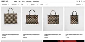
The value of a clean and simple product view and high-quality images on your product landing pages cannot be overstated. We mentioned earlier that eCommerce consumers require extra assurances before making a purchase.
Consequently, the more aesthetically pleasing your product page layout, and the more eye-catching your product images are (and the more accessible you can make their attributes, variations, and alternative views), the more attractive you make the purchase.
A great way of achieving that is to make sure that you effectively maximize the use of space on the product listings page without making it too busy. The above example, taken from a Prada handbag eCommerce product detail page, is a prime example of how to monopolize webpage real estate.
The company has chosen to utilize a grid-based display that maximizes attention and minimizes eye fatigue. Therein, each bag is shown against a neutral background and, while not occupying the entirety of the allocated space, clearly highlights the detail and draws the eye.
Don’t worry about cramming multiple angles and information into the shot. Simplicity is best for eCommerce category pages and, of course, you have your hover function to provide further info.
10. Apple – Easy navigation
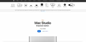
One of the best things you can do to appease both your users and search engines is to flatten the architecture of your website. If you can make navigating to your product pages (and indeed the rest of your site) incredibly intuitive and simple, you’re on to a winner.
Let’s have a look at the screenshot (above) taken from Apple’s website. Apple is known for its clean yet powerful image and designs, and its website is no different. The main menu is located across the top banner of the product page and holds a link to match any potential intent their users could have.
In this instance, clearly, our user is interested in Mac and, thanks to the navigable interface provided, they have located the Mac drop-down menu which, in turn, reveals Mac product subcategories. It’s simple, efficient, and maximizes the use of page real-estate, leaving the rest of the product page to maintain Apple’s clean image and product view.
11. Bonus: La Fermière – Dynamic content and API integrations
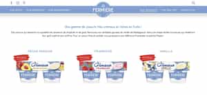
Creating a complex website demands tools that offer extensive functionality and save time. You need to manage the WordPress backend efficiently, including custom post types, taxonomies, and advanced page options.
Listings allow a consistent design to be applied across multiple items, such as dynamic sliders for product categories, and can be combined, like embedding a Product within a Categories listing.
So how do you achieve this without code? By using dynamic content plugins. For example, using tools like JetEngine to pull in live data, such as social media feeds or personalized product recommendations, can keep content fresh and relevant, thereby reducing bounce rates and increasing user engagement.
FAQs
What are the most important elements of a listing page?
We could make a case for all of the above being the most important elements of listings/product pages.
However, to pick three, a solid foundation of search engine optimized, informative product descriptions, clean and simple product viewing/layout and easy navigation should give you a head start in the search engine results pages and sales race.
How many products should be in each of my categories?
Realistically, there isn’t a maximum limit on the number of products you should have within each of your category/product pages as long as they’re easily navigable. However, the ideal minimum lies between 6 – 12.
This provides a healthy range of options for your users to choose from and for search engines to determine the page’s content and, thus, rank it accurately.
How can listing page design affect search engine rankings?
A clean, navigable listing/product page design can affect rankings positively by flattening the architecture of a site and thus enabling search engine robots to read and analyze the content, value, and relevance of a product page (and website) more easily.
In addition, a clean page design will also engage users more successfully, reducing bounce rates and increasing authority and traffic, aspects which will also positively impact on WooCommerce SEO over time.
How can I create an eCommerce website?
There is a multitude of methods and website-building software options through which you create an online store. But the simplest is with our own powerful Shoptimizer WooCommerce theme. Together with the included CommerceKit plugin you can create a world-class eCommerce store, designed for performance and conversions.


 How to Make Your WooCommerce Product Pages Stand Out
 WooCommerce Examples – 38+ Top Designs to learn from (2021 update)
 How to Defer Offscreen Images in WordPress
 CommerceGurus heading for WordCamp Europe!