We’ve put together an extensive guide to some of the best product page practices, with examples of each from the biggest eCommerce stores. When designing and planning your online store, most of the early focus is on the homepage. People expect that visitors arrive on the homepage and progress through the site in a linear fashion, clicking on a category as the next step, before browsing through the products within it.
The conversion rate for visitors who browse in this fashion is actually exceptionally low, at between 2 and 2.5%. On the other hand, visitors who land directly onto a product page convert on average at 7%. A huge difference.
An effective product page will within seconds, convey the value of the item and provide a clear call to action to purchase it. It’s the most important page of any eCommerce site, and is one we focused on extensively in our Shoptimizer WooCommerce theme.
These are the product page examples we’re going to describe.
- Have open graph images
- Work on introduction copy
- Clear call to action button
- High quality images
- Create product videos
- Use color swatches for variations
- Collect leads for out of stock products
- Display clear shipping costs
- Inspire trust
- Social proof for reviews
- Show products in real life
- Have a comprehensive product description
- Display technical information
- Include questions and answers
- Add a “hint” to your product pages
- Include details which aren’t obvious in photos
- Intelligent cross sells
Product pages are crucial sources of traffic
It is also a crucial source of organic search traffic from Google. When a user is searching for a specific product, they’re at the final stage of the research journey. This is when they’re most attuned to a buying signal which will make them pull the trigger and make a purchase.
Crucially with organic traffic, it’s also free. It will take time to rank, but once it does, it can be a huge driver of sales to your site. This is especially true if you incorporate the product page practices which we outline below. You can make your product pages far superior to competitors which will, over time, be reflected in your Google SERP ranking.
Remember that according to Google 53% of shoppers do research before buying, so you want your product pages ranking highly. But competition is fierce. Not just from other online stores, but from Google itself with display ads and featured snippets vying for attention. So, you’ll need to do a lot of work to make yourself noticed but the rewards are certainly worth it.
Now, let’s get onto the product page examples.
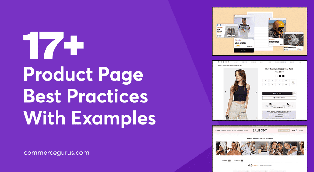
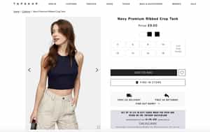
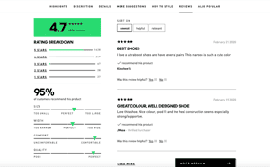
1. Have open graph images
One simple trick many eCommerce stores are missing is creating custom og:images (open graph images) for better sharing on social networks. If someone was to paste one of your product links into Facebook or Twitter what would they see? It’s likely to be a badly cropped featured image which does not present the item in the best possible light.
On the WooCommerce platform, the Yoast SEO plugin allows you to upload custom images for the major social networks such as Facebook, Twitter and Pinterest. A smart approach would be to create custom images for each platform’s size requirements. And to include the title, rating, price, and number of reviews in the image, like the example above.
These would be certainly time consuming to create for large catalogs but you could be missing a great opportunity to make your product page stand out far more on social media.
2. Work on introduction copy
The introduction text is one of the first things visitor’s will read on the page. It’s crucial to make it impactful, insightful, and unique. Ensure that you don’t simply copy and paste this from somewhere else, each introduction should be carefully crafted using specific keywords. As the saying goes, sell the sizzle, not the steak. Ensure you mention the benefits of using the item. It shouldn’t be just a description of its features.
This is a great opportunity to write a short, impactful introduction which is memorable. It’s even better if you can write it in a style which matches your brand and tone.
3. Clear call to action button
The call to action button is the most important element on the page. It’s the one link you want users to click on to start and hopefully complete the buying process. To this end, having a clear and obvious button is vitally important. It can be a simple use of color to highlight it compared to every other feature on the page.
The other aspect of an effective button is to declutter the area and make sure that you don’t have too many other elements of lesser importance surrounding it. For mobile, it’s also important that the button is as far up the screen as possible and the customer doesn’t have to scroll too far to reach it.
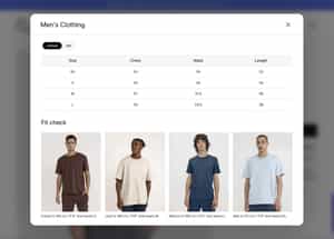
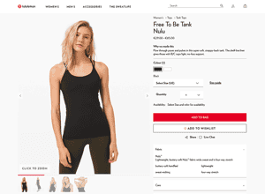
4. High quality product images
I still see many stores which don’t focus enough on their product photography. Great quality images are absolutely crucial in making your items look drool-worthy enough to buy. If you’ve created your own products it may be cheaper than you think to hire a local photographer. Shooting them with consistent framing and backgrounds will make sure store look more professional and inspire more trust in customers who are hesitant in buying.
The other important aspect is to always include at least one image on your product page which is in scale so a buyer can understand its sizing relative to its surroundings. If your only images are “cut out” shots, a visitor would find it difficult to answer questions such as “How far does this cover my neckline?”. If your items are non-clothing, you can still include images of it in use. If you’re selling pillows, include a shot of them on a couch or bed.
We have a popular guide to creating great WooCommerce images if you’re using that particular platform.
5. Create product videos

Product videos are still under utilised in eCommerce and if pictures paint a thousand words, then videos paint.. well a lot more. If you really want to overtake your competition, video on your product pages is the way to go. Videos have been shown to make buyers 65-85% more likely to purchase an item as they provide far more visual information to a user than images alone.
They also increase dwell time on product pages. Buyers will stay longer taking in the information and often end up browsing more of the overall page, increasing the likelihood that they will buy.
Google also prioritises video. If you have video, and your competition does not, there’s a high chance of ranking higher, especially if you also host it on Youtube.
Plus, as the example above shows, it can be a demonstration or tutorial on how to use an item. A personal video can give you a real edge and it’s something that can’t be simply replicated elsewhere.
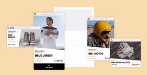
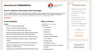
6. Use color swatches for variations
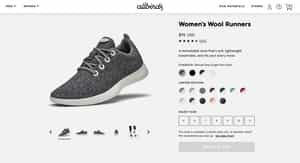
If you’re selling products with different colors it’s always a good idea to include swatches. Humans are visual creatures and it’s always simpler to spot which colors are available at a glance with a visual clue, rather than having to read text. Color swatches on a product page help prevent decision paralysis if users are faced with a large number of dropdown choices.
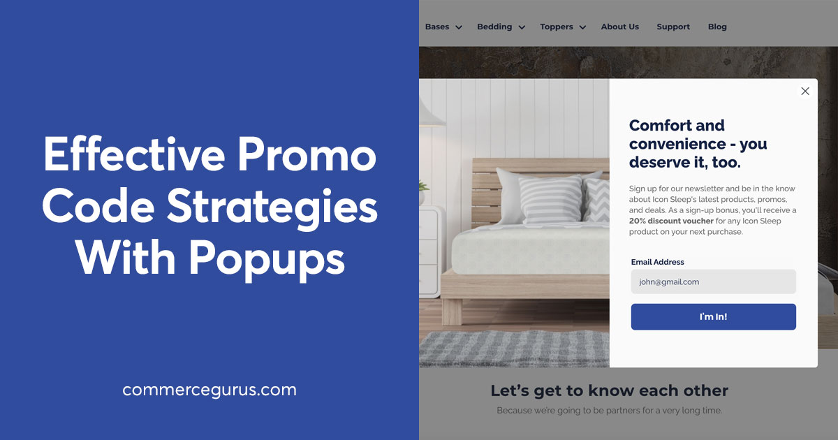
7. Collect leads for out of stock products
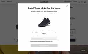
Rather than simply displaying an “Out of stock” notification it would be far more useful to collect warm leads from customers who you know are interesting in purchasing your items. A waitlist is an important feature to consider on your product page. With some correctly setup email segmentation you can have a ready made list of buyers when your product, or an alternative version of it, is available again.
8. Display clear shipping costs
According to Baymard’s research 21% of US shoppers abandoned their purchase due as they weren’t able to see the total order cost upfront before initiating the checkout. With 64% of users looking for the shipping costs on the product page itself, this is clearly a really important consideration. Far too many eCommerce stores fail to include shipping prices on the product page.
It is tedious for users to have to switch to a separate shipping page and there is a distinct possibility that they will lose focus on completing the buying process once they leave it.
9. Inspire trust

Trust is an essential component to convert visitors into buyers. Traditionally when you think of trust you’d think of security badges such as that of Norton which gives people reassurance that their credit card details are secure. But trust can assume other forms. If you include a warranty with your items, that’s a form of trust. A returns policy is also a trust symbol.
If you have won any awards from peers in your industry, that would give buyers an additional indicator that you’re a trustworthy operation. There are many ways to communicate trust and it’s important to think carefully about how you present that on your product page.
10. Social proof for reviews
Customer reviews are a key aspect of what we call social proof. Before buying anything most visitors want to see what other buyers thought of a product. This helps remove some of the uncertainty around online shopping and can reveal key information not exposed in the product description. Reviews add credibility to an online store and provide reassurance for new buyers that others have bought from the site. Items with few or zero reviews on a product page have been shown to convert less.
But how do you encourage purchasers to leave a review? That’s where review platforms such as Yotpo, Stamped and Judge (our pick) come in. An email is automatically sent to a buyer after say 2 weeks requesting a review. The buyer can complete it by filling out a simple form within their own email client. This reduces a lot of friction in collecting data. See our guide to WooCommerce reviews for more details as well as an overview of Judge.me.
11. Show products in real life
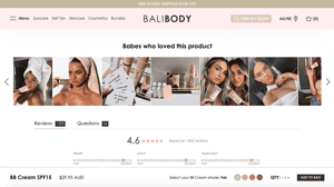
Something we’re seeing more and more of is top eCommerce brands harnessing the power of Instagram on product pages. It’s a perfect match. You can get high-quality real life images from customers who use your items. These can be far more powerful than your own and add a layer of authenticity as customers can see how much existing buyers have enjoyed using your items. A huge 77% of shoppers prefer authentic customer photos to professional images.
Plus, integrations such as Yotpo are powerful enough to create a shoppable version of your Instagram feed to enable shoppers to buy the products in your photos. This ensures that there’s the shortest possible path to purchasing.
12. Have a comprehensive product description
A great product description is a big plus when it comes to conversions. But it’s important to understand your buyer. If you’re selling say niche workshop tools, it’s ok if your language and jargon reflects the technical nature of your products. It shows that you understand your market and you’re not dumbing it down for a wider audience.
Having a lengthy product page description is also great for SEO. But it needs to be unique and not copy and pasted from elsewhere. The use of adjectives in your copy such as vibrant, compact, and richer can bring your text to life. But depending on your item there may be limitations about how much copy you can have. Selling a plain white t-shirt, maybe a paragraph or two will do. A tv on the other hand needs more detail, and even better if you can also include multiple images and videos of it in use.
13. Display technical information
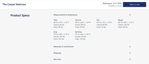
Many stores sell items which really require more than just a lengthy product description. They need precise dimensions, ingredients, weights, calorie counts, and more. If you neglect to include these details, a significant percentage will leave to find that information elsewhere. Others will email you their questions which is time consuming.
It’s a good idea to have size guides, manuals, and comprehensive product specifications all on the product page. You’ll find that some purchasers come back just to read through that information once they start using the item. Having this info elsewhere causes friction and detracts from the importance of the product page in the buying journey. It’s a great way to build traffic and gain repeat business from existing buyers.
When it comes to adding size guides to your eCommerce store, WordPress store owners can use our CommerceKit plugin. It works with any WooCommerce theme and store configuration and is included when you purchase our Shoptimizer theme.
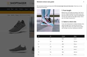
For Shopify users, our freemium CommerceGurus Size Guides app gives you an easy way to create size guides for the products at your store.
The Shopify Size Guides app was built with accessibility in mind, so if you’re looking for a highly accessible tool that complies with EEA accessibility guidelines, this is a great option.
With both tools, you can create multiple size guides for the different types of products you sell. You can then assign the guides to specific products or product categories and types.
By creating multiple style guides, each one tailored to a specific type of product, you can display the necessary technical information to help shoppers choose the right one, leading to increased customer satisfaction and fewer returns.
14. Include questions and answers
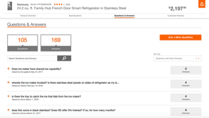
In any scenario where you can address concerns of a buyer you have a far greater chance of taking of their business. A questions and answers area is ideal for this, especially if what you sell is complex and prone to numerous queries about its functionality. The other great advantage is that it can cut down on emailed questions, as the product page contains all of the answers already.
Customer review platforms such as Yotpo can email existing buyers of an item with a question which has been posed and automatically display the response if it is submitted. With systems in place like this the store owner doesn’t need to research the answer themselves. Plus, there is a more authentic response as it’s coming directly from another buyer.
15. Add a “hint” to your product pages
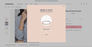
I’ve seen wishlist functionality on plenty of eCommerce stores but this “Send a Hint” feature would be an interesting approach if you sell products which require input from a significant other. It’s perfect if what you sell are frequently gifts and users can drop a hint as to what they would really like to receive.
It opens up a form, and once filled out, the recipient gets an email with a link to the product and the name of the person who sent it. All very simple and would be extremely effective if gifting is a key driver of your sales.
16. Include details which aren’t obvious in photos
Too many product page descriptions focus on details which are clear and obvious within the product images. Valuable and prominent text should instead be used to describe what cannot be seen. The downside to eCommerce compared to a bricks and mortar store is that a visitor cannot feel the item. So retailers should also focus on the fabric – is it smooth, or rugged? Is the material light or heavy? Is it flexible or stiff?
It’s worthwhile to think about your own product catalog and how you could improve your own product descriptions based upon how it feels and the details which cannot be conveyed through photos alone.
17. Intelligent cross sells
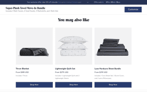
The majority of shoppers in eCommerce are first time buyers. To this end it’s important to try and maximise each sale and cross sells are crucial to that. Thoughtful execution of complementary products is key and it’s well worth spending some time considering what items a buyer might add to their purchase.
If it’s shoes, it might be easy to encourage a decent percentage of customers to also add additional laces and polish. This will raise the average order value and provide an important opportunity to give new buyers a taste of more than one item in your catalog.
Wrapping up
So now, it’s over to you. Which of these product page features most resonated with you and your store? Do you have any essential product page feature which you think we should include in the list? With product page design taking on an ever greater importance I’d love to know your own strategies. Let us know in the comments below!


 WooCommerce is the most popular eCommerce platform in October 2014
 WooCommerce Quantity Discounts, Rules and Swatches Review
 What is the most popular eCommerce platform in 2014?
 ADA Lawsuits Targeting eCommerce Store Websites
Great post Simon.
Regarding #15, how can I add an hint popup with shoptimizer?
I’ve only ever seen this plugin for WooCommerce but it hasn’t been updated in 3 years so may not work anymore. There’s probably a market for a developer to create something new.