In this blog post I’m going to be showing you the top WooCommerce examples in 2021. This won’t be just a static gallery of beautiful screenshots. Each example will include a tip or action you can implement on your own WooCommerce site.
So, if you love real world WooCommerce examples and want to know how to apply key learnings to your own store, you’re in the right place. Let’s dive in!
These are the WooCommerce examples we’re going to cover:
- Protest
- Veer Gear
- Leaf Shave
- Niche & Cult
- Whitetail Gin
- A-dam Underwear
- Maradji
- MJ Kiev
- Open Wear
- Simply Chocolate
- Sandlund/Hossain
- Vaxxen Labs
- Le Cafe Noir Studio
- Magna Tiles
- Sodashi
- Henry J. Socks
- Fumo Design
- Procus Go
- Avrox
- Fru.it
- Lafinesse
- Disconnect
- Femme and Fierce
- Meet Milu
- Murals Wallpaper
- Studio Job
- Carl Edmond
- Face Gym
- Bookblock
- Firmamento
- Two Chimps Coffee
- Absolut Art
- Bang On Books
- Bloomscape
- Craft Can
- A. N. Other
- Cozydots
- Gilmour
Protest
From the Netherlands
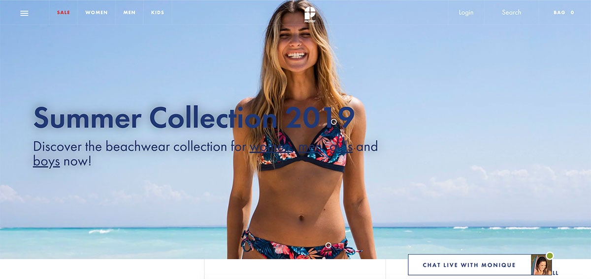
One of the best looking sites in the collection, Protest are a clothing brand from the Netherlands focusing on sportswear and outdoors wear. There’s a lot to admire in the design, especially their use of large bold photography. The classic Futura font works excellently at different weights and sizes, from large headings right down to small capitals in the footer.
The single product pages include simple checkmarks underneath the main call to action, highlighting free shipping and delivery times. This is something we’ve included on our own Shoptimizer WooCommerce theme product pages and is a good way to reassure buyers by answering common questions without leaving the key buying page.
Key takeaway: Go big and bold with photography. If you’ve got it, flaunt it.
Actionable tip: For a free alternative to Futura, check out Jost – a free font from indestructible type with numerous weights which is very similar.
Veer Gear
From the United States
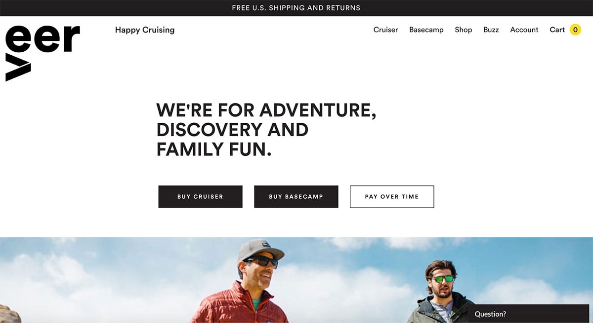
Veer make baby strollers for the kind of adventurous parent which often goes off-terrain. These strollers are designed to be strong with rugged tyres to enable you to pivot and turn, no matter the ground conditions.
The site is simple and clean with impressive photography of the products in action. Each photo is overlaid with bold titles, e.g. ‘It Outsmarts any Wagon’ – they’ve clearly spent a lot of time on the copy and it shows. Including awards at the bottom of the homepage adds to the reassurance that you’re looking at quality products, particularly important if it’s for your own children.
Key takeaway: Work on your copy, try to create simply snappy headings which would appeal to a buyer visiting your store for the first time.
Actionable tip: Their single product page includes useful additional tabs such as ‘What’s in the Box’, ‘FAQs’, and ‘Manuals’ – add extra ones to your WooCommerce site by using a plugin such as Custom Product Tabs for WooCommerce.
Leaf Shave
From the United States
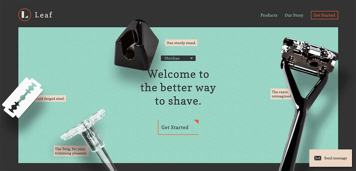
Leaf Shave is an (almost) one-page site which utilizes clever animation to create a fun site selling razers and blades. Scrolling down brings elements into view and tells their story in an interactive fashion. With only two primary products to sell, they can also really focus on great product pages for each. I also liked the use of the menu label ‘Our Story’ rather than ‘About Us’ – it reflects that the creators are real people with a story to tell and not a large corporation.
Key takeaway: Using animation can be a great way to tell a story and add interest to an otherwise static page.
Actionable tip: Like Leaf Shave’s product pages, you can improve the standard WooCommerce reviews display by using a plugin use as Customer Reviews for WooCommerce.
Niche & Cult
From the UK
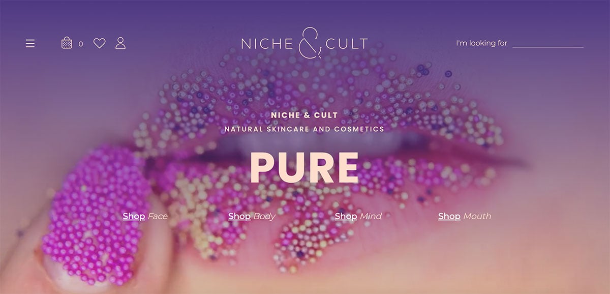
A skincare and cosmetics brand from the United Kingdom, Niche & Cult is a super-clean and stylish WooCommerce site which has lots to admire. The deep purple is a good palette for a product in this niche and the designers made it work particularly well, blending it with softer peaches. The homepage looks well thought-out, with the main hero shot linking to their key categories.
By changing the heading text (with a typewriter effect) and not changing the image each time will certainly have performance benefits also. Subtle animation is used to good effect to bring in their post popular and latest products in their range.
Key takeaway: Using a strong primary color such as purple requires a softer complementary one, and this is well executed in the design.
Actionable tip: Instagram isn’t for everyone but for a brand in this beauty space it’s essential. It’s easy to display your social media shots on your WooCommerce store by using the Smash Balloon Social Photo Feed plugin.
Whitetail Gin
From the UK
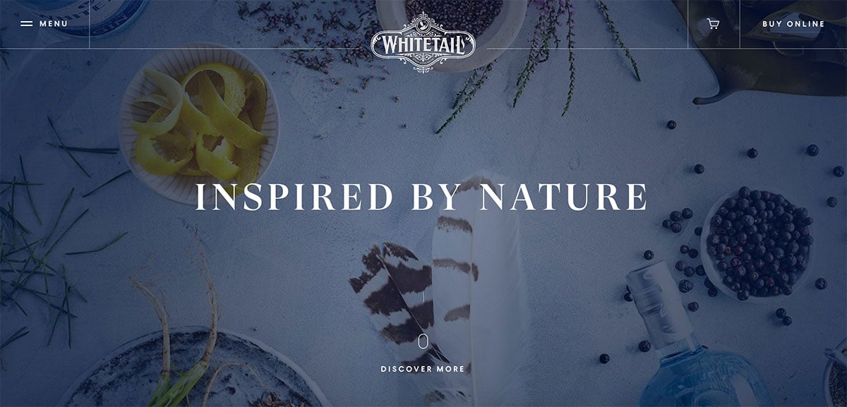
A truly gorgeous site with a blend of elegant type, stunning photography and parallax scrolling effects, Whitetail is a gin brand from Scotland. The homepage tells a story as you scroll, introducing you to the brand and describing the care and love they put into their spirits, finessed over the years. It’s one of the nicest WooCommerce examples I’ve come across, with excellent attention to detail.
There’s a really nice balance between serif and sans-serif fonts, with the more elegant serif typically used at larger font sizes for headings and titles. A good serif works particularly well when you have a high-end brand like this one and you want to portray quality. The dark blue of the logo is used as a strong background color on certain sections, as well as for bold titles on white.
Key takeaway: Blending serif and sans-serif fonts effectively can create a premium feel.
Actionable tip: For an elegant serif on Google Fonts for headings, try DM Serif Display from the Colophon Foundry.
A-dam Underwear
From the Netherlands
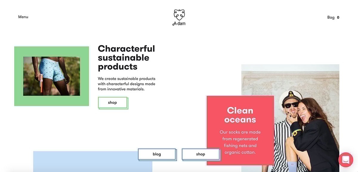
A-dam Underwear is a cheeky, fun site, which also uses its homepage to tell a story using splashes of bold complementary color blocks, scrolling text and animated gifs. You can get a good feel for the kind of brand it is by the little details which include made-up quotes from the Dalai Lama, Johnny Depp and Darth Vadar on certain product pages – it’s irreverent and jokey. The contact page includes a photo of a Bond-esque villain with a cat – it’s one of the WooCommerce examples that has lots of little details to discover.
Key takeaway: Don’t take yourself too seriously. Especially if you sell men’s underwear.
Actionable tip: Create complementary palettes and use bold color areas in your designs with the Coolors generator.
Maradji
From France
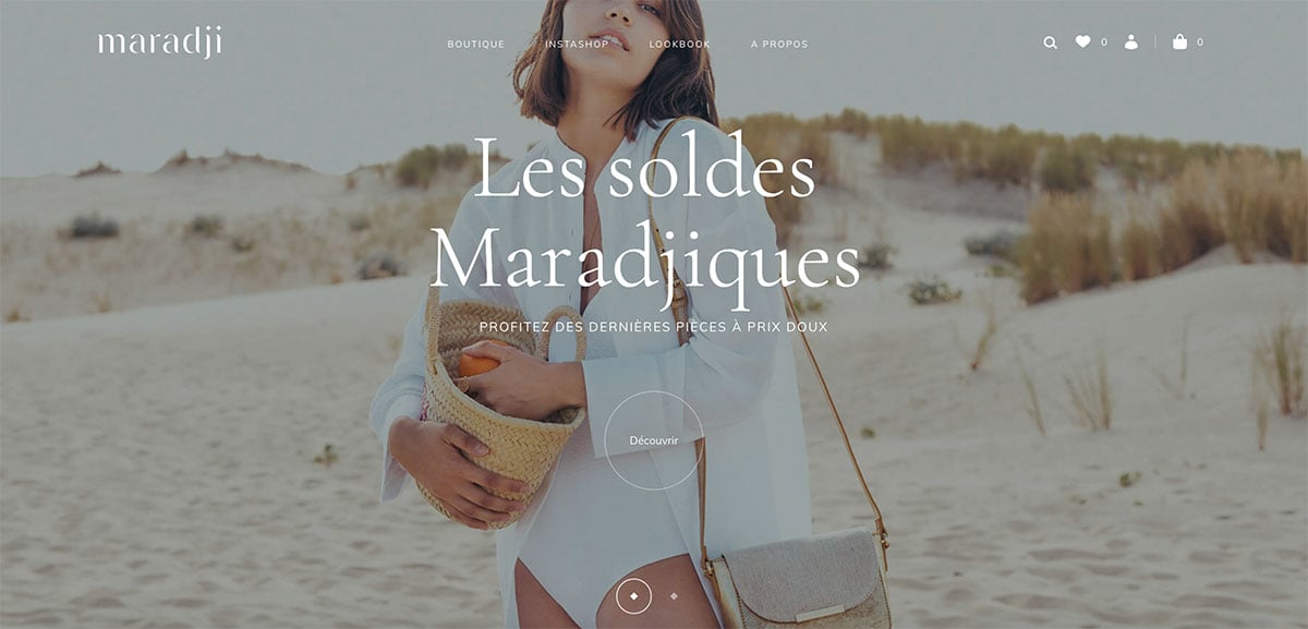
Maradji is an extremely elegant clothing and accessories brand from France. Very quickly you can see that each detail has been carefully thought out, the balanced typography, simple animation and neat hover effects – a lot of work has gone into this. I’m not typically a fan of scroll highjacking but I can see why it was implemented on this store, it compels you to browse down the page slowly and savour the products on display.
The photography throughout is beautiful and I love the icons they used towards the bottom of the homepage – it’s in keeping with the attention to detail throughout the entire design. Some of the individual product pages include photos of the item being made which is a good way to demonstrate the care put into the production. This ‘making of’ feature on single product pages is a recurring feature amongst these WooCommerce examples.
Key takeaway: Focus on the small details in your design, subtle additions of animation or typography tweaks can have a big impact.
Actionable tip: The serif font they use is called Cormorant Garamond and is available for anyone to use within the Google fonts library.
MJ Kiev
From Ukraine
You get an immediate impression that this is a fun, funky brand via the big video which plays immediately. Rather than telling a story by scrolling down the page, the video does the job pretty effectively in less time. There’s not much to explore in this site, but I still feel they’ve managed to capture the tone of the brand and the demographics they’re targeting quite well.
Key takeaway: Yellow and black as a color scheme still works.
Actionable tip: It’s a simple one, but directly linking to the phone number in the header using the tel: attribute means that visitors can call the number if tap it on a mobile. It’s so obvious, but I still see many stores not doing this.
Open Wear
From Switzerland
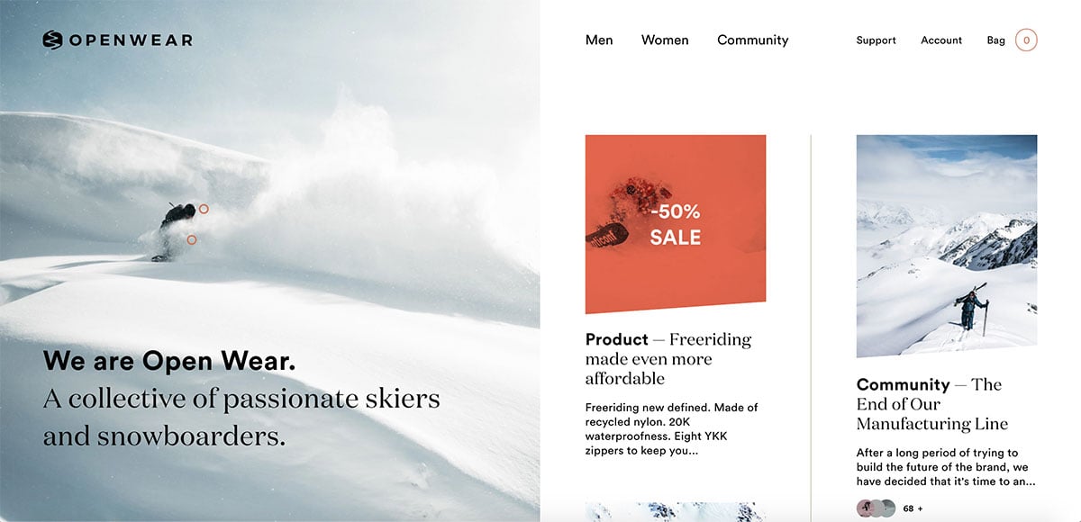
OpenWear is a Swiss brand focused on clothing for skiers and snowboarders. It’s an interesting design – super clean with great font choices but feels more like a magazine than an eCommerce store. Perhaps that’s the intention. Some stores can feel too pushy but this one seems too understated and could do with some more buying signals on the homepage. That said, it is a nice layout and the outdoors shots in the snow look fantastic. It’s a niche which lends itself to gorgeous photography.
Key takeaway: Experiment with bigger and bolder fonts to create real impact.
Actionable tip: If you run a clothing store a size guide can be really beneficial for customers. One of the most popular solutions is the WooCommerce Advanced Product Size Guide plugin.
Simply Chocolate
From Denmark
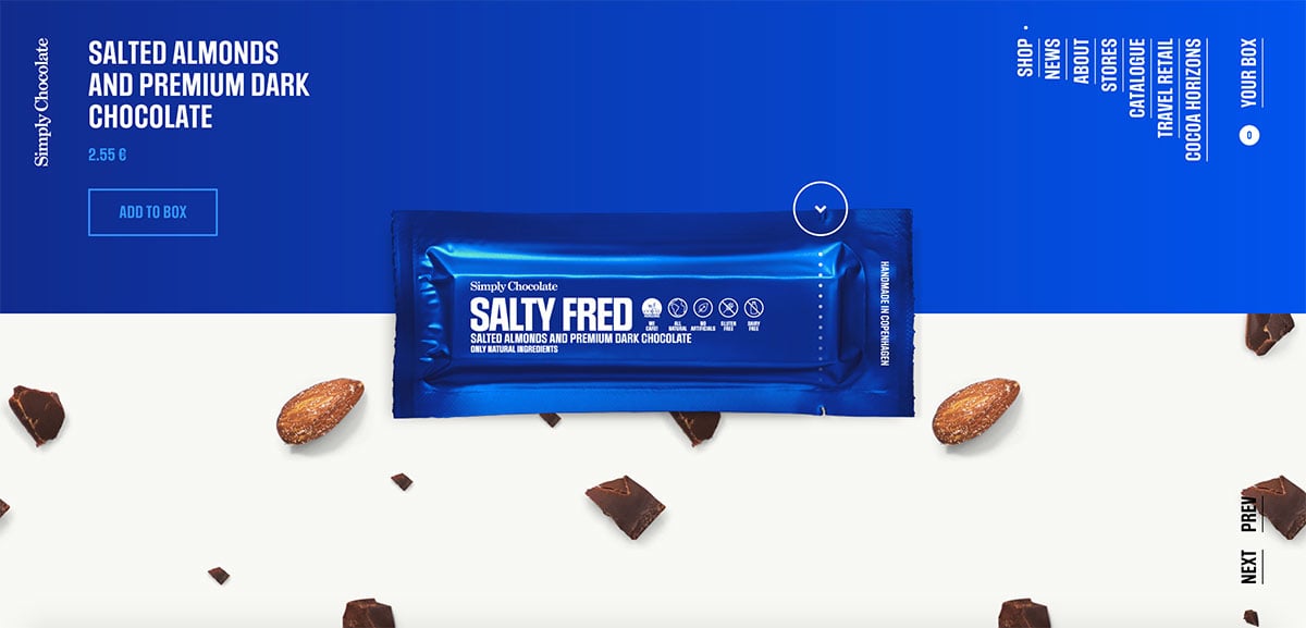
Big, brash and bold. With chunky typography and striking colours for each flavour, this design has as much bite as the chocolate. It’s a one-page design but with enough visual detail for each taste to keep things interesting. I love the parallax background made up of the ingredients for each flavor. Plus, the wrapping tearing as you scroll past, revealing the chocolate underneath. It’s wonderfully well thought out and is one of my favorites in this list of WooCommerce examples.
The navigation is also quite unique, fixed on the top right with vertical text. I don’t remember seeing such a layout before but by using their capitalized chunky display font it remains very easy to read.
Key takeaway: Check out the About page with staff members in black and white holding different chocolate bars in full colour.
Actionable tip: For a font that works in a similar fashion check out Oswald, designed by the late great Vernon Adams.
Sandlund/Hossain
From Sweden
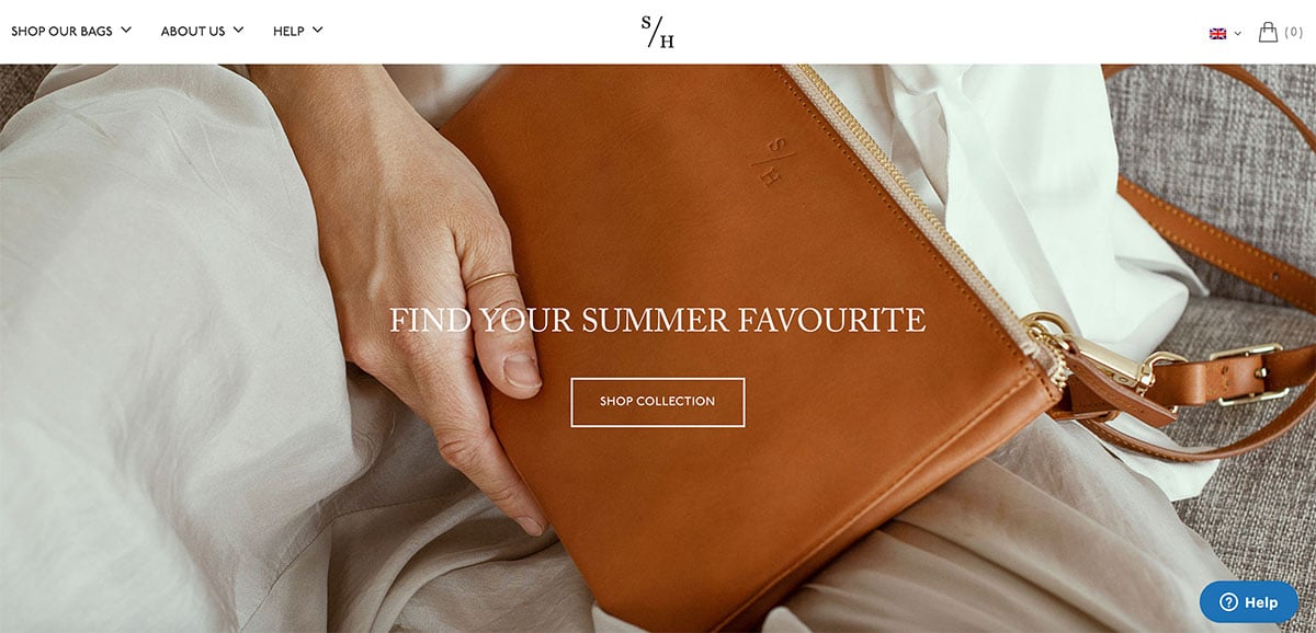
A deceptively simple site from Swedish bag maker Sandlund/Hossain is quick to load and easy to navigate. They keep things clean with large photography and excellent copy throughout, foregoing any animations or clutter. The products employ a simple hover effect allowing you to view them at a different angle. There’s a prominent mention that when you buy items from them, they donate cows to a struggling family in Bangladesh. Delving deeper into the site reveals more about this combination of Swedish design expertise with Bangladeshi production workers who make the bags.
Key takeaway: Introducing a social contribution to each item you sell can be a very useful way to better connect with buyers who share these principals.
Actionable tip: Sign up to a charity such as 1% for the planet and introduce homepage and single product content highlighting your store’s involvement.
Vaxxen Labs
From the USA
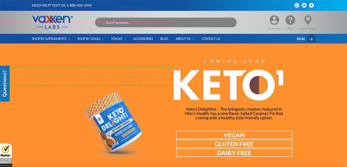
Vaxxen Labs is a supplements site from the US, for people who want to improve their fitness and diet. It employs a memorable bright blue palette with a complementary orange color which work very well together. It’s a really nice implementation of our Shoptimizer WooCommerce theme and there’s enough changed to give the brand its own distinctive look. I liked the small touches such as the large capitalized bold product titles and the light orange gradients on the ‘Add to Cart’ buttons, reminiscent of Amazon’s.
The single product pages are well done with clear trust badges and reviews from TrustPilot, which provide great credibility to potential buyers. The sticky add to cart bar really helps in this regard, following the user and ensuring the call to action is always displayed, no matter the page length.
Key takeaway: Adding an additional categorization menu label such as ‘Shop by Goals’ can help customers find what they’re looking for if they’re new to the subject matter.
Actionable tip: The Shoptimizer WooCommerce theme can help you get your WooCommerce store started with great conversion-ready features included as standard. You can see more WooCommerce examples made possible by the theme in the showcase section.
Le Cafe Noir Studio
From the Netherlands
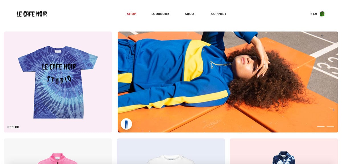
Le Cafe Noir is one of the WooCommerce examples which gets down to business quickly. There’s no hero image, or long introduction. Just straight into its products which I really like. For a store like this, you probably don’t need to tell a long story. You just want people to see them as soon as possible. It uses a simple grid on the homepage which displays the catalog, broken up by stylised photography to keep things interesting. There’s a different soft container color behind each item which gives the grid a bit more vibrancy also.
I liked their single product pages also. They keep things simple and let the photography do the talking. Hovering over the logo reveals a random scrolling color hover which is a nice touch to an otherwise minimal site.
Key takeaway: Leading with products right away on your homepage is a good approach if they don’t need much of an introduction.
Actionable tip: Simple product swatches using a label or color can look a lot better than the WooCommerce defaults. You can see the Variation Swatches for WooCommerce plugin in action on a variable product within our Shoptimizer theme demo site.
Magna Tiles
From the USA
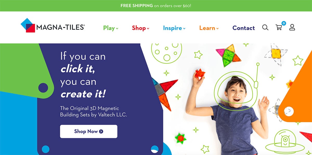
Magna Tiles is one of the big, bold and colorful WooCommerce examples. As it’s designed for kids this is a perfect approach. And no Comic Sans to be seen thankfully. They’ve gone for font sizes which are bigger than standard and it really works. Using bigger type for the navigation and mega menu in particular means it’s easy to get around, and by utilizing different spot colors for each section it adds a degree of playfulness and fun throughout. Plus, it’s a nice way to separate primary areas and encourages exploration.
Key takeaway: Go bigger with your fonts and try separating key sections by color if your design and brand guidelines allow for it.
Actionable tip: Add a ‘New’ label to your own latest products by using a plugin such as Advanced Product Labels for WooCommerce.
Sodashi
From Australia
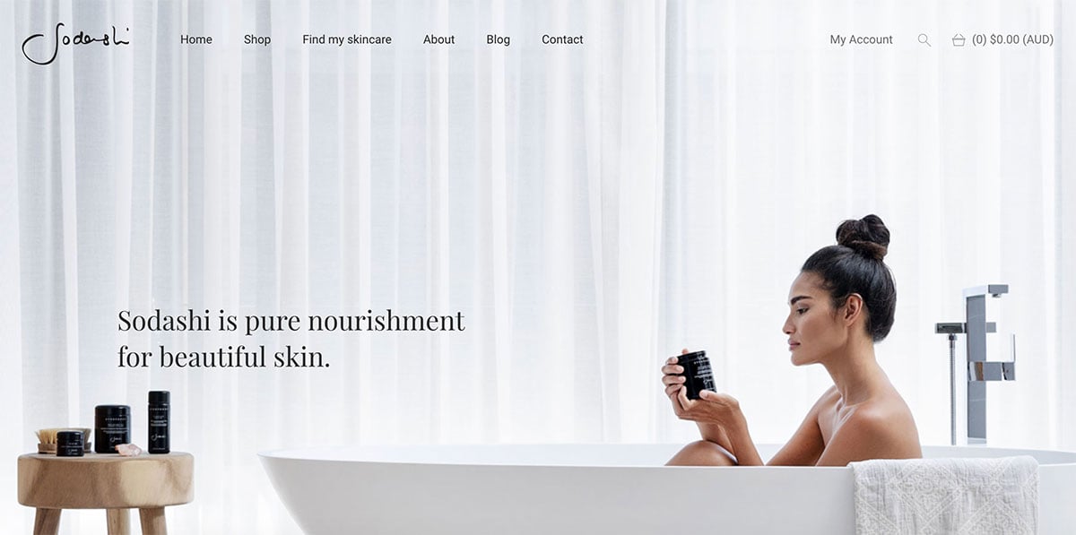
A skincare brand from Australia, Sodashi was designed by Humaan. you know you’ll looking at a solid design before even clicking. What you’ll get in a clean design with lots of whitespace and nice photography with clear call to action buttons. It’s a lesson in keeping things simple and the focus firmly on the products. With premium price tags on the skincare items, the website reflects this by combining a nice blend of serif and sans-serif typography with subtle animations.
Key takeaway: Adding additional sections to your product detail pages such as ‘Key Benefits’, ‘How to Use’, and ‘Tips’ can be a great way to add more depth to your products and encourage repeat visits even from existing buyers.
Actionable tip: Sodashi uses the Afterpay payment gateway plugin to enable buyers to pay for an item in instalments. This might be a useful option for certain kinds of stores.
Henry J. Socks
From the UK
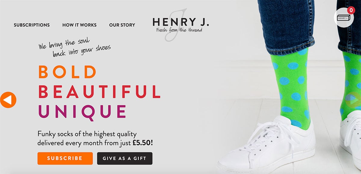
An extremely simple site, Henry J Socks does one thing and does it well; send you socks at regular intervals. Yes, it’s a socks subscription service. The socks are bold and brash and they have a site to match. Using big typography with a bright orange color scheme ensures that the primary buttons are nice and clear and difficult to miss. It pulls in authentic testimonials from reviews.co.uk on the homepage. This is important for social proof – there are no made up quotes here.
Key takeaway: The messaging and main actions are nice and clear, there can be no confusion about what this store sells. This is something that every store can look at and learn from.
Actionable tip: You can use the official WooCommerce Subscriptions plugin to create your own subscriptions-based store. We take a look at how to achieve that in our review.
Fumo Design
From the USA
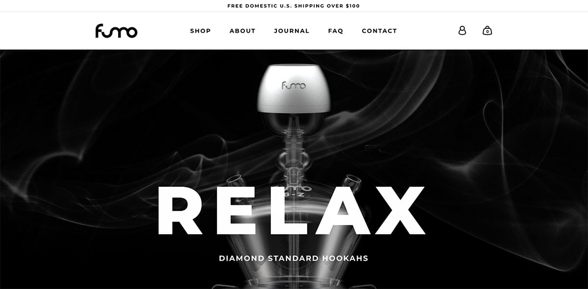
A brand of Hookahs from the United States, Fumo Design features a minimalist black and white design with clean typography and a simple layout. The nicest part of the site I feel are the customization options on the single product pages. They did a really nice job on making it really easy to create a custom hookah with your own specifications. A sticky box on the right follows your progress and automatically updates the price based on what you have chosen.
Key takeaway: Designing a site without color doesn’t have to be boring.
Actionable tip: Use the WooCommerce Product Addons plugin to add additional customization fields to your products.
Procus Go
From India
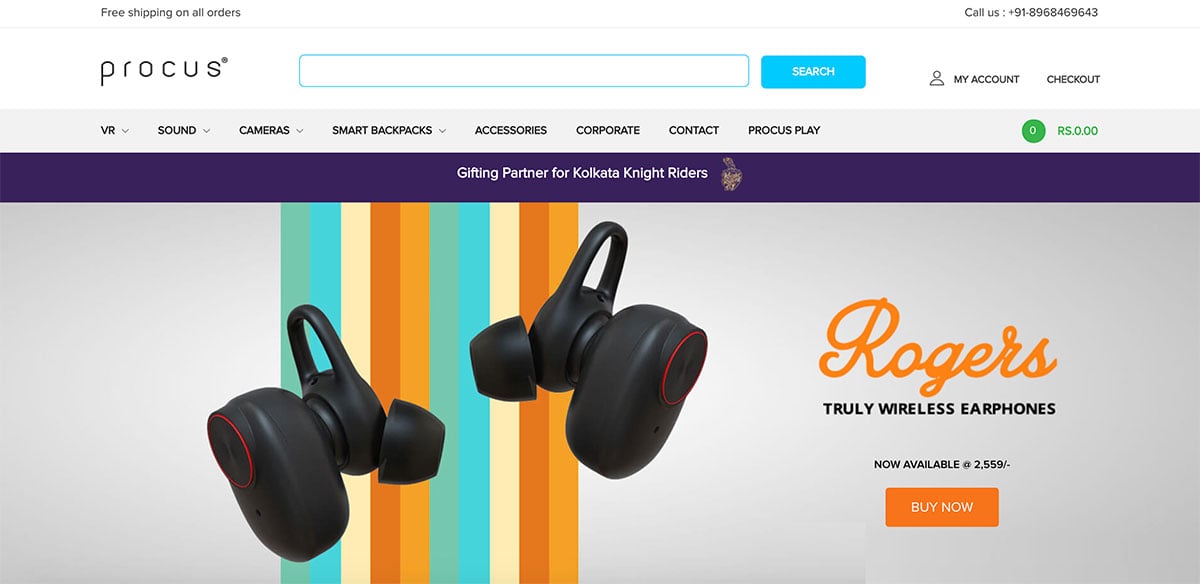
Procus is a super stylish tech brand from India focusing on VR sets. They also carry a range of other electronics such as headphones and cameras. Built using our Shoptimizer WooCommerce theme, it’s a great example of how you can customize it to a brand and give it a very unique look and feel. I particularly liked their key products within the mega menu. It’s a great way to encourage users to visit handpicked items.
On single product pages, they include a ‘Call to order’ button. This might be a good idea for certain regions where people are more comfortable ordering over the phone. The product descriptions are nice and long and include lots of details. It includes video and images about each item which gives plenty of confidence before ordering.
Key takeaway: A ‘Call to Order’ button may be useful for certain items which are high value. Or, if you’re selling in countries where customers need some added reassurance before purchasing.
Actionable tip: Procus have implemented Zendesk Chat on their site, included as an option in our Customer Support eCommerce Guide.
Avrox
From the UK
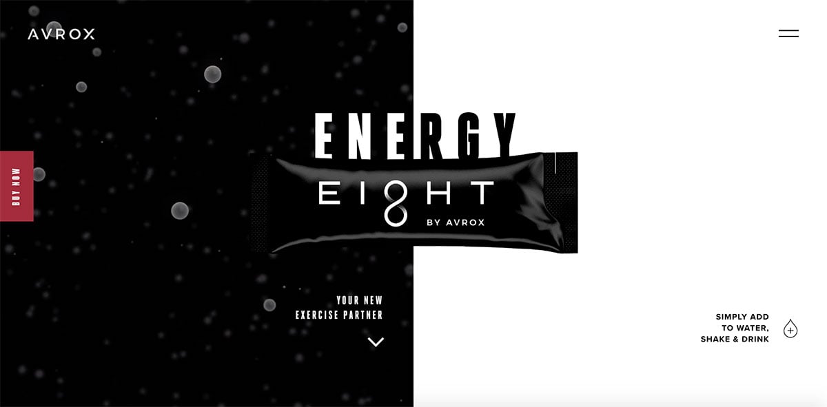
Avrox is a stylish one-page site for an energy powder you add to water before flying. I haven’t come across such a product before and the makers do a good job in explaining the benefits of such a drink on the homepage using a combination of story telling by scrolling and video. The structure is well thought out and incorporates how easy it is to take with scientific research on why it can help airline travellers. Of all these WooCommerce examples, this one-pager is a good one to reference when you only have one item to sell.
Color is barely used – the reddish splash is reserved for the fixed ‘Buy Now’ button which was a good choice by their designers. Black and white reflects the palette of the packaging and gives the site a premium feel.
Key takeaway: Video backgrounds behind products can make them seem more dynamic.
Actionable tip: You can find similar falling liquid videos for free within Mixkit’s abstract category.
Fru.it
From Italy
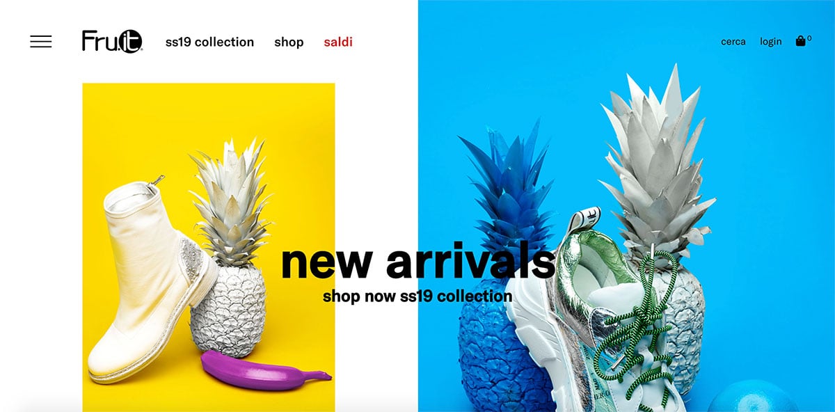
A shoe brand from Italy, Fru.it combines bright colors with excellent photography and large chunky text to create a fresh look. It’s a design which isn’t afraid of white space and doesn’t try and cram too much into a small space. There’s a bit of scrolling and discovery on the homepage before you reach their latest products which displays a degree of confidence that you’ll like what you see.
I also liked the fixed red bar at the top highlighting a coupon code with a discount. The brand isn’t afraid to use splashes of red which can be an awkward color to use but it’s difficult to miss.
Key takeaway: Try creating a separate Sale page with a unique color in the menu to make sure it’s noticed by visitors.
Actionable tip: Incorporate your products within your blog posts, Fru.it do it to good affect. We also apply this technique of within Shoptimizer’s blog posts and explain how to do so using WooCommerce Shortcodes.
Lafinesse
From Spain
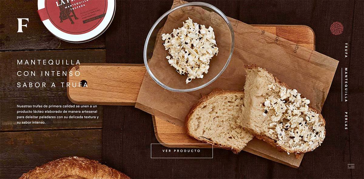
It’s almost a bit unfair reviewing Lafinesse. Not many stores can sell Spanish truffles using some of the most stunning photography I’ve seen on any of these WooCommerce examples. They go all in with the imagery and the homepage involves just a simple cycle between three incredible shots, each showcasing a product. There’s no need to overcomplicate things when you have imagery so vivid you can nearly smell the screen.
I really liked the layout of the single product pages also. The quantity and main buy call to action button sticks to the bottom as you scroll which is a great touch. They included key information with plenty of white space and more great photography. Not many sites have this kind of quality to choose from.
Key takeaway: Invest in great photography and make your images the star of the show.
Actionable tip: Don’t be afraid of creating longer single product pages with plenty of images.
Disconnect
From France
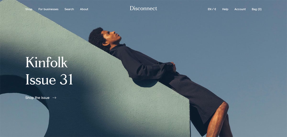
Disconnect is a magazine store based in Paris who specialize in beautiful and independent publications. I’ve been an avid buyer of “Offscreen” for years, and can vouch for the quality of each issue.
There’s nothing fussy on the homepage, just a simple hero shot from their featured magazine of the month leading into selected issues they’ve handpicked. I liked the illustration style of the ‘For businesses’ and ‘About’ blocks at the bottom, they stand out amongst the rest of the content.
Each magazine tends to have a very distinct photo on the cover so the designers have gone with an ultra minimal design around this, with discreet greys framing each and letting the image pop more. The single product pages include a simple gallery scroll of selected inside pages to give you a flavour of what you’re getting.
Key takeaway: If you have bright colorful products, a greyscale design might be the best way to present them.
Actionable tip: I liked the ‘Suggestions’ links when the search is selected. It’s a way to direct buyers to the most popular publications if they don’t know what to choose for themselves.
Femme and Fierce
From the Netherlands
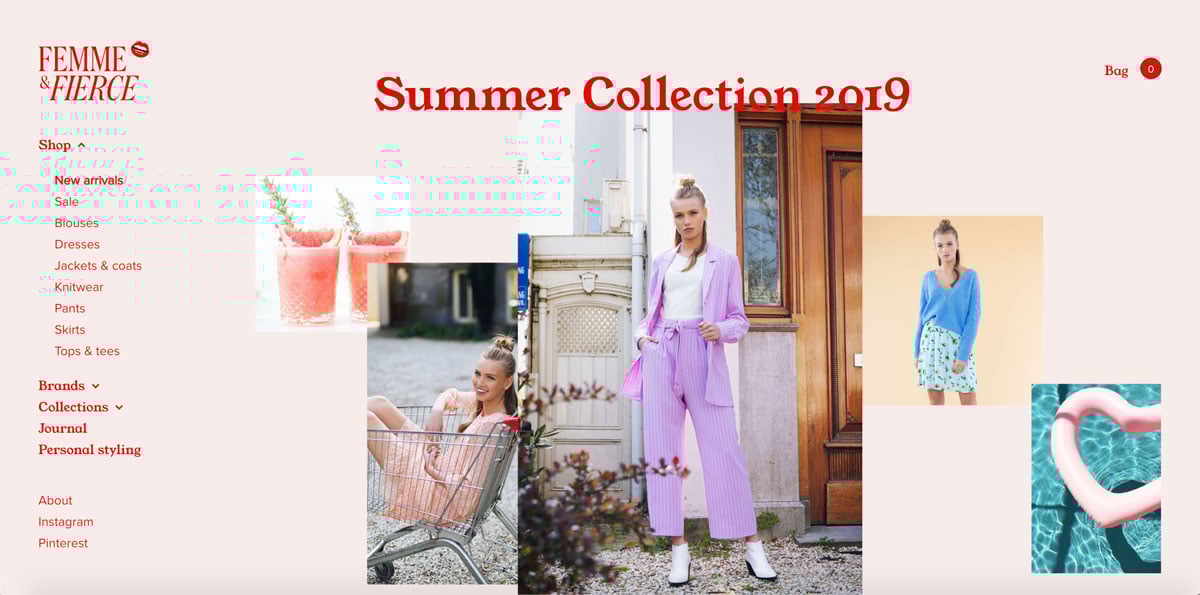
Femme and Fierce is a very stylish clothing site from the Netherlands. It features what has become a rarity in web design; a left navigation sidebar. I loved the bold serif they used for the primary menu labels and titles. It’s very distinctive and stands out next to the regular sans-serif used for copy extremely well. The palette uses a bold red, with a soft pink in the body background emphasising the feminine nature of the products. It’s one of the most beautiful WooCommerce examples in this list.
Funky animations are seen as you scroll down the page, including lipstick being opened and lips licked. These reflect their brand logo and the fun, unapologetic approach of the design.
Key takeaway: Even the ubiquitous chat bot on product pages is unique, with kissing lips and intro text of ‘Hey giiirrrl, let’s get you looking fly!’. It shows you can bring personality into every element of a design.
Actionable tip: The super stylish serif used, ‘Young Serif’ is free to use and can be downloaded from the Open Foundry website.
Meet Milu
From the Netherlands
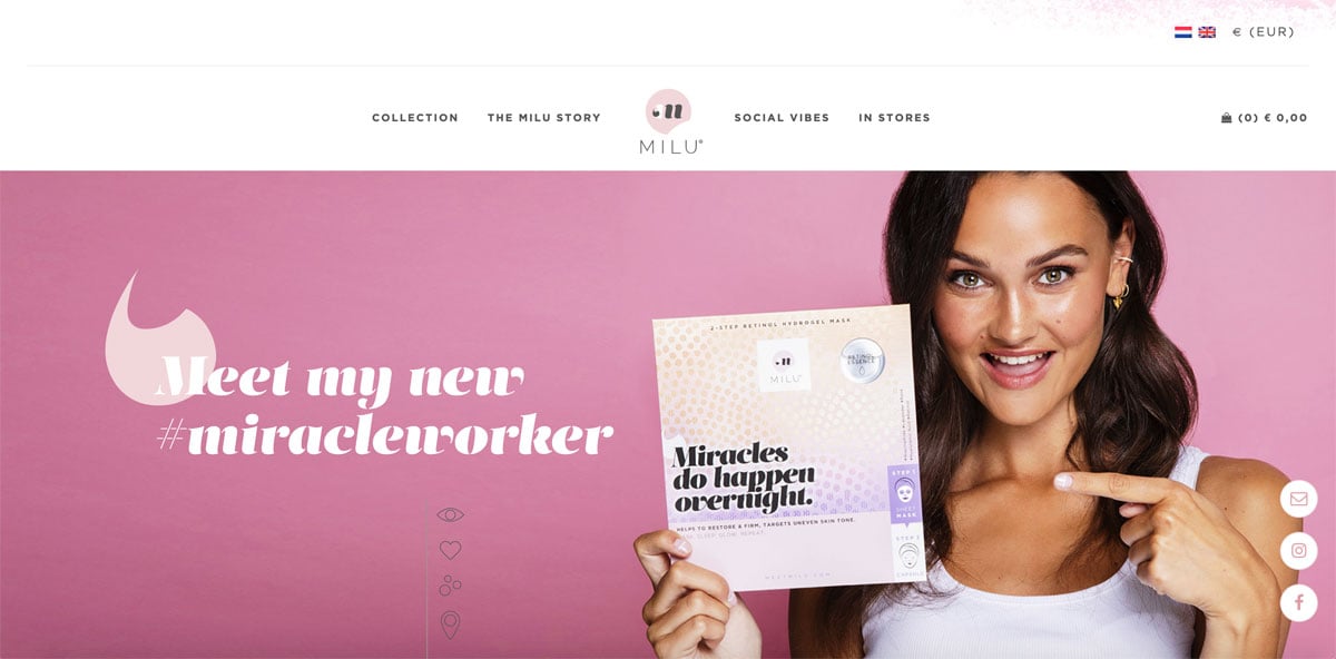
A skincare brand from the UK, Milu is one of the recommended straightforward WooCommerce examples which isn’t too flashy but presents its brand extremely well and has the target market nailed. Through a selection of soft pinks and well shot brand photography and video it’s easy to see who the store is targeting. The homepage focuses more on telling a store than displaying products but in a crowded market this might be a wise approach. You need to explain why you’re different when there is so much competition to choose from.
Key takeaway: Using only different shades of the one primary color can work very well to define your brand.
Actionable tip: An ‘As Seen In’ bar on the homepage can add brand credibility and reassurance to prospective buyers.
Murals Wallpaper
From the UK
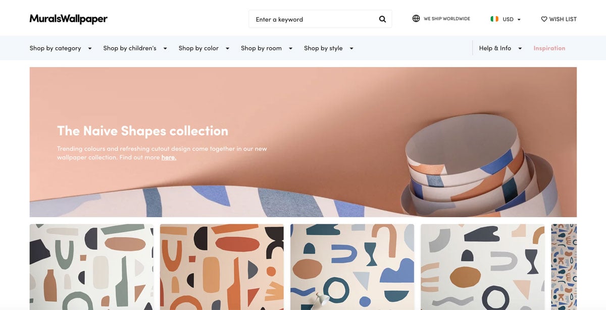
MuralsWallpaper from the UK probably stock the largest collection of products among all of the examples on this page, easily more than a thousand different wallpaper types. Because of this, navigation and filters UX are particularly important and they do a good job on both counts. The main menu includes a mega dropdown with labels such as ‘Shop by category’, ‘Shop by color’ and ‘Shop by room’ which aids buyers in finding what they want within such a large catalog.
A prominent Help and Info section is also very important for these kinds of products as they are relying on users to be able to take accurate measurements. A comprehensive guides section is a necessity to ensure fewer mistakes with orders and to reduce refunds.
Key takeaway: Spend time on planning your navigation and include multiple ways of discovering products on sites with large collections.
Actionable tip: It’s frequently overlooked but adding some quality category description text can have huge SEO benefits. MuralsWallpaper did a great job with the copy on their categories.
Studio Job
From the USA
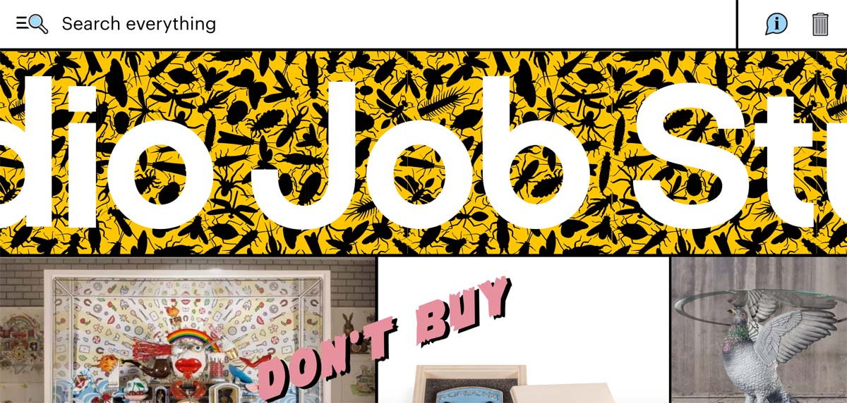
It’s hard to review Studio Job because it’s just such a wacky, creative, and imaginative experience it defies standard conventions. There’s so much going on, you’d spend time just clicking and exploring to see what craziness the designers have implemented on each page and forget that it’s actually an eCommerce store.
Key takeaway: It’s ok to go wacky and ultra creative with the design if that’s your brand.
Actionable tip: This is one of the WooCommerce examples where I’m not sure there’s anything you could directly implement in your own store 🙂
Carl Edmond
From Sweden
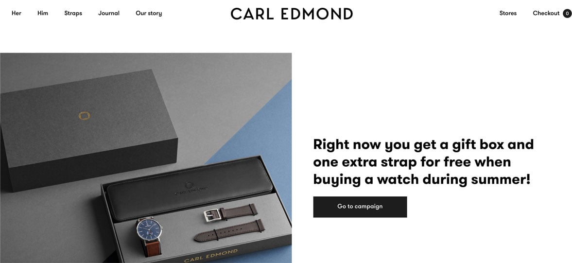
Carl Edmond is a premium watch brand from Sweden with a minimalist black and white design and a fixed navigation. It utilizes simple bold type overlaid onto excellent photography extremely well. Similar to other premium brands, it takes its time before revealing the products, preferring to tell its story next to close up shots of the well-crafted watch details.
The single product pages are nicely laid out and there’s a promo code below the primary button offering buyers a free extra such as a gift box or an additional strap for their watch.
Key takeaway: A free extra such as gift wrapping over the holiday season might be an inexpensive way to increase sales in your own store.
Actionable tip: The Giftable for WooCommerce plugin allows you to offer free gifts once certain products are in the cart.
Face Gym
From the UK
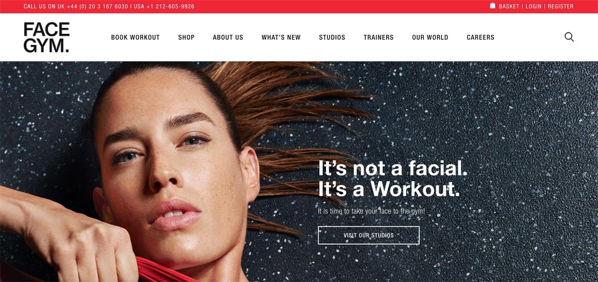
A very clean site from Face Gym, with splashes of red to bring prominence to key areas. Unusually they don’t bring any products onto their homepage but this may be because they have separate catalogs for their US and UK markets. I liked how clean their Shop landing page looks. With lots of whitespace it’s easy to discern the key categories on the left and the cut-out images of the products look great. There’s nothing particularly revolutionary about this design but it’s well executed, loads quickly and foregoes any gimmicks. Of these WooCommerce examples, it would be one of the most straight forward to implement.
Key takeaway: The clean shop and category pages are worth looking at in particular.
Actionable tip: Roboto Condensed, a Google font, can create a similar look to the typeface used in the navigation and within the content.
Bookblock
From the UK
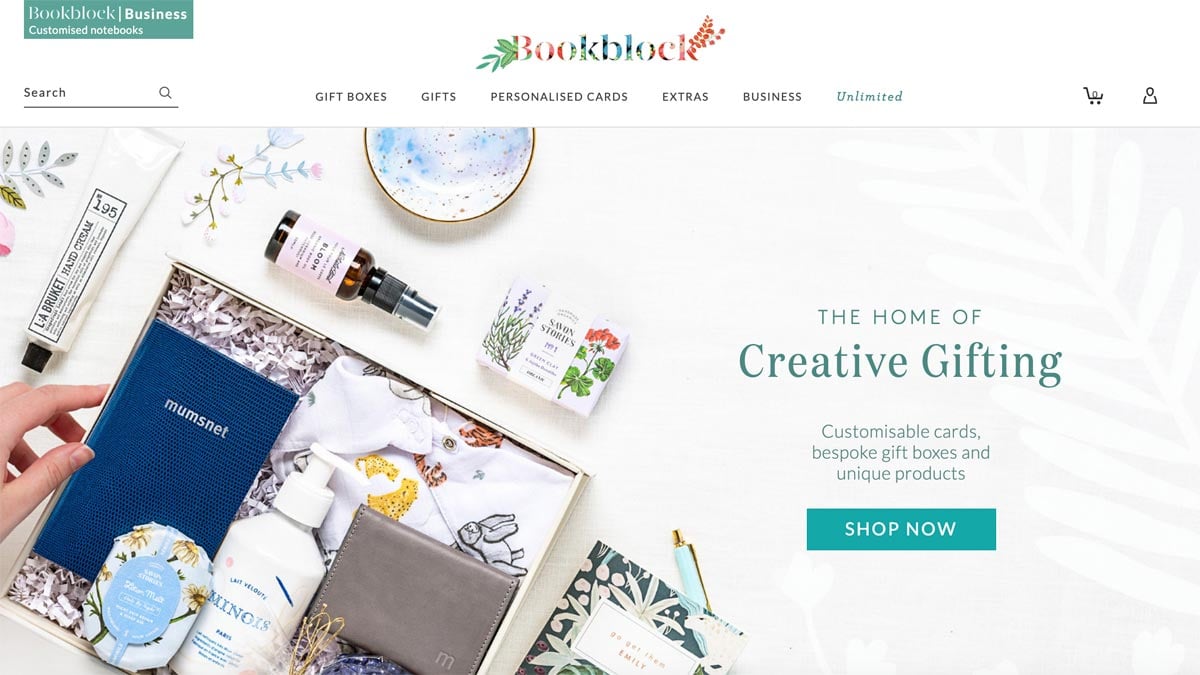
Bookblock, a brand from the UK sells thoughtful products for the home, kitchen, and babies amongst other categories. Everything in their catalog looks beautiful and well presented, ideal for gifting. Their site is split between one-off purchases and encouraging visitors to create a custom giftbox and include a number of items in one elegant package. Their curated gift selections include ready-made boxes to make the process even easier – you can choose the packaging from a number of designs.
The design is primarily a light grey but the product packaging is generally so colorful they pop quite well on such a muted tone. I liked the addition of some animated gifs for certain products while scrolling, it added visual interest and caught the eye. It’s one of the WooCommerce examples which has a surprising amount of detail you only discover once you spend time browsing it.
Key takeaway: Introducing customizable gift boxes might be a popular addition for certain WooCommerce stores.
Actionable tip: You can use the offical WooCommerce Product Bundles plugin to create customizable product kits.
Firmamento
From Spain
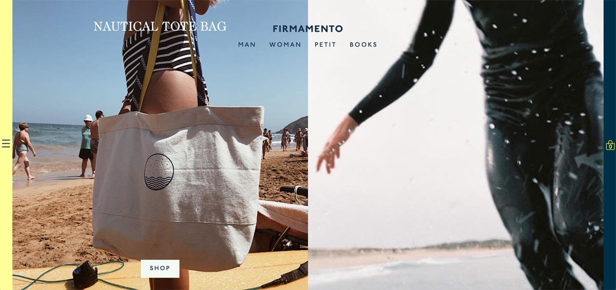
Firmamento is a stylish site from sunny Barcelona features clothing and accessories as well as a selection of books. It goes with a serif font for its main typeface which gives the site an elegant, premium vibe. A neat, capitalized sans-serif is used for the main navigation and headings – the two work very well together. As seen on a number of other stores, the navigation stays fixed as you scroll. This certainly seems like a design trend in vogue.
A thin yellow bar on the left reveals secondary links such as the Lookbooks and Journal. It’s conspicuously hard to discover but perhaps this is to keep the product categories as the primary focus for visitors.
I liked the simplicity of the single product pages, it’s a little different to the WooCommerce default and the bright yellow is a good draw to the add to cart call to action.
Key takeaway: Switching to a serif for your primary font can give your store a very different feel. It’s one of the only WooCommerce examples in this list who employ such a typeface but really works for their brand.
Actionable tip: The About page feels personal and is well laid out. It’s a good example to study for your own store.
Two Chimps Coffee
From the UK
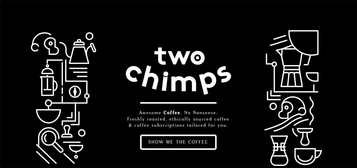
Two Chimps Coffee is a gorgeous site from the UK selling various flavors of coffee as well as subscriptions so you can get a regular delivery of your favorite brew. It’s beautifully designed throughout with lots of little details to explore on each page. I really liked the wizard on the homepage with a couple of simple questions to narrow down what blend might be best for your circumstances. Sometimes these ask too many questions and people struggle to finish them but the designers got it just right.
I liked the dark color scheme and the animation throughout, it gives the site a dynamic feel. The single product pages are carefully thought out and the information on the farmers growing the crops is interesting and encourages buyers to support independent retailers like this one.
Key takeaway: A simple wizard with a small number of questions can help visitors quickly find a suitable product.
Actionable tip: The WooCommerce Subscriptions plugin is your go-to solution for creating a similar subscriptions based store.
Absolut Art
From Sweden
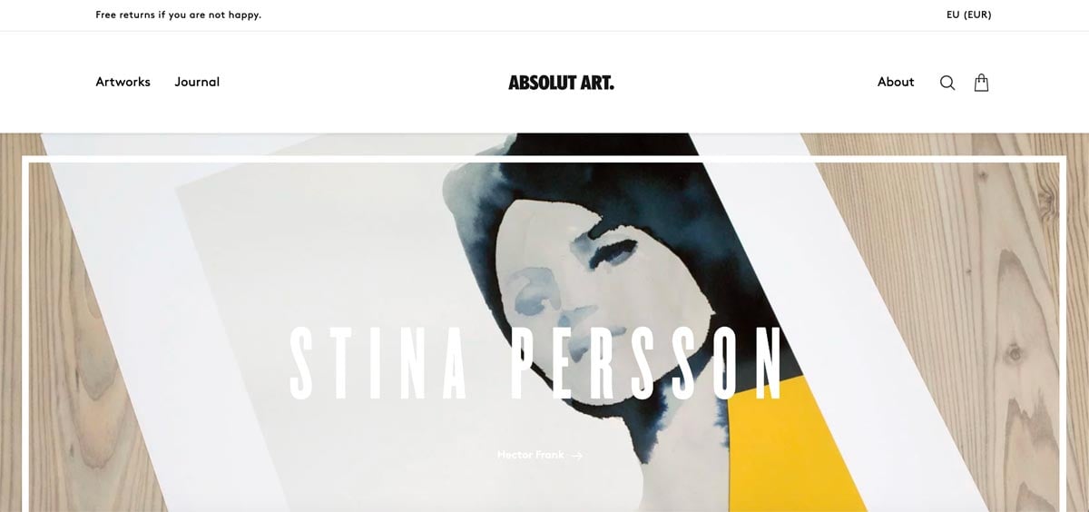
One of the most stylish WooCommerce examples on this list is from Sweden. Absolut Art wants to make buying artwork easy and fun. Like some other stores in this collection when you have great assets to work with, the design certainly becomes easier and more minimalist as you want to stay out of the way and let the products showcase themselves. Saying that, there are some lovely touches with a condensed typeface for headings and splashes of color for certain sections on the homepage. I liked the ‘How it works’ section and the interesting grid it used.
I liked the category pages, with some category description text to the right of the heading allowing the art to appear further up the page. The smaller thumbnails allow more visual interest on each row. The single artwork pages are gorgeous, with the condensed typeface making a reappearance for the titles and the artist info is laid out in a clean, easy to read fashion.
Key takeaway: The homepage has a great layout, blending artwork items with information about selected artists.
Actionable tip: You too can display stock levels on the category pages by using a plugin such as Woo Custom Stock Status.
Bang On Books
From the UK
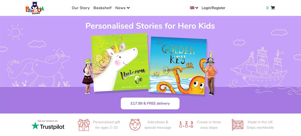
Bang On Books is another bright and colorful entry to these WooCommerce examples. It allows you to create and buy personalized children’s stories and send them anywhere in the world. it features some terrific illustrations and a fun, colorful design which reflects the content very well. The rounded font helps give the store an approachable and friendly feel, and using bright heading colors aids further in this regard.
The homepage uses alternative color backgrounds on each row featuring a book which works as they are complementary and don’t clash. The single book pages are well structured with quick-to-fill-out personalization options right on the page, as well as screenshots of the content.
Key takeaway: Bright colours and a rounded font are great choices for building an eCommerce site which features products for kids.
Actionable tip: The friendly heading font used is Nunito, available through Google Fonts.
Bloomscape
From the USA
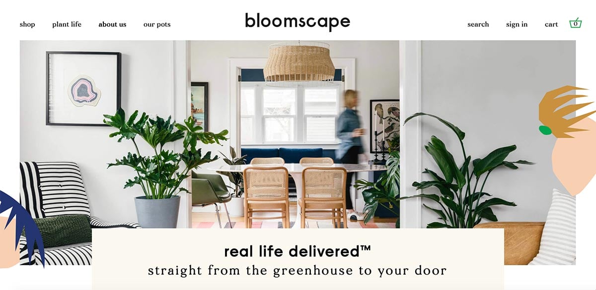
A beautiful eCommerce store from the US, Bloomscape offers plants to be purchased and delivered. The example photography is vibrant and lush and shows how bringing nature into your home makes everything look better. They did a great job with their filters. They even have a ‘difficultly’ filter for busy folk who want the least possible upkeep. I liked the little text snippets when hovering over each plant, such as ‘loves light, perfect for beginners’. It makes it much more pleasing to browse the catalog.
You can choose from a selection of pots and they’ve included separate photos of each choice. This would have entailed a great deal of effort, but it means you know exactly what you’re going to get. I liked the size/light/pet friendly attributes displayed on each single product page, it’s well structured.
Their blog (called ‘Plant Life’) is also a case study on what to do – with SEO friendly topics such as ‘Our favorite plants for Dad’ including direct links to the items described.
Key takeaway: Excellent filters and description text snippets on the catalog pages make this site a pleasure to explore, and is one of the best WooCommerce examples you can learn from.
Actionable tip: You can reproduce some of the excellent illustrations scatted throughout the design using UnDraw. It’s a great source of free illustrations you can colorize and use on your own projects.
Craft Can
From the UK
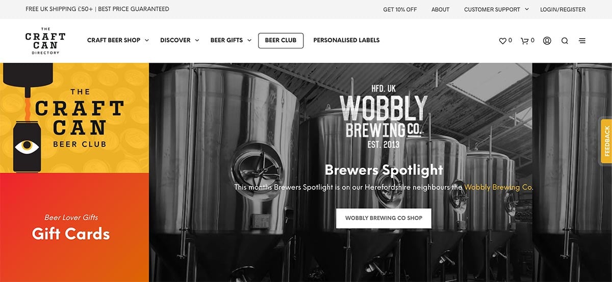
Craft Can is another one of the stylish WooCommerce examples from the UK offering an interesting selection of craft brews for the more discerning drinker. It employs a very clean layout with a highly readable font and utilizes splashes of yellow to emphasize key features. Yellow works well on black and as a background color for white text. It’s a good choice to use when you want to add subtle design differences for different elements. Unlike many of the other sites listed there is a large amount of text on this homepage. This should be good for SEO and it answers many of the key questions a visitor would have.
Key takeaway: For a new store, ensure you have enough text on your homepage with rich keywords for SEO.
Actionable tip: The site utilizes loyalty points for each purchase. You can implement something similar on yours with the official WooCommerce Rewards and Points plugin.
A. N. Other
From the USA
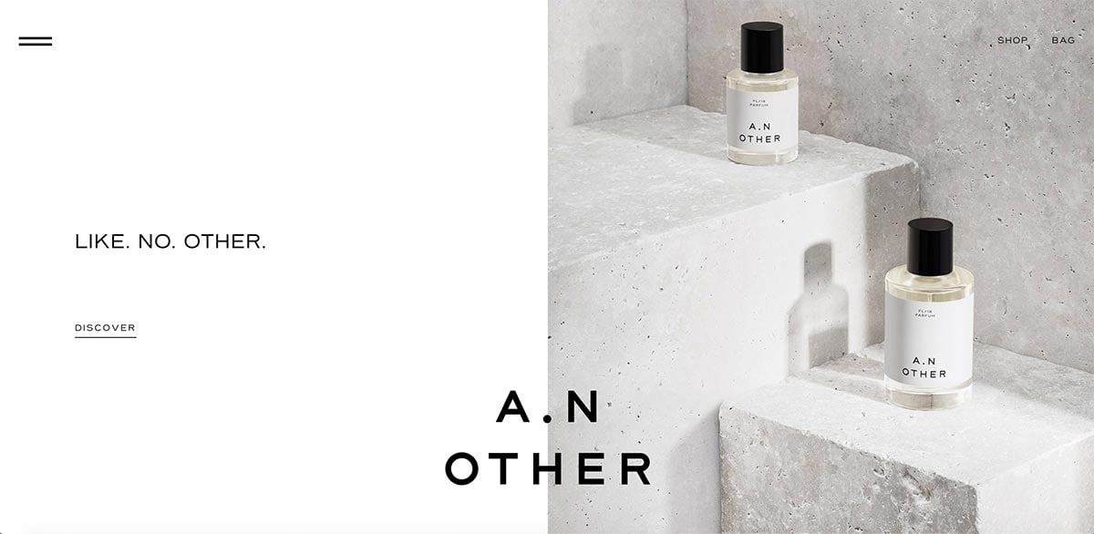
A perfume brand from the US, A. N. Other’s site is a beautiful showcase of their products. With lots and lots of whitespace and sleek photography the design embodies elegance and sophistication. I really liked the typeface used. It’s an unusual one with wide glyphs but is easy to read and very charismatic. It’s one of my favourite typefaces used within this list of WooCommerce examples.
The homepage grid is simple but works well with an alternating image and text. A similar layout is used within the stories section where you can read in more detail about each perfumer. I enjoyed the Concept section also where they broke down the cost of each bottle of perfume and explain how they want to make this process far more transparent.
The single product pages display the same elegant attention to detail with a nice animation effect on the call to action when you add a bottle to your cart.
Key takeaway: Creating stories and concept sections for your own store can give buyers a better understanding and appreciation of your products.
Actionable tip: For a wide font which works well in body copy also try Montserrat, part of the Google Fonts collection.
Cozydots
From Poland
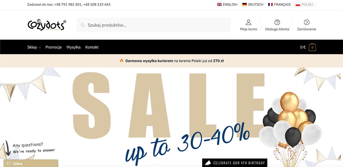
Cosydots is a store from Poland, selling amongst other items, play sets for kids such as teepees. Built using our Shoptimizer WooCommerce theme, it’s a great example of a fast loading, easy to browse store with a neutral color scheme which allows the products come to the fore.
They utilized a number of conversion features included within the theme such as displaying trust badges under the main buy button on the single products, and on the cart and checkout pages.
Key takeaway: A prominent bar highlighting free delivery is a great way to increase the average order spend.
Actionable tip: You can add multilingual options to your own store with the excellent Weglot plugin.
Gilmour
From the USA
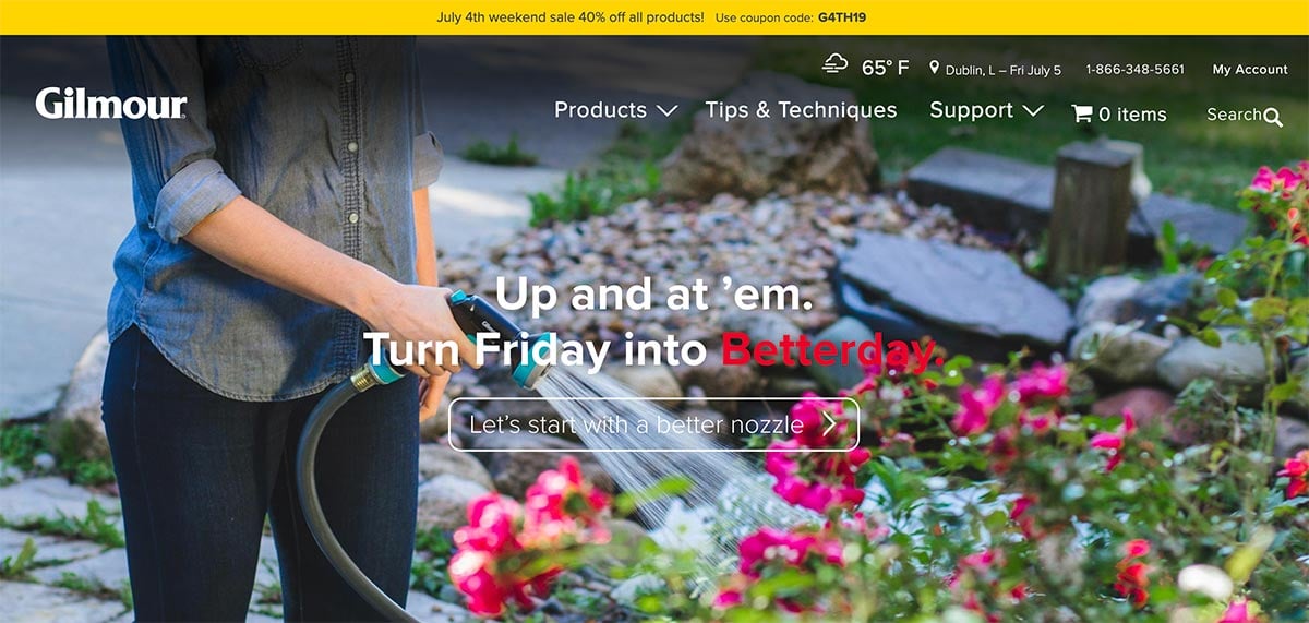
A popular garden tools brand in the US, Gilmour uses plenty of photography to promote visitors to get busy outdoors. The homepage main text updates the day referenced according to the current one. Coupled with the temperature and your current location displayed in the top bar helps make everything feel very current. I liked the mega menu with categories easily accessible, as well as icons offering you to browse by activity instead.
The homepage dedicates quite a bit of space to articles about lawn care which shows expertise in the area. It shows a willingness to share tips to homeowners rather than using the space solely to promote and sell products.
Key takeaway: The catalog pages use the excellent FacetWP plugin so the filters work instantly.
Actionable tip: The Awesome Weather Widget can be a useful feature to include if you sell items which rely on outdoor weather conditions.
Did I miss any other WooCommerce examples?
Now, I’d like to hear from you. Which of the WooCommerce examples listed above was your favourite? Or maybe I missed a great store which should have been included. Either way, let me know by leaving a comment below right now.


Nice examples. Are those example created by Shoptimizer theme? Which theme do they use?
Some of them use Shoptimizer. Most of them are custom themes. There are more Shoptimizer examples here.